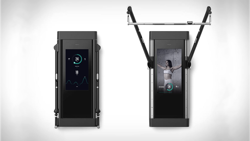
Two primary use modes: Free weights and instructor lead workouts.
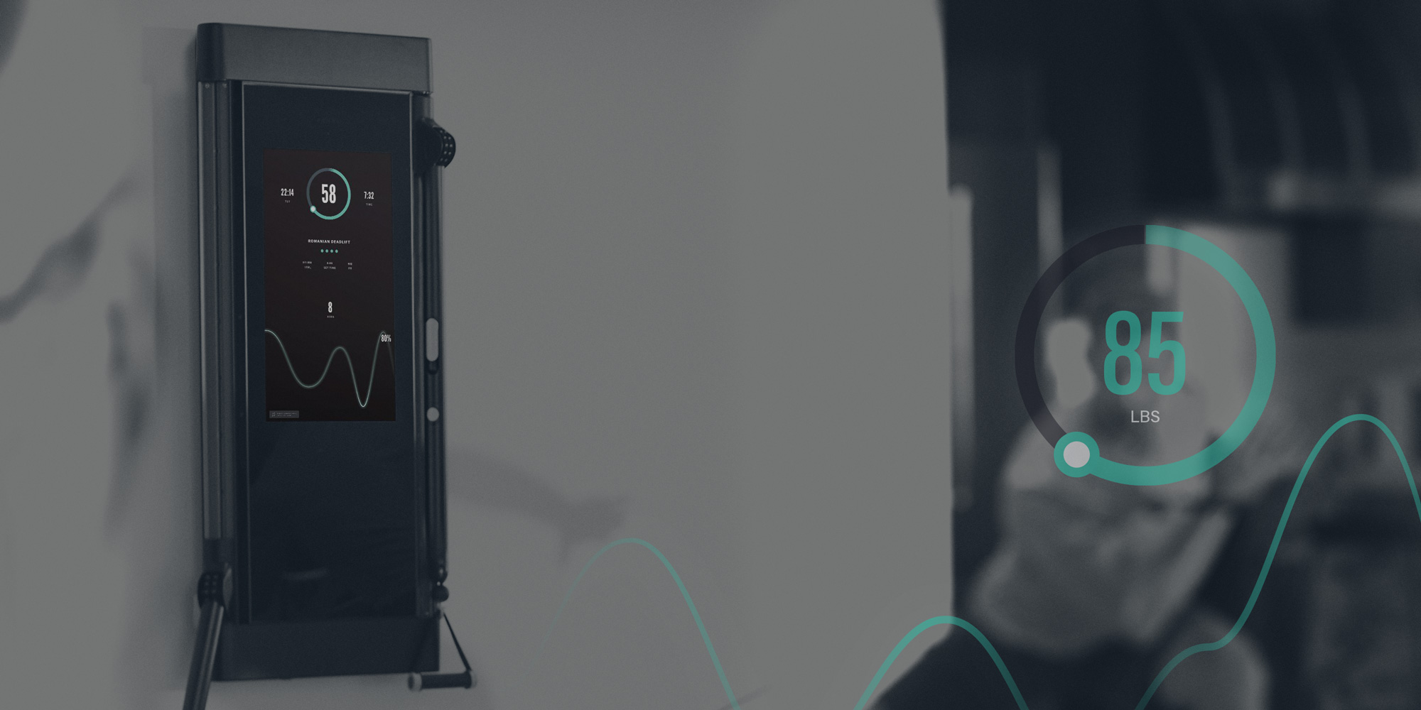
Two primary use modes: Free weights and instructor lead workouts.
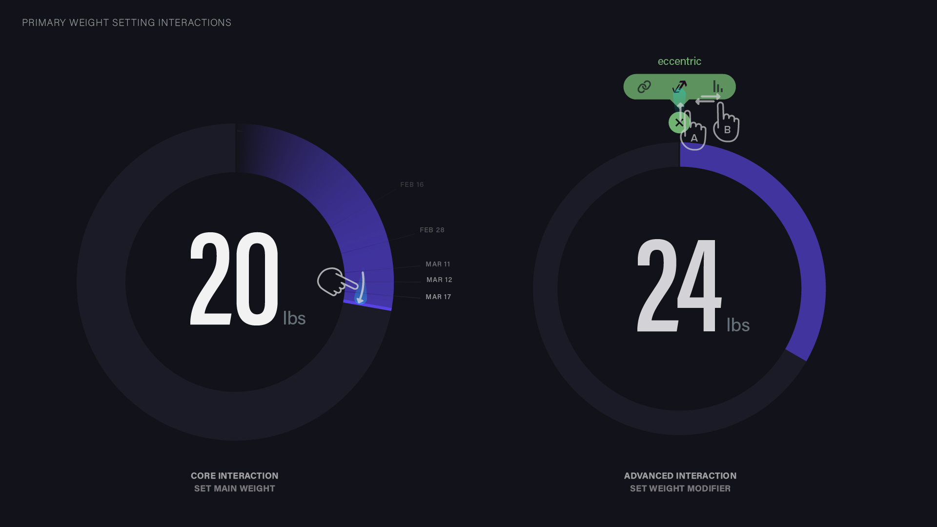
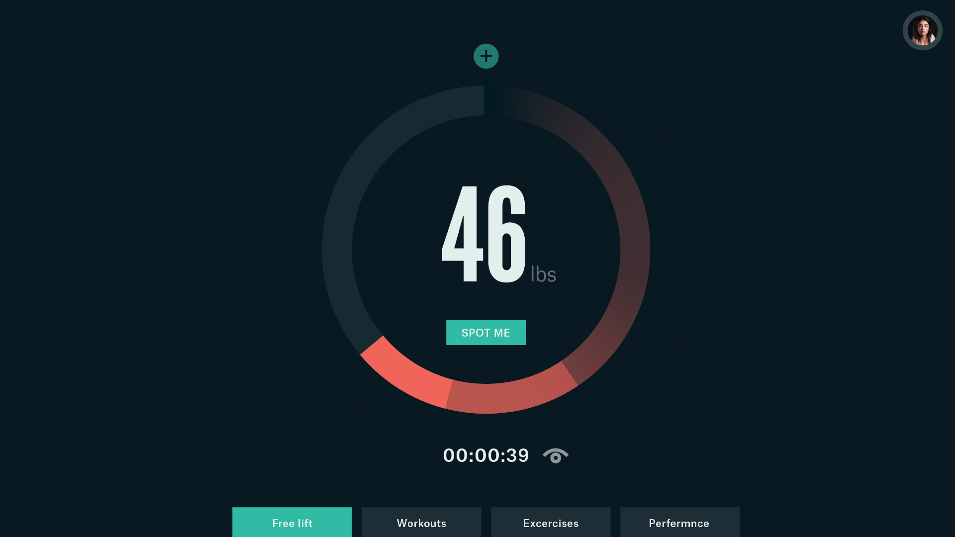
Primary interaction, setting main weight. Secondary (advanced user) interaction, setting weight modifier.

This is the first round of explorations done of the core weight dial UI. I also explored different contextual menu styles for representing and adding the weight modifiers.
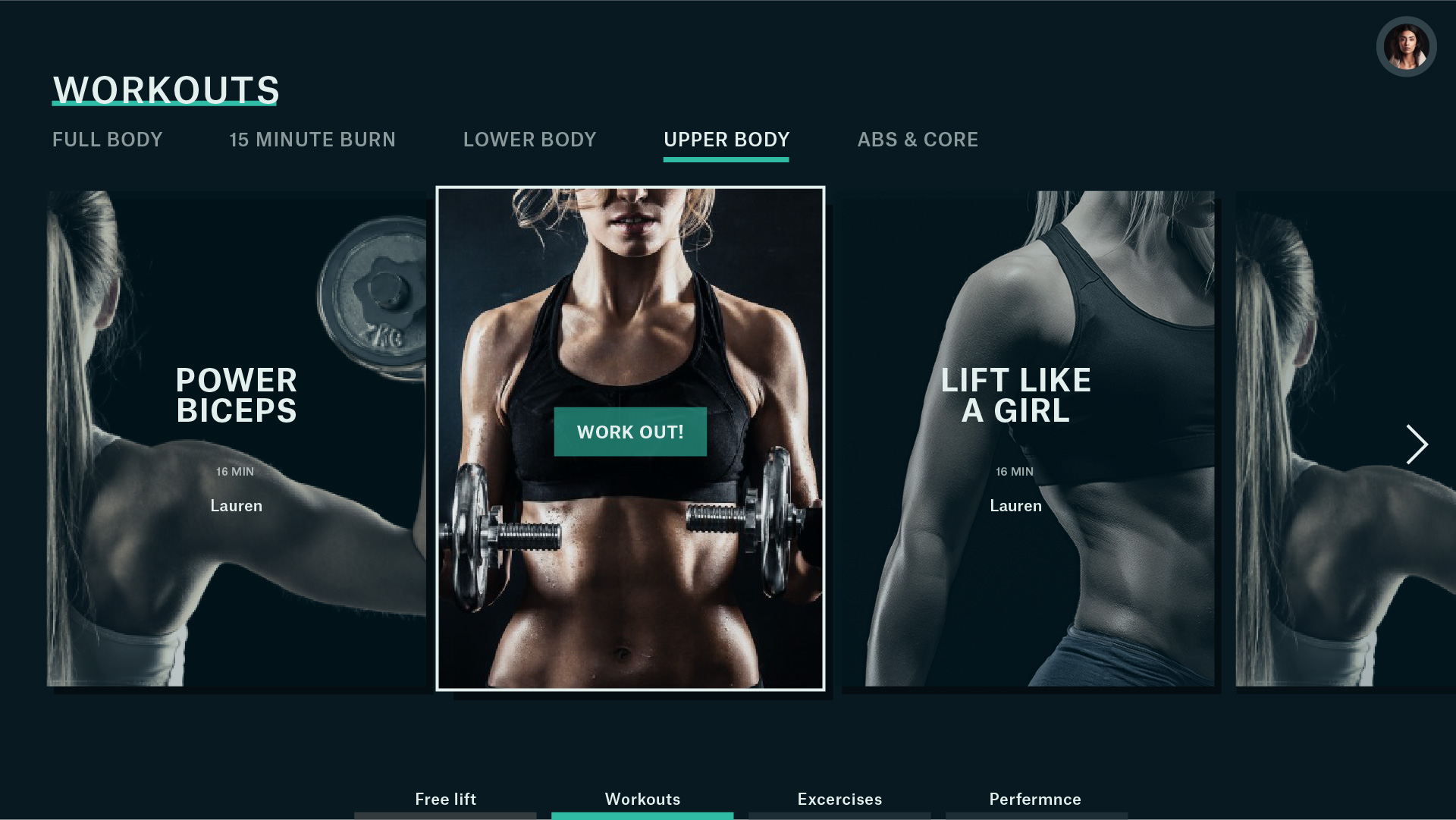
Early style study of the workout browsing view. In the end it was decided to create distinction between the spaces by having the workout mode be on light background with free weights on dark.
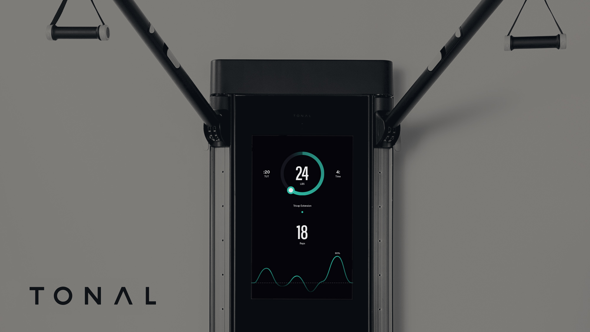
I was no longer contracting on this project during the final visual design/ production phases. However my preliminary studies in typography, color and visual language for the controls and power read-outs was instrumental in informing the design decision that went into the manufactured product.
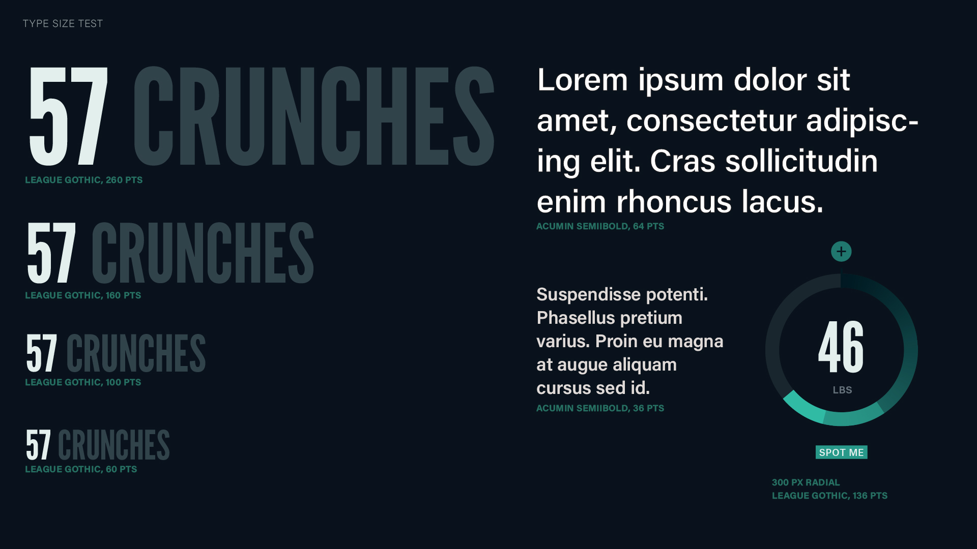
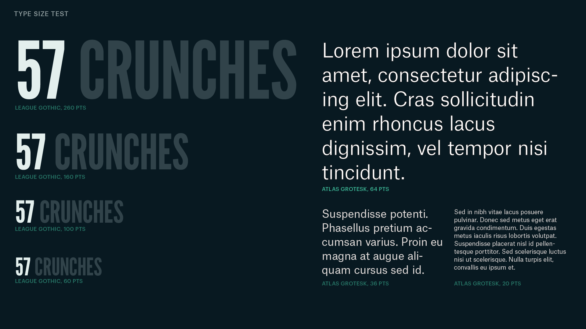
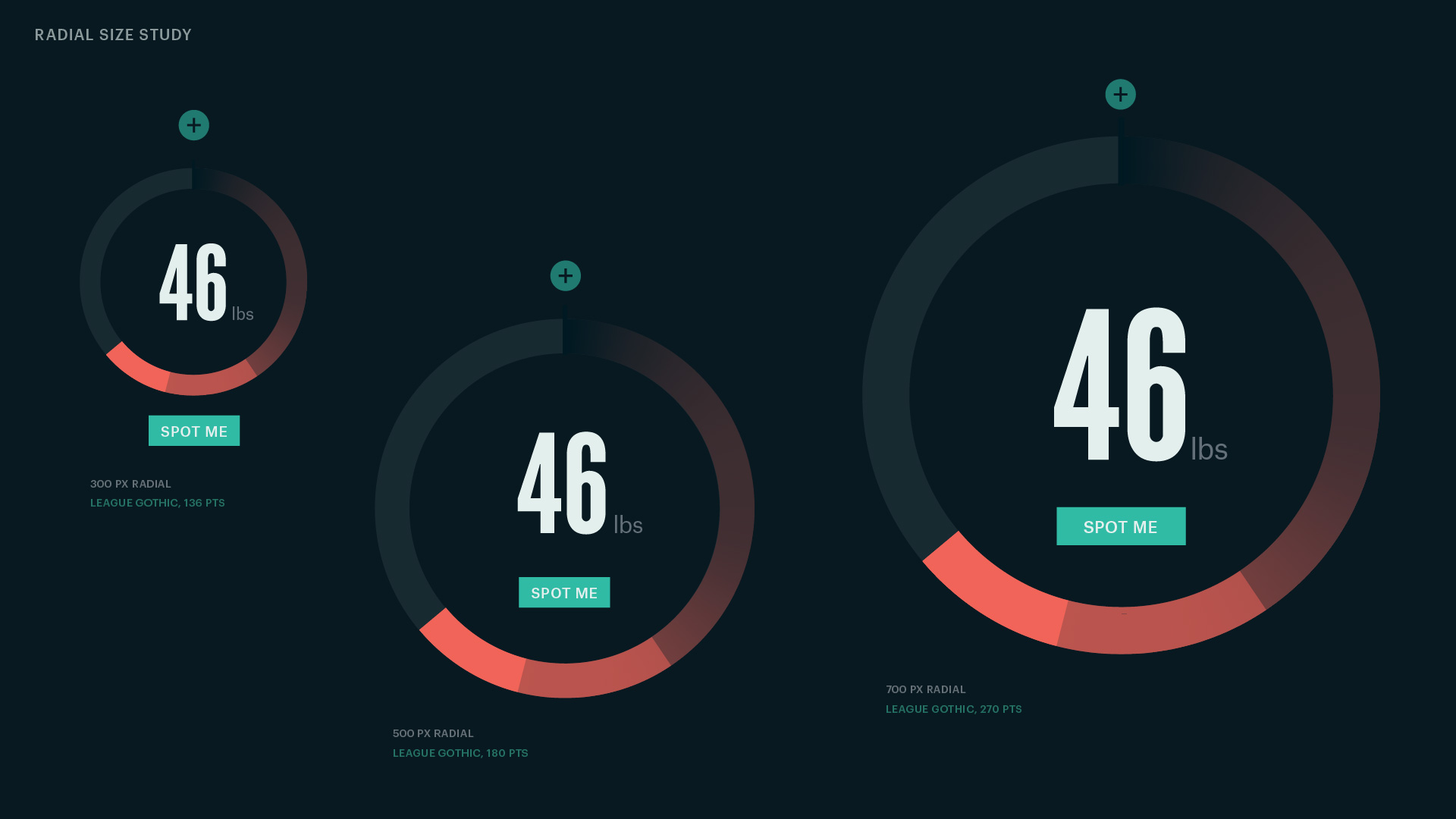
These are some of the early typography and color palette studies I created. I was testing type legibility, hierarchy, and contrast. As well as the visual range of the color palettes.


