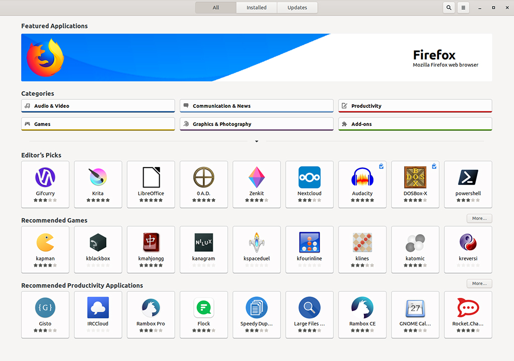
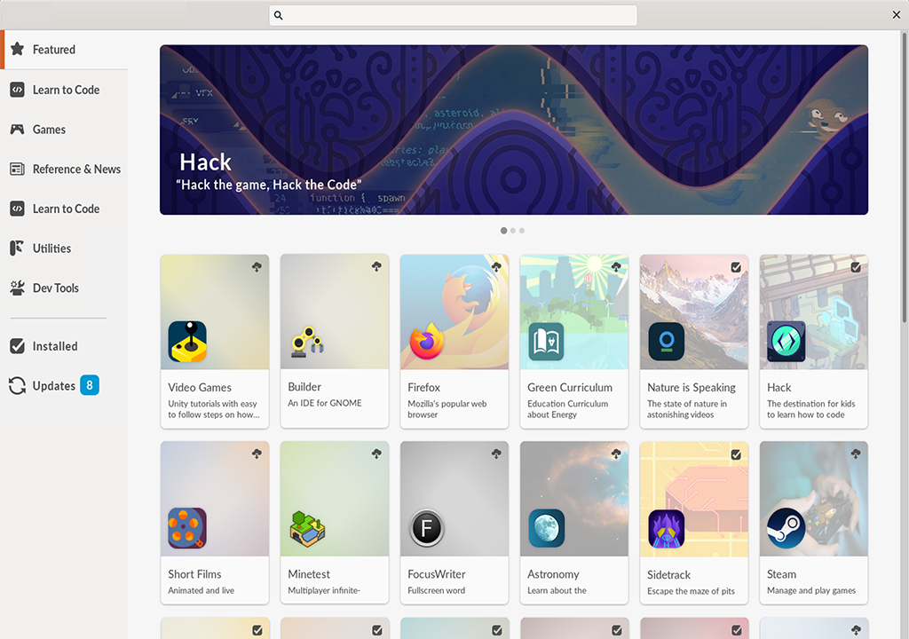
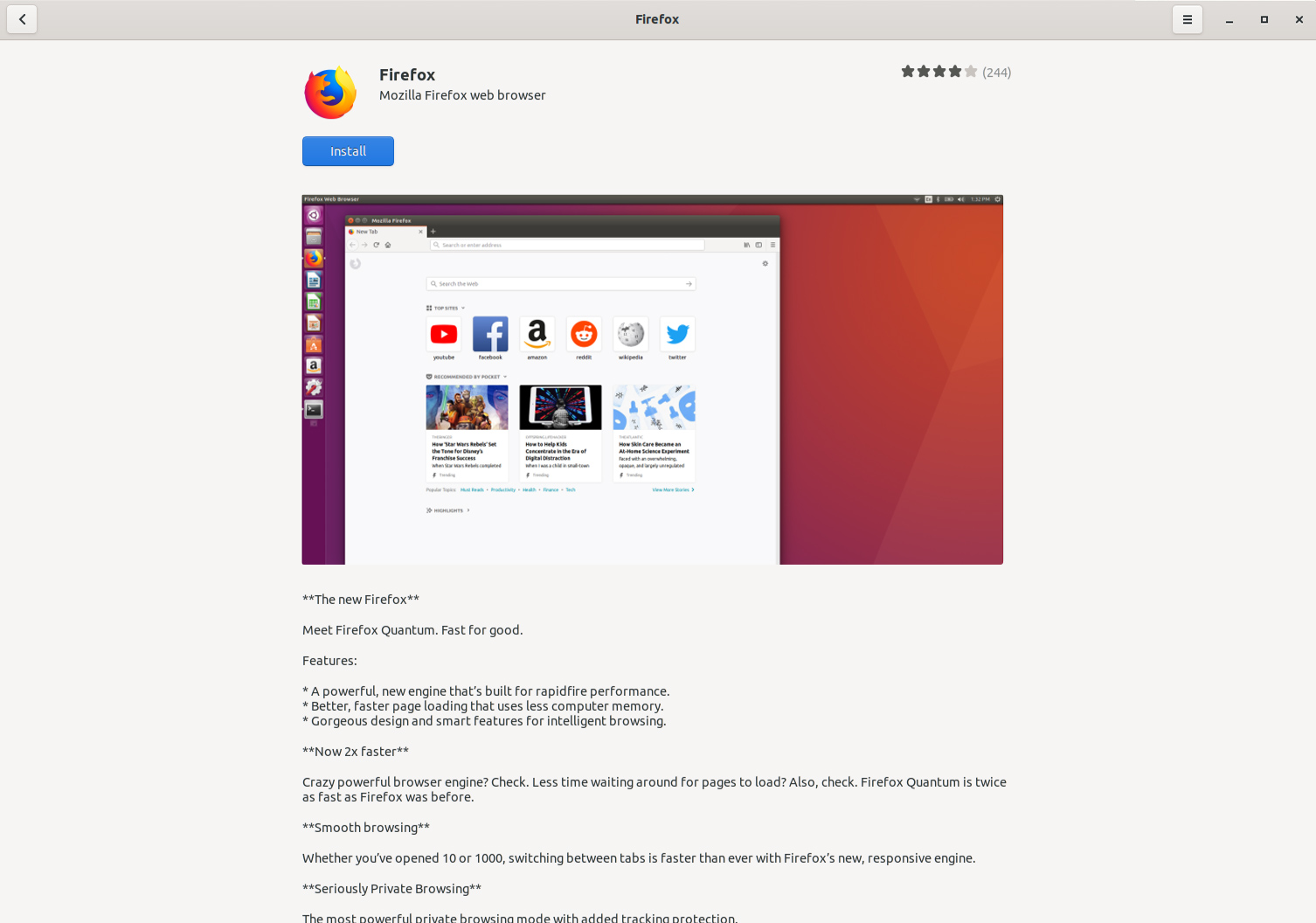
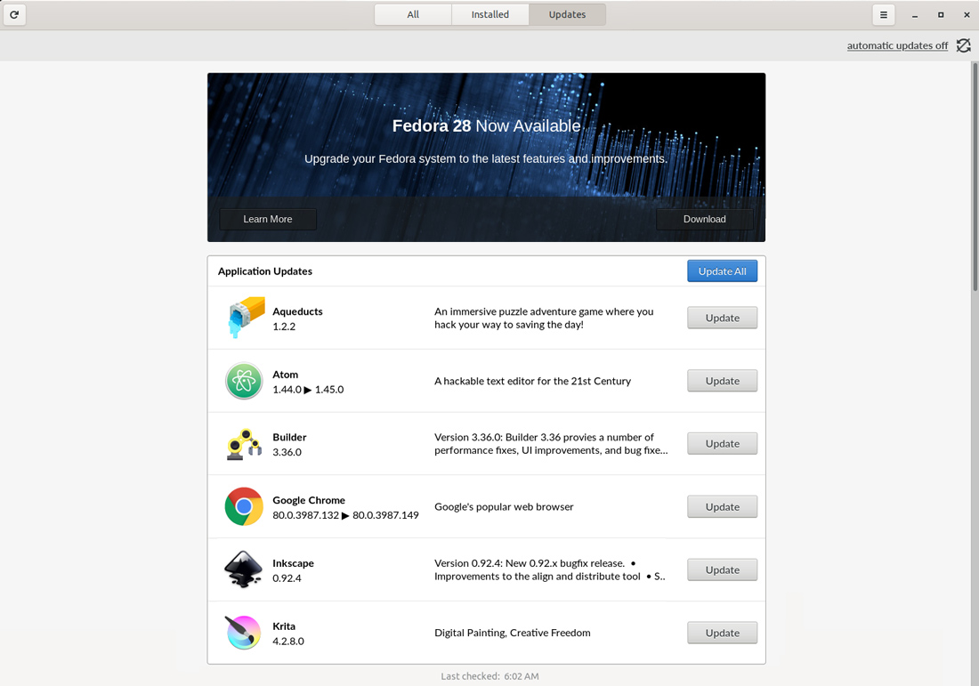
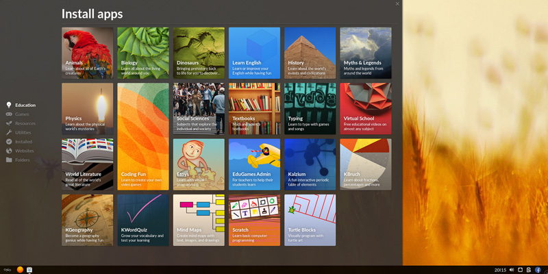
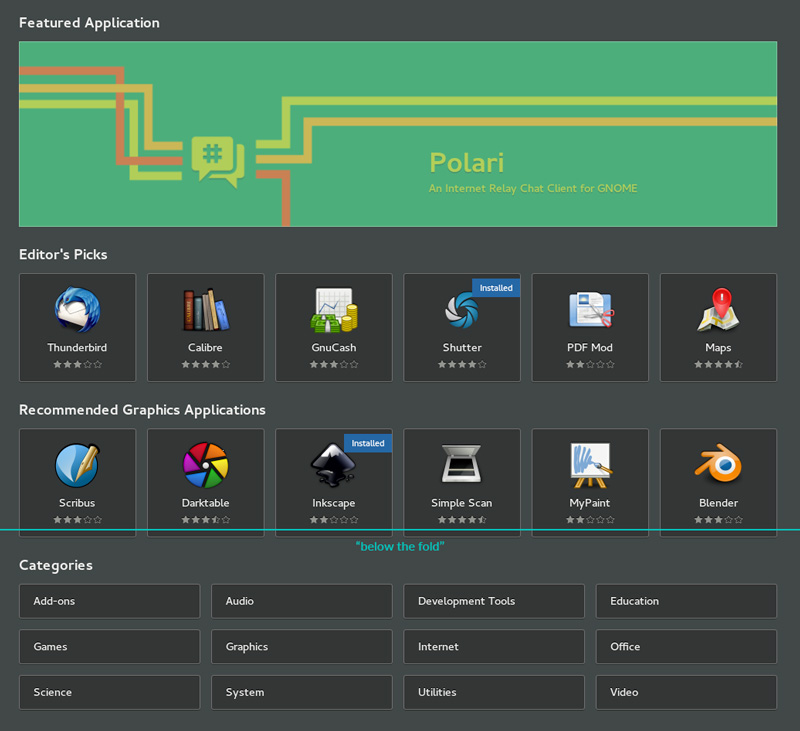
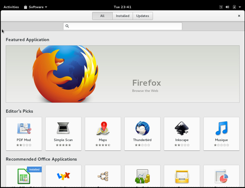
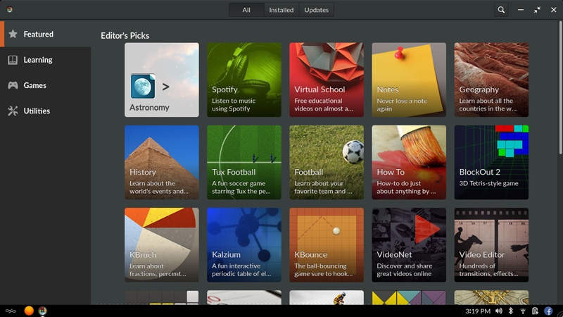
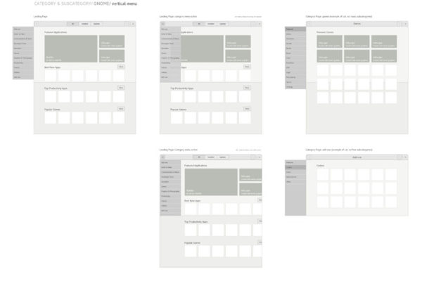
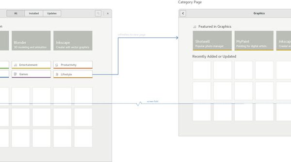
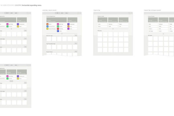
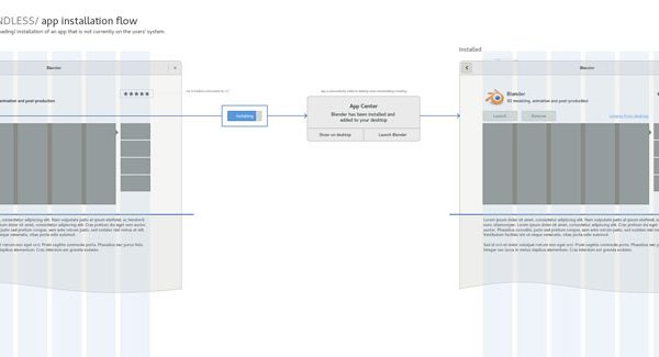
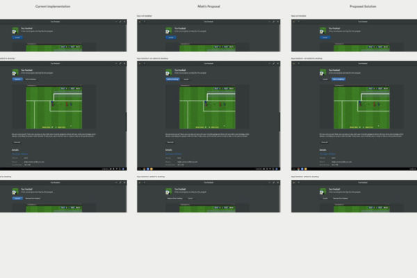
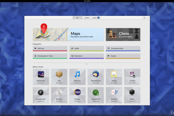
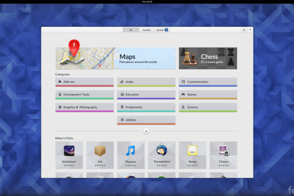
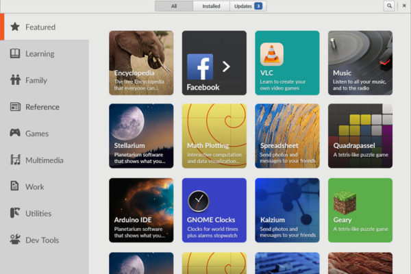
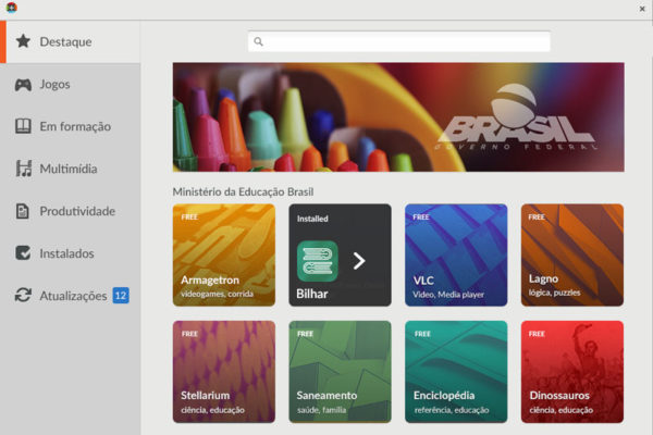
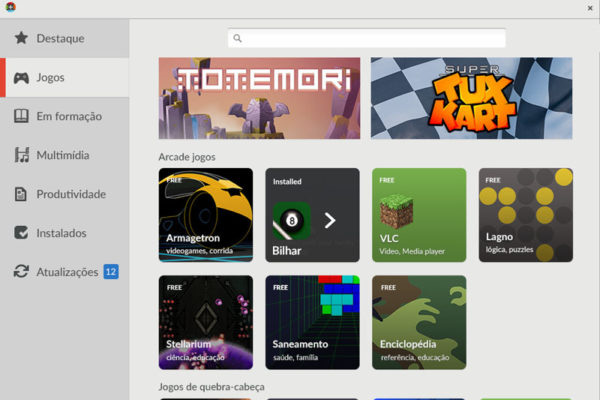
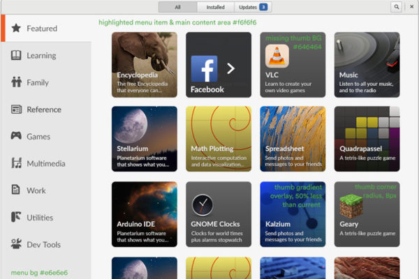
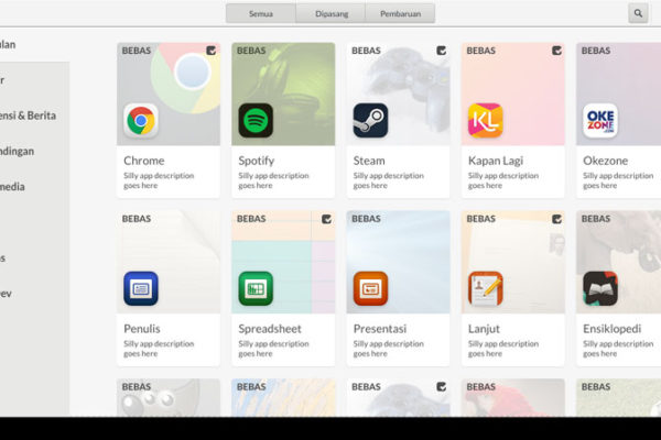
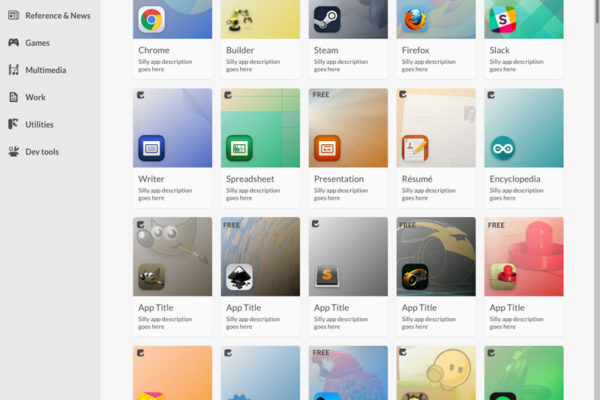
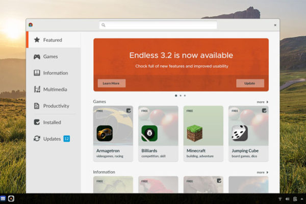
While the software of both of these expereince share much of the same code and core functionality, there are some key, very noticeable differences between Endless’s App Center and Gnome Software. Most of these differences are visual, how the apps are styled and presened. There are also differences to the navigation structure of the two, as well as the category breakdown. These distinctions are owed toward the very different user-base the two apps target.
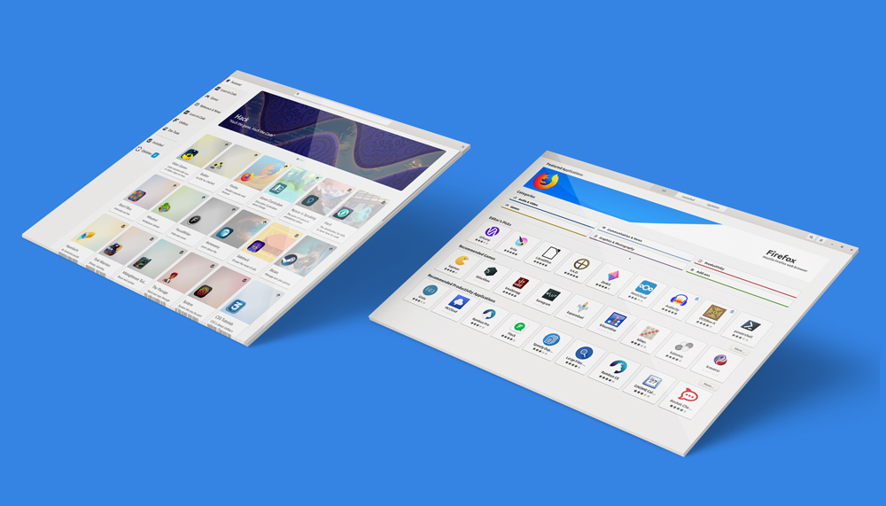
GNOME Software/ Endless App Center alignment
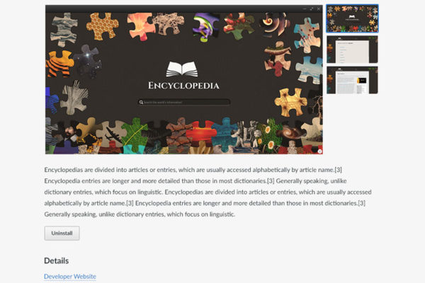
The functional pages such as, the app detail view, installed apps, and app updates look and function very much the same. I collaborated with Allan Day, the lead UX designer for know to iterate on the UX and behaviors of these pages over the past several years.
-
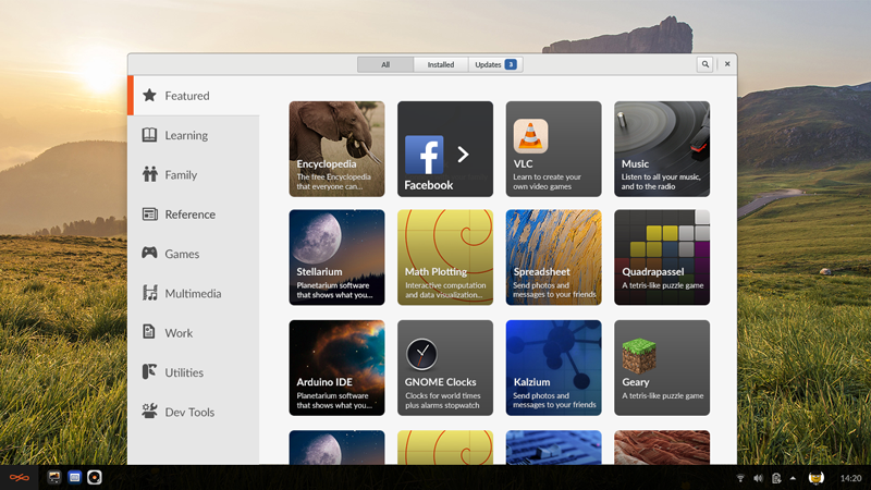
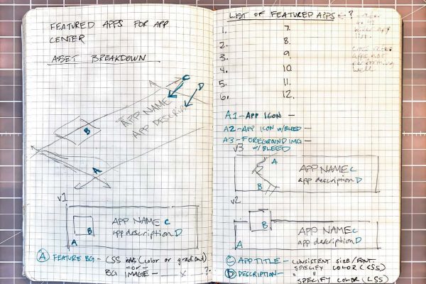
When I first started at Endless in 2015 Endless had a custom made, proprietary App Center which slid out as a tray from the right of the screen. Our founder had liked the custom tiles representing each app, saying that it made the experience feel “magazine like.” These assets needed to be created individually along with the icons for every app.
-
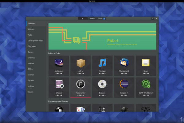
Category navigation being “below the fold,” was a key issue I was looking to solve in the redesign. Endless’s user in particular don’t always know to scroll down to find content and functions they’re looking for. Key navigation such as categories being visible on first glance was of top importance for us.
-
In the first re-design we aligned upstream on top level navigation. We moved categories to a side bar navigation making categories visible from all screens. This was an intentional decision to promote ease of app discovery. We retained the bespoke app tiles as a request from our stakeholders.
-
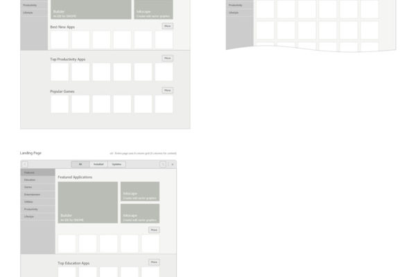
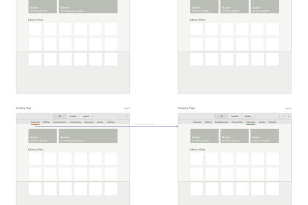
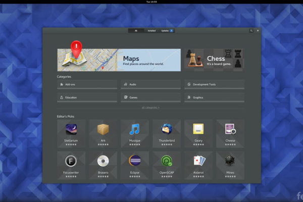
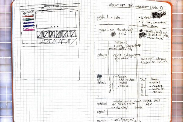
On the Gnome Software side, a chief outcome from this collaboration was moving the category navigation above editors pic content so that it could be viewed and accessed without scrolling. Colors were added for differentiation and visual appeal. We revisited and streamlined the lower level navigation in each category which was inconsistent and fragmented.
-
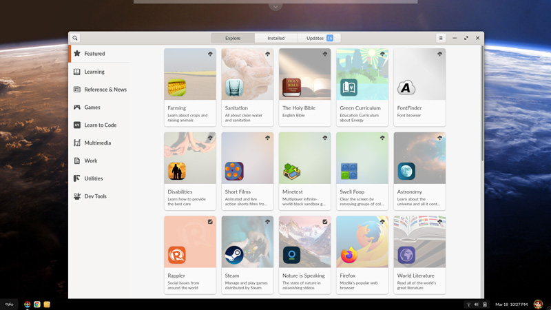
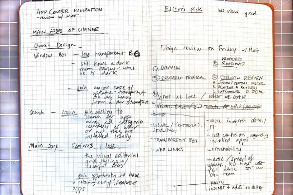
In the second update, we acted upon a round of user research we conducted on the app center, focusing this update on the low-hanging fruit changes. We received feedback that users did not understand that this was an app store. One reason being that most app stores across platforms have a light background, while ours was dark. The other reason was that users didn’t recognize our custom tiles as apps. Having complex dependencies, we targeted this issue for the following update.
-
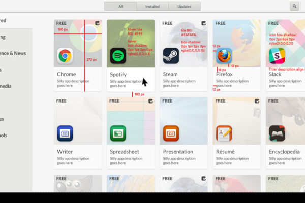
In this update we carried out change to place the app icon in the foreground and the tile in the background of each app card, rather than revealing it on hover as we had before. This was a crucial change for user engagement and understandability. One added challenge to this move is how to handle apps without tiles, now that we pull apps from Flathub. To solve this we created an algorithm pulling colors from each icon, creating a unique gradient for each tile.
GNOME Software/ Endless App Center alignment
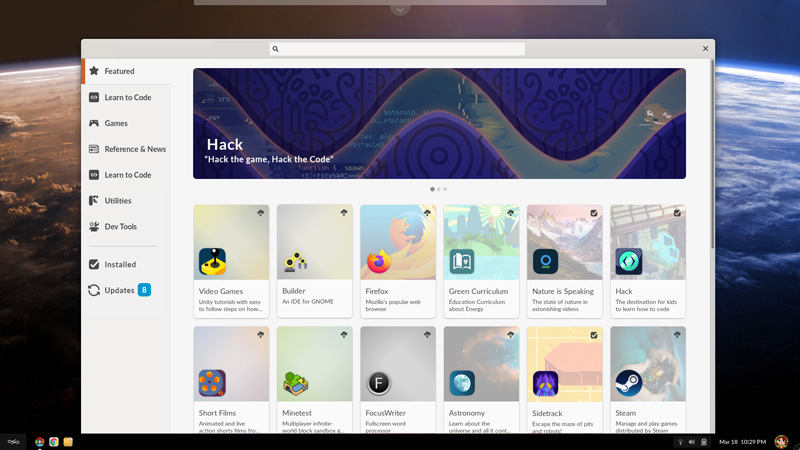
For this planned update we solved a known issue of simplifying and unifying the navigation which was previously in two areas, using two different interaction modes. We unified all the navigation to the side bar allowing us to keep search open and in the forefront on the title bar. We also improved our ability to feature apps based on editorial choices rather than algorithms and implemented the feature banner.


