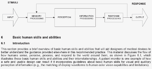
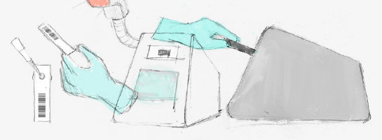
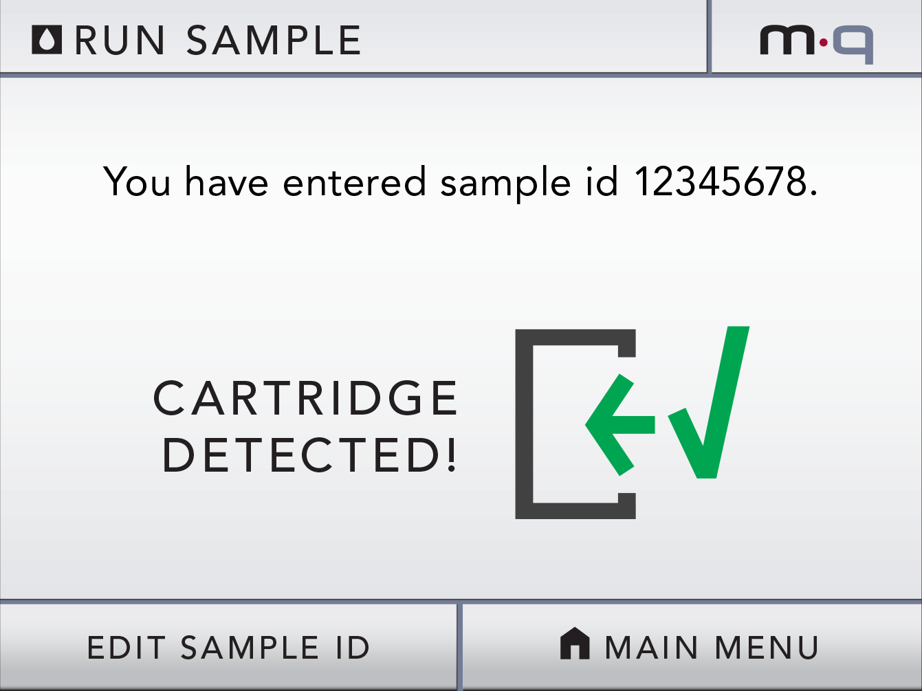
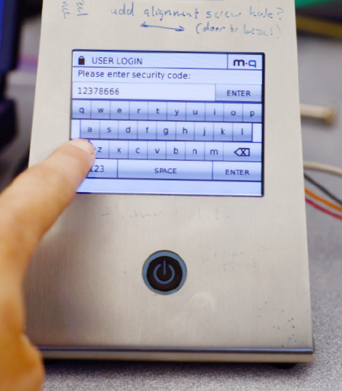
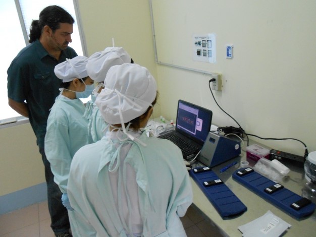
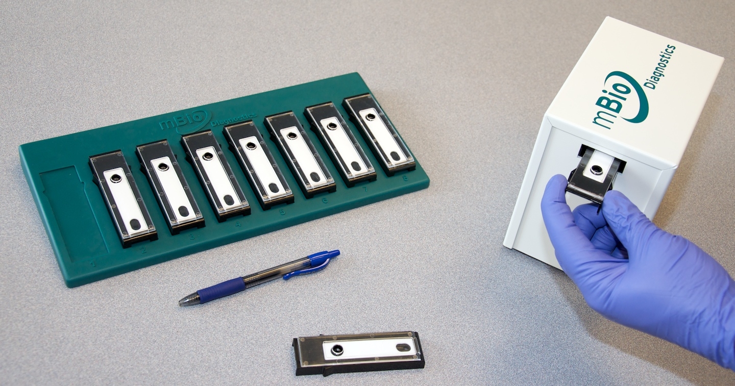
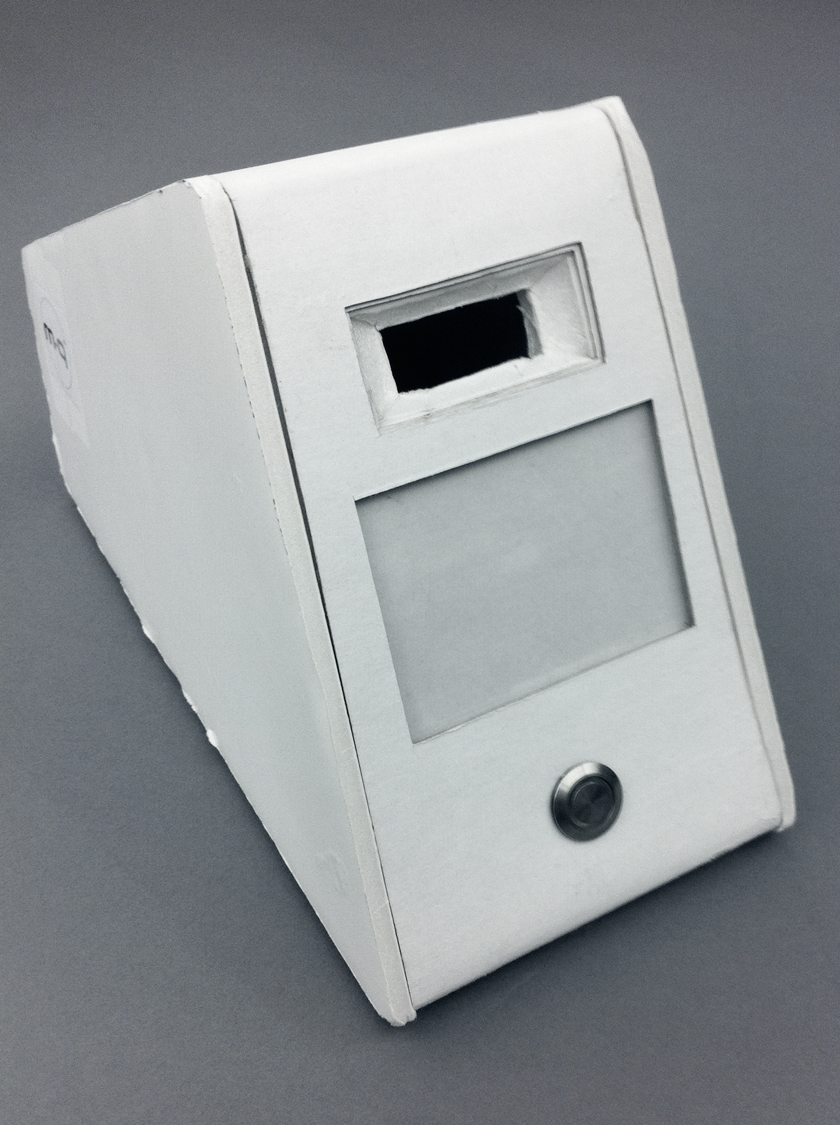
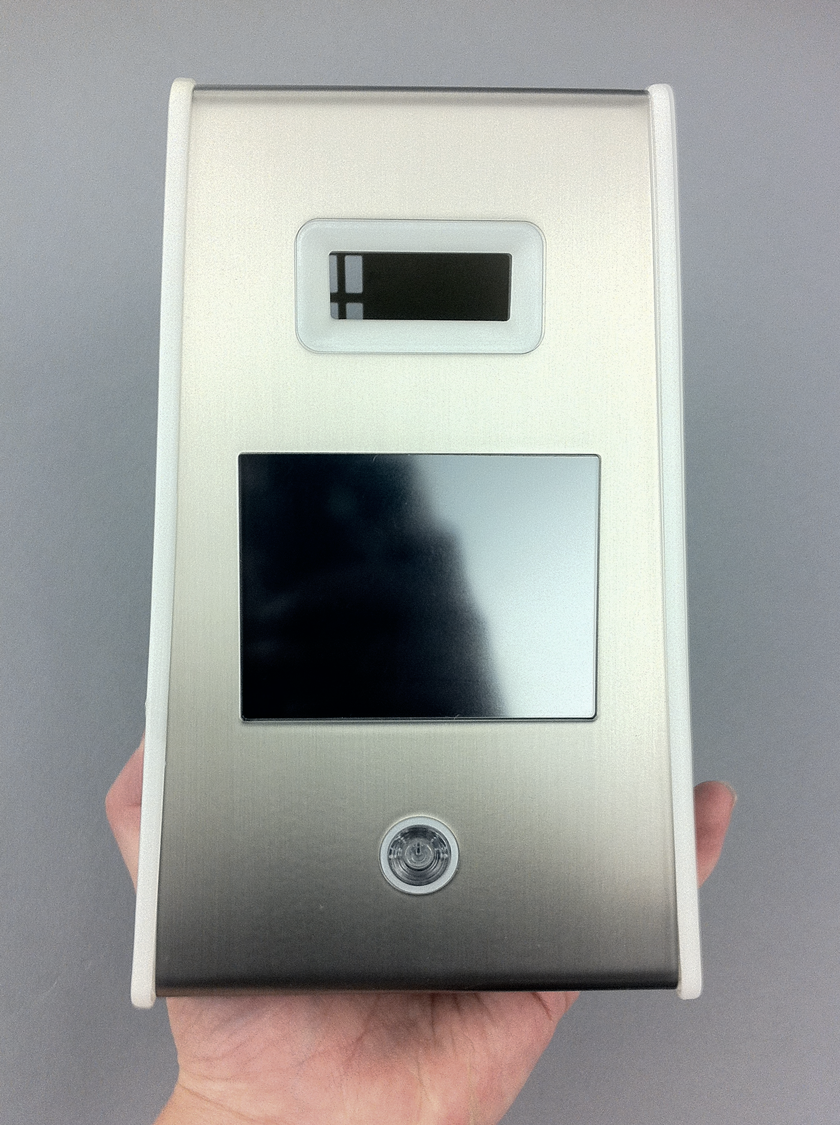
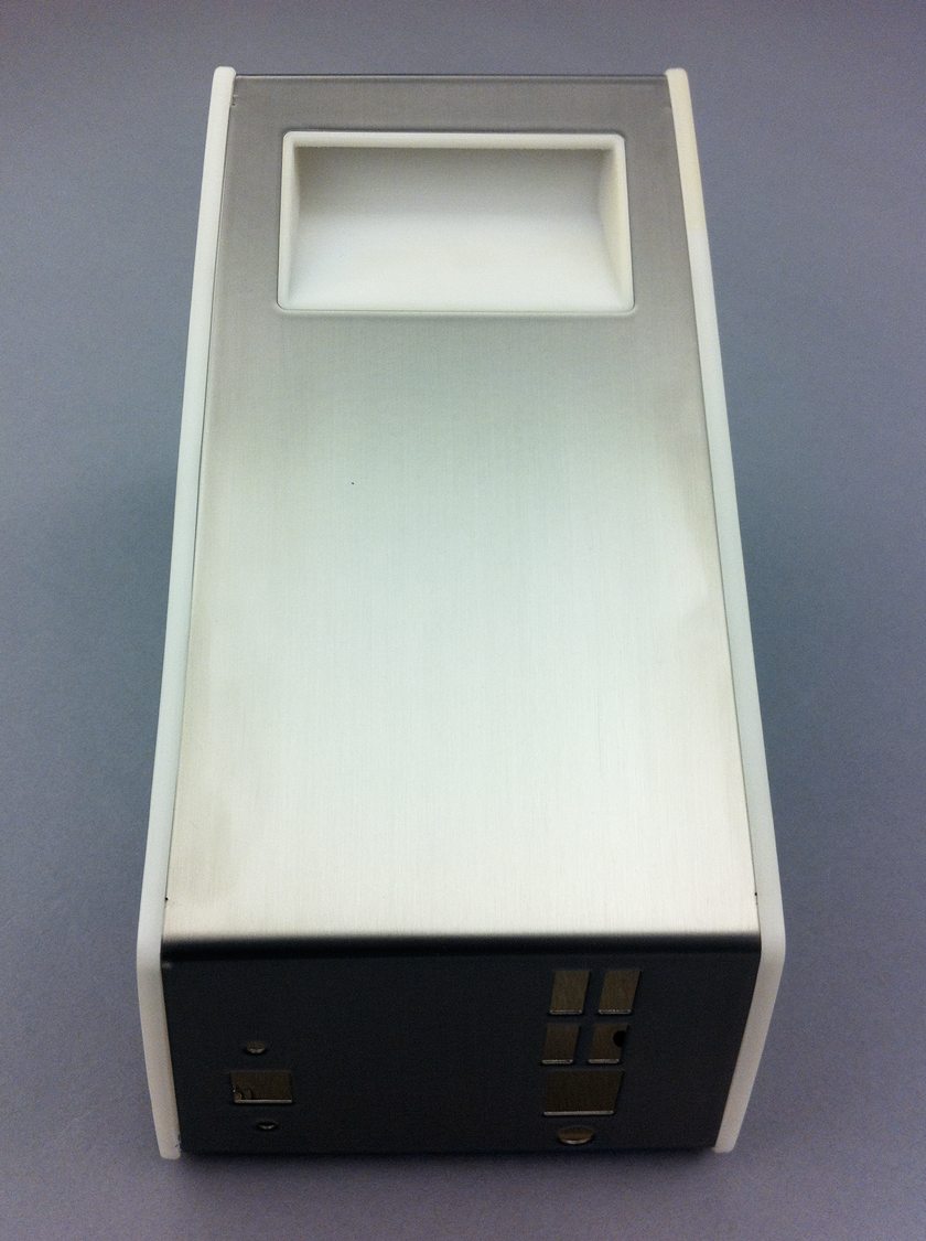
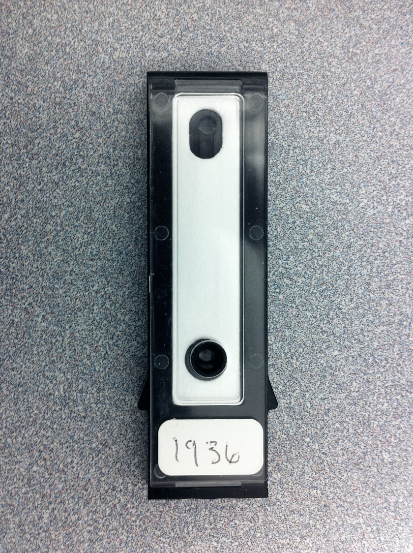
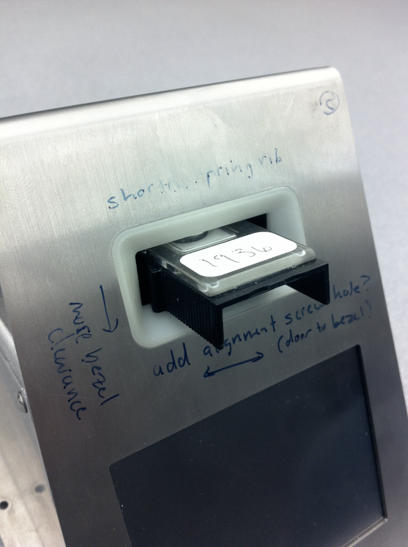
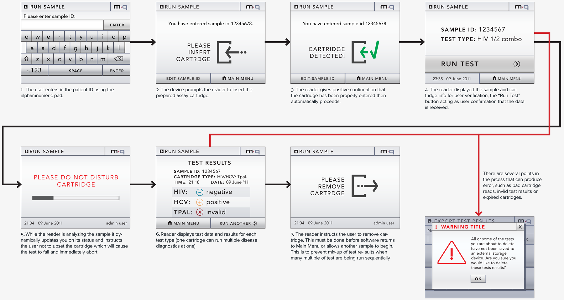
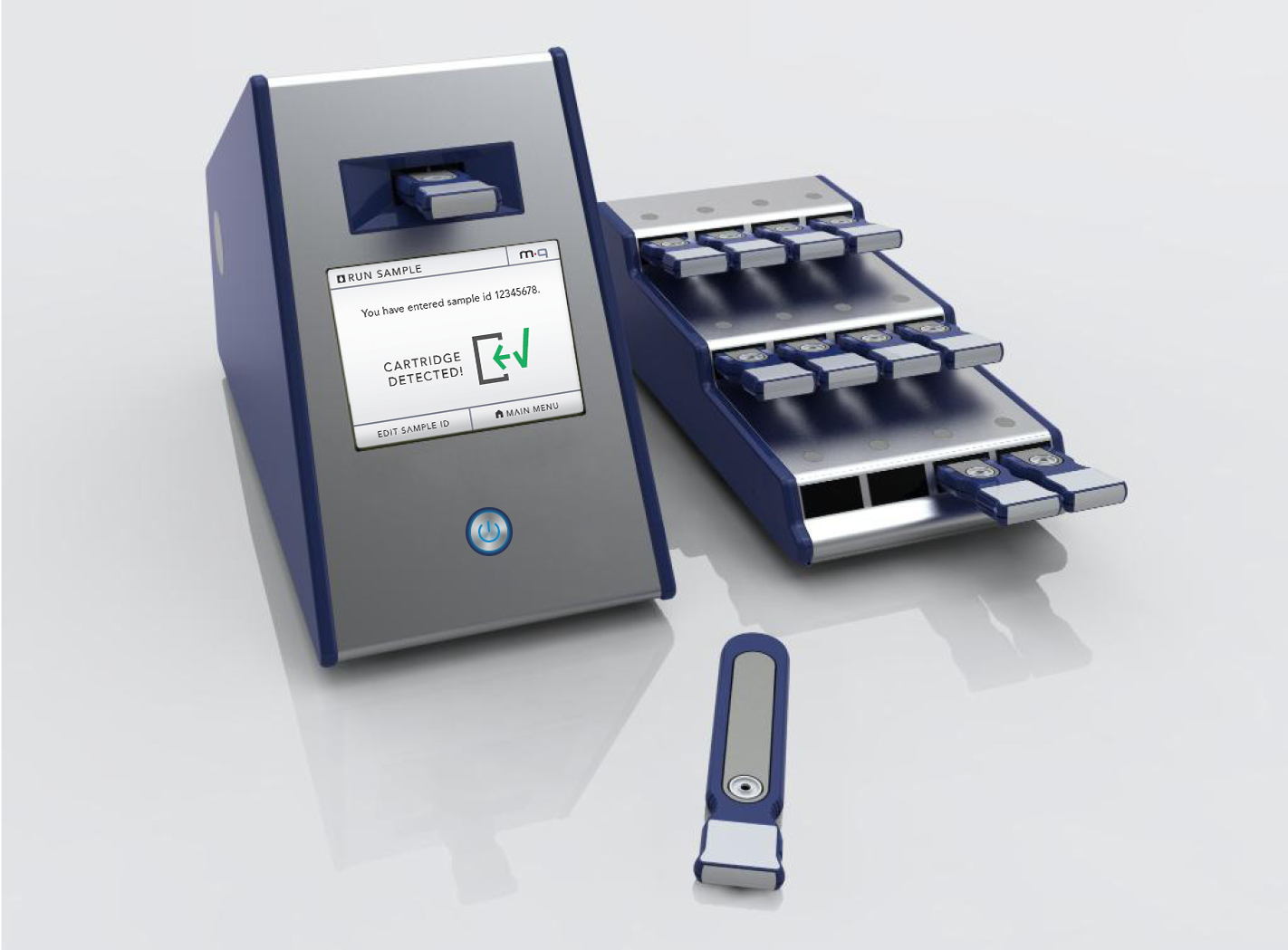
Our client (at Seamless Product Development), mBio incubated and productized disruptive medical diagnostic technologies that have completely changed how infectious diseases such as HIV and Syphilis are diagnosed. Their new technologies include a proprietary laser-optics assay reading process and custom software algorithms which enable affordable, rapid, and reliable diagnosis of infectious diseases. By combining their technologies they have been able to create a diagnostic device for HIV and Syphilis that will cost only around three thousand dollars per device with a form factor barely larger than an electric pencil sharpener. This is ground-breaking when compared to the car-sized million dollar machines currently in use for reliable diagnosis of HIV.

This significantly lower price-point and physical size of their device will allow reliable testing to be more readily accessible to developing nations, urgently in need of these advanced medical technologies to prevent the rapid spread of infectious diseases such as HIV.

While working at Seamless Product Development I led the team that developed and tested the UX, and carried out the visual UI for this device from conception to production. This project spanned 4 main stages.

Research and assimilate usability guidelines and best practices established for design of medical devices. Create a road map of guidelines and design rules we must follow for optimal/ safest use of the device and for passing the FDA approval tests.


mQ_standards_thumb02b

Develop understanding of operational use case scenarios, users, and environments of device use. Map out user interface flowcharts for all regular/ required processes that the device must support. These would inform the official Product Requirements Document (PRD) for both software and hardware.

mQ_uxflow_sketch1_02

In this phase of the process we carried out the UI design from visual and experiential concept through to pixel perfect creation of all visual assets. This phase was heavily informed by case / use studies by mBio’s lab technicians, our own research, as well as the flow charts and Software Requirements Documents we established during the first two phases of the project.

mQ_screen_cartridgedetected_01

Producing design specifications documents for the UI/UX and overseeing the software development. Exporting and managing production assets for the development team. Creating redlines documents as the software versions were created to fix bugs in the UX and refine the visual implementation to match the design specs.

mQ_testim_img_01

Phase 1: Research

We spent time in the lab understanding the various test processes and operation environments that we would need to design for.

We worked with the lab technicians to optimize the assay test workflow using the working beta of mBio’s technology which included working hardware and viewing test results on a Labview program to understand their workflow and the functionalities/ results results that were essential to include on the smaller embedded product UI.

mQ_standards_thumb01

The scientifically dense human factors standards documents did not just state the rules, they explained the scientific/ semiological justifications behind the rules making them surprisingly interesting and reinforcing the rule’s purpose. They included many rich diagrams illustrating the science and biology behind their logic

Phase 2: Defining UX flows/ parameters

One of the first major UX decisions was how users would interact with the device. This decision was integral for informing the development of our UX work flows. “Will we have physical hardware buttons, a radial dial? How will the users input patient data and interface with the device?”  We had an opportunity to the explore UIs of other medical devices on the market,  see what interaction methods were often used, what worked well and what didn’t. Many devices currently on the market were very confusing, particularly when several physical buttons served multiple functions. Both the size of our device and need for alpha numeric input made it clear that hardware buttons were not the way to go.

We decided to develop our UI on a touch display system. This is nice because it allows a lot of flexibility and adaptability while the actual UI and workflow was still under development and subject to change even after the first software version.

Another nice thing about choosing  touch display is that it allows us to give only as many choices / buttons in the user interface as are necessary at any given point. This will lead to higher efficiency of use. Less, well thought out options make each step more intuitive. More importantly, less available options per each screen or stage will mitigate use error caused by accidental button pushes. This is critical when designing for a medical context.

This diagram shows the specs for the touchscreen interface I selected. We put this display through rigorous testing; cleaning it with harsh chemicals commonly used in highly sanitary clinical environments. As well as ensuring receptivity to touch using a gloved finger.

We designed the software and UI to be intelligent to its context, such as the processes that are being run, revealing the options and buttons only as needed for that context and purpose.

The flexibility of the touch display allows us to show the minimum number of choices at any given time. This minimizes confusion and the risk user error by touching the wrong buttons at the wrong time.

The device will also be intelligent to its peripheral configuration. For example it will know when a barcode scanner is attached and will allow users to scan in information such as security IDs, patient IDs and cartridge information rather than hand typing in the keypad.

mQ_peripheralsUX

This is a diagram created to show how all possible peripheries may connect to the device and the UI rules that the device software will follow.

We created a range of rapid prototypes and UX sketches before arriving at our final interaction flows and hardware buttons. These quick studies were instrumental in forming solid UX decisions and testing UX flows and screen/ button sizes with test users within mBio’s lab.

Phase 3: Visual UI Design