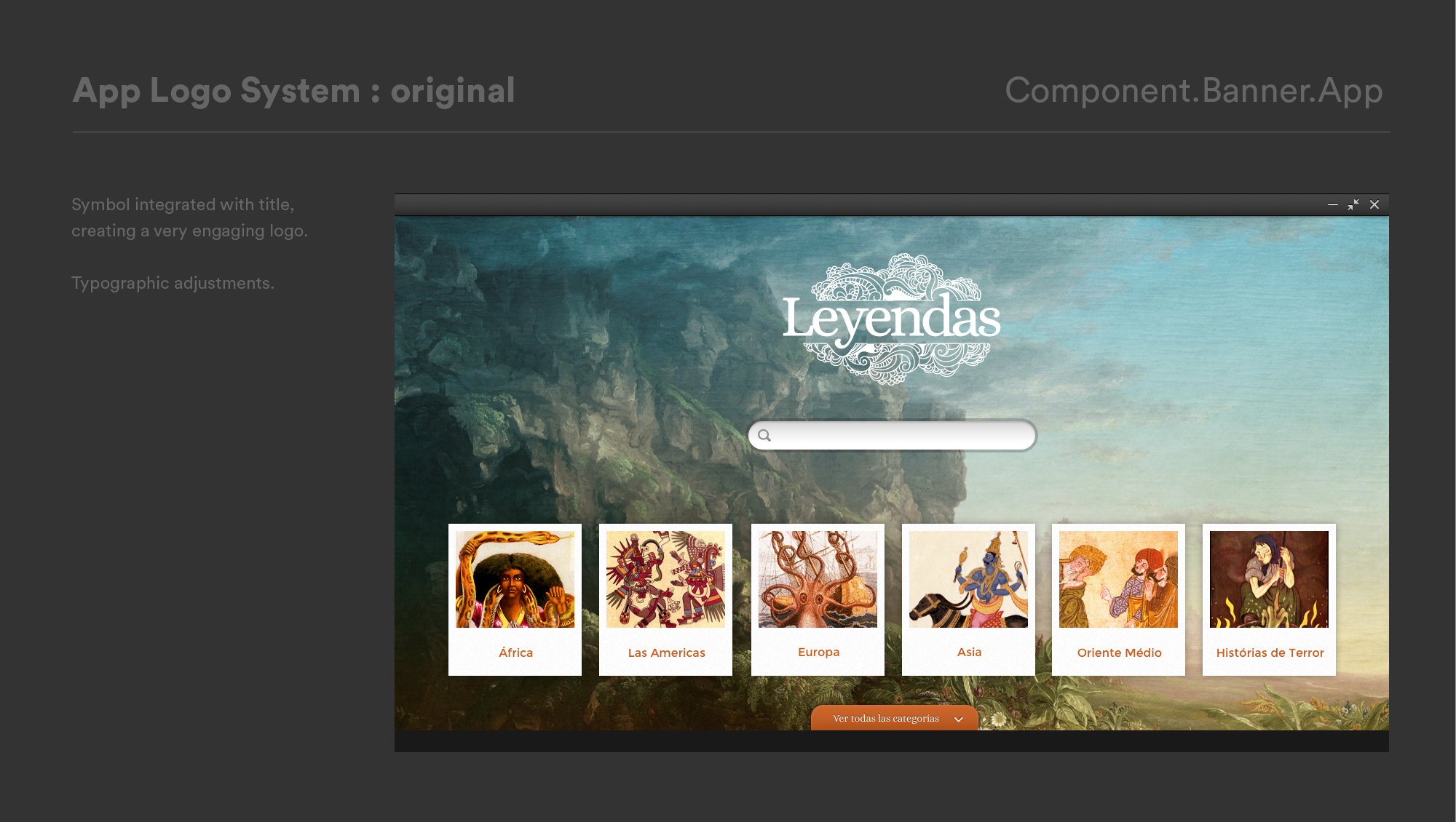
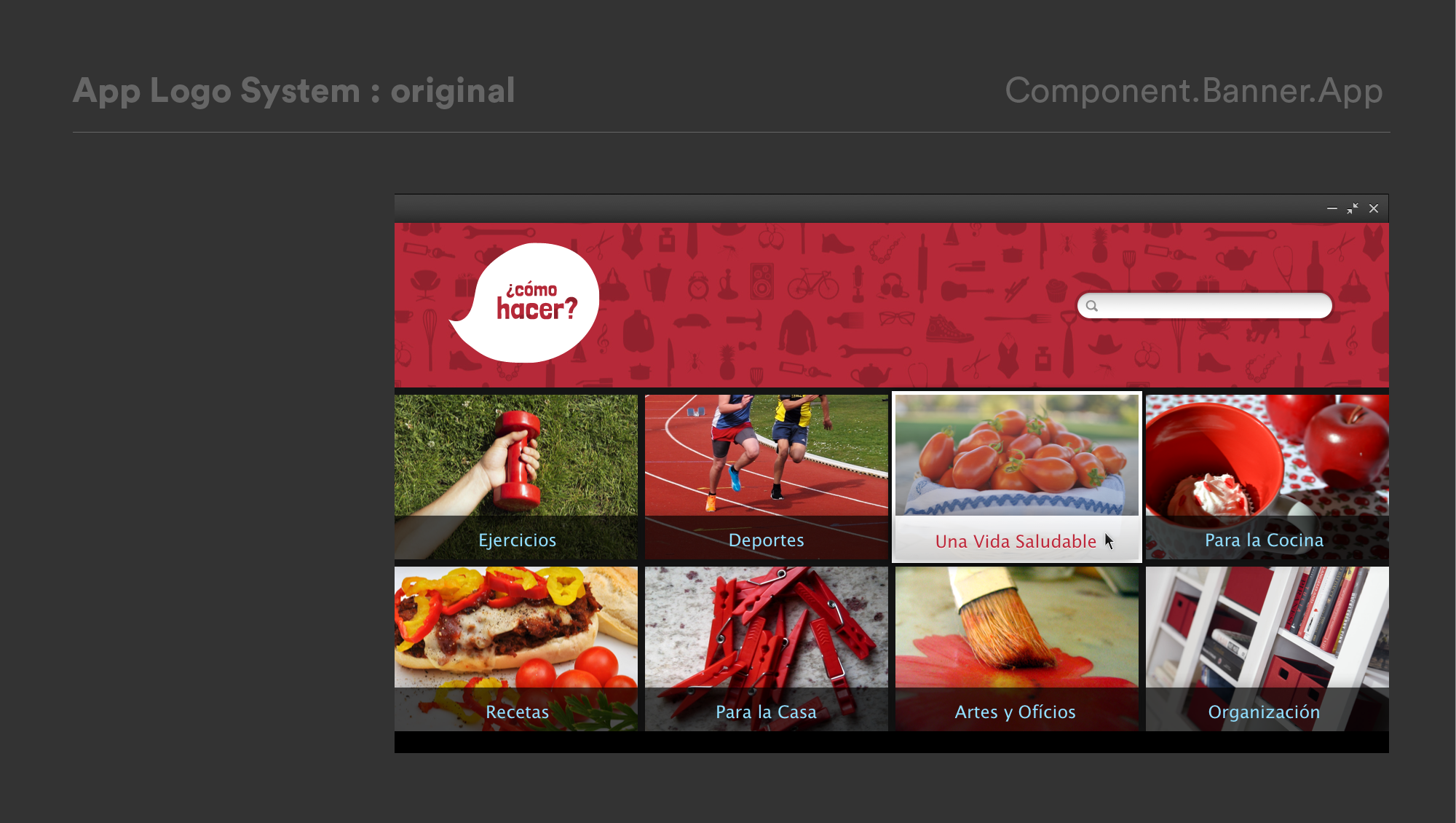
How does a small product team quickly scale a rich app ecosystem with useful, localized content targeted for users in a broad global market?
- Product design
- User research
- UX/ UI Design
- App Production
The Challenge
There is a natural tension between the efficiency of a scalable system and generic “templates” that can’t be easily repurposed for diverse content or configurations.
Known Issues
- Our existing templates did not serve a wide enough variety of content structures & types.
- We didn’t have meaningful variation based around content organization and display.
The Goal
A truly scalable framework needs to allow:
- Content to drive front-end display.
- Modularity of elements to support different configurations.
- Variation to account for different content experiences and visual display options.
Pillars
- Content first
- Meaningful experiences
- Scalable variation
Overview

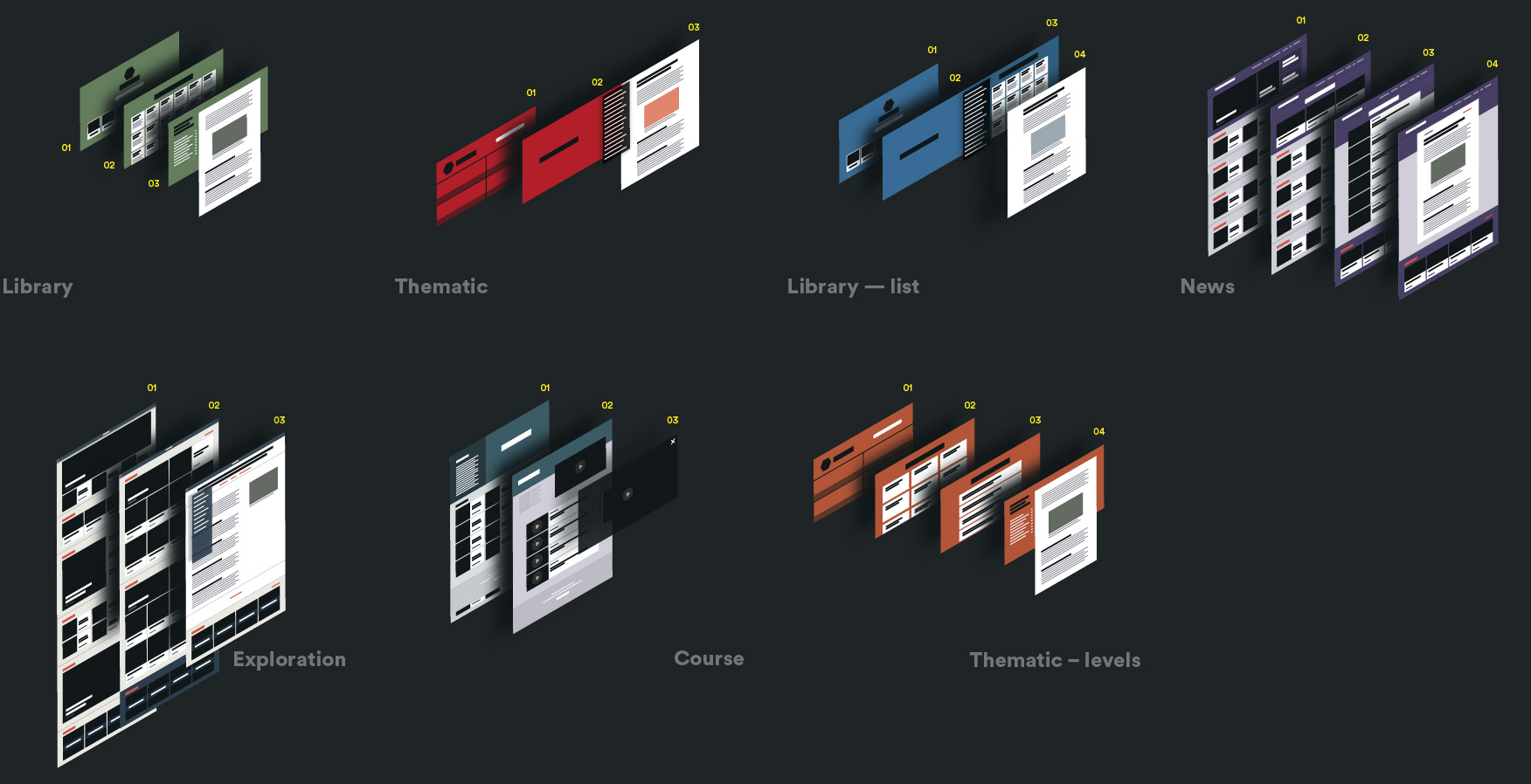
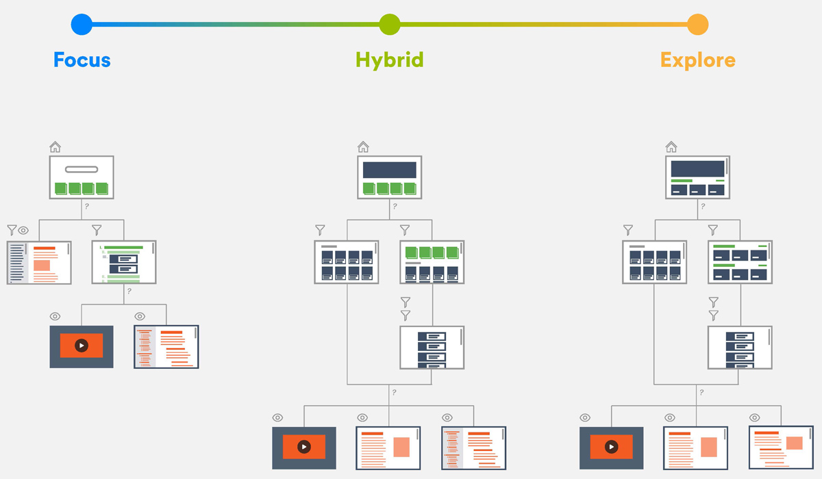
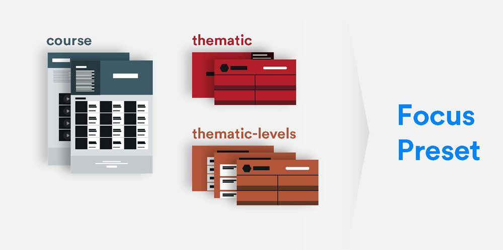
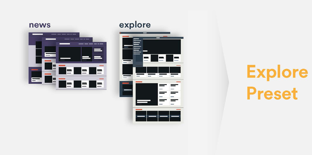
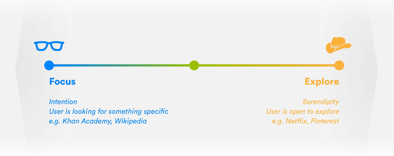
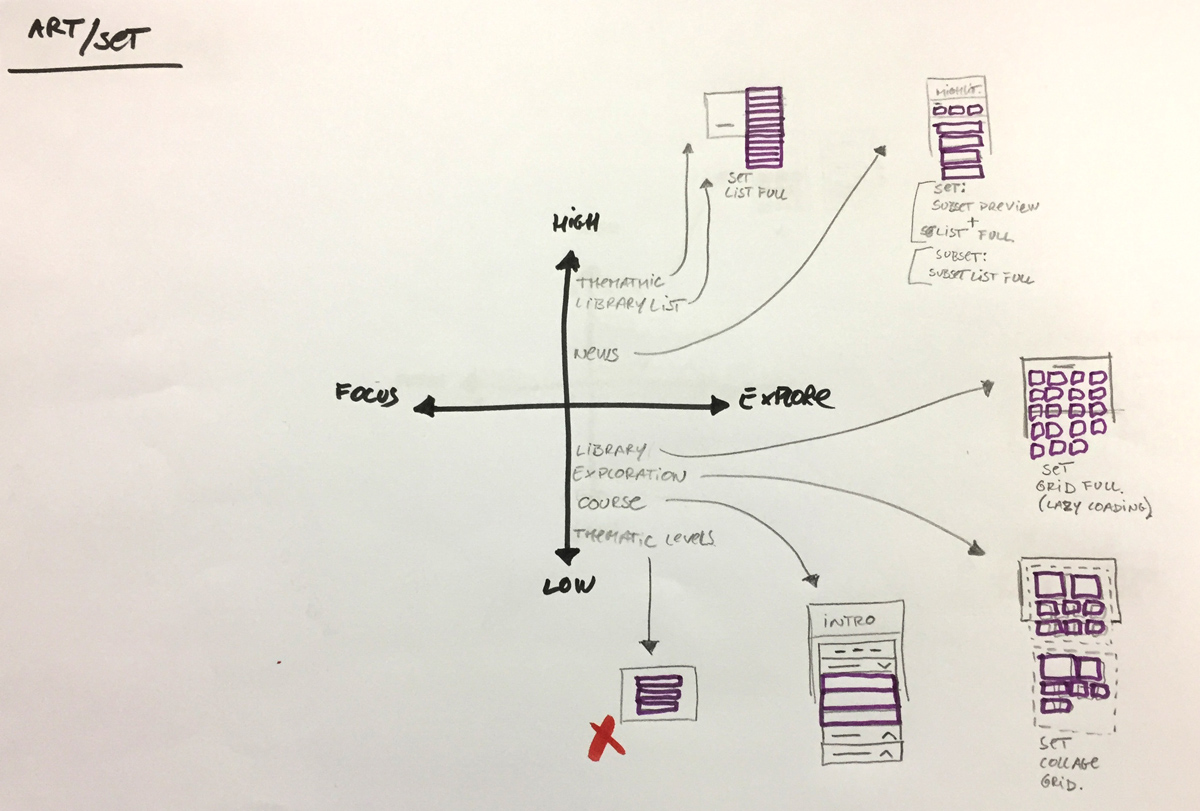
From templates to presets
Presets support a certain experience and “content narrative”. Specifically, we use Preset to refer to a combination of pages and components. Presets should be reusable; a few good ones should support a wide range of content types. We propose starting with 3 different presets – Focus, Hybrid and Explore – and expanding from there.

Our Approach
Template Mitosis
Let’s look at how we were making apps at the outset:
- An existing template is used as a starting point.
- Design evolves based on a specific content use case.
- Content is force-fit to the template, inheriting its constraints.
- UX is compromised by a lack of modularity and flexibility.
- Templates proliferate based on minor tweaks, resulting in a fragmented system of narrow differentiation.
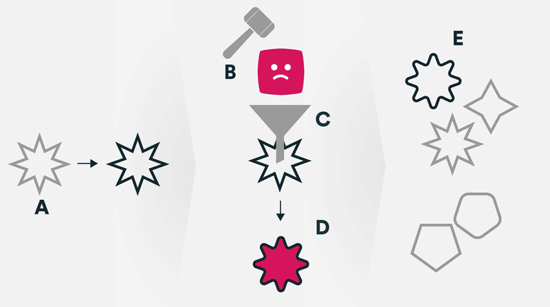
duplicate template
insert jam in specific content
update template library
Three Basic Steps
-
Use content to drive the design of the front-end solution. (Content types AND structures)
-
Ensure the front-end solution supports the optimal user engagement with the content. (Through user testing and app usage metrics)
-
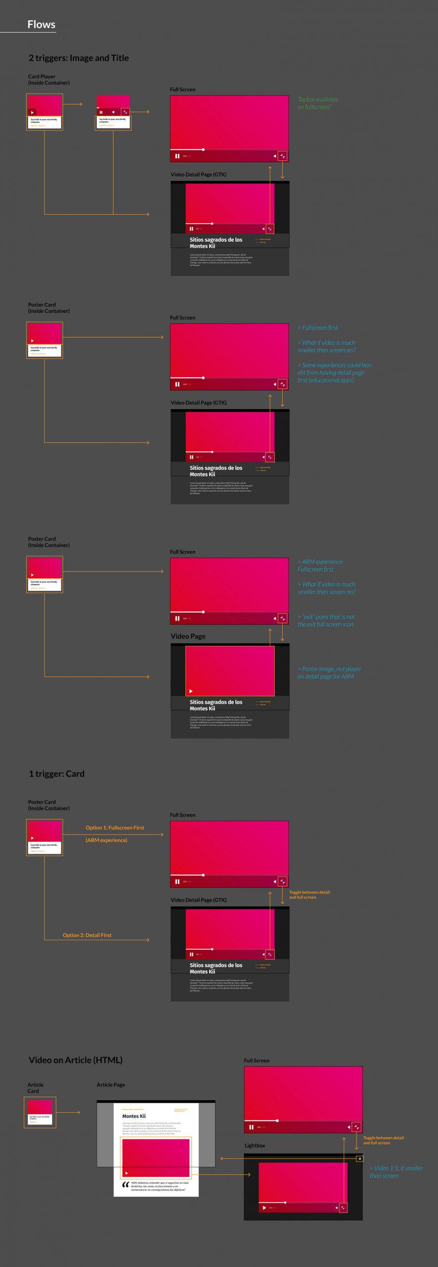
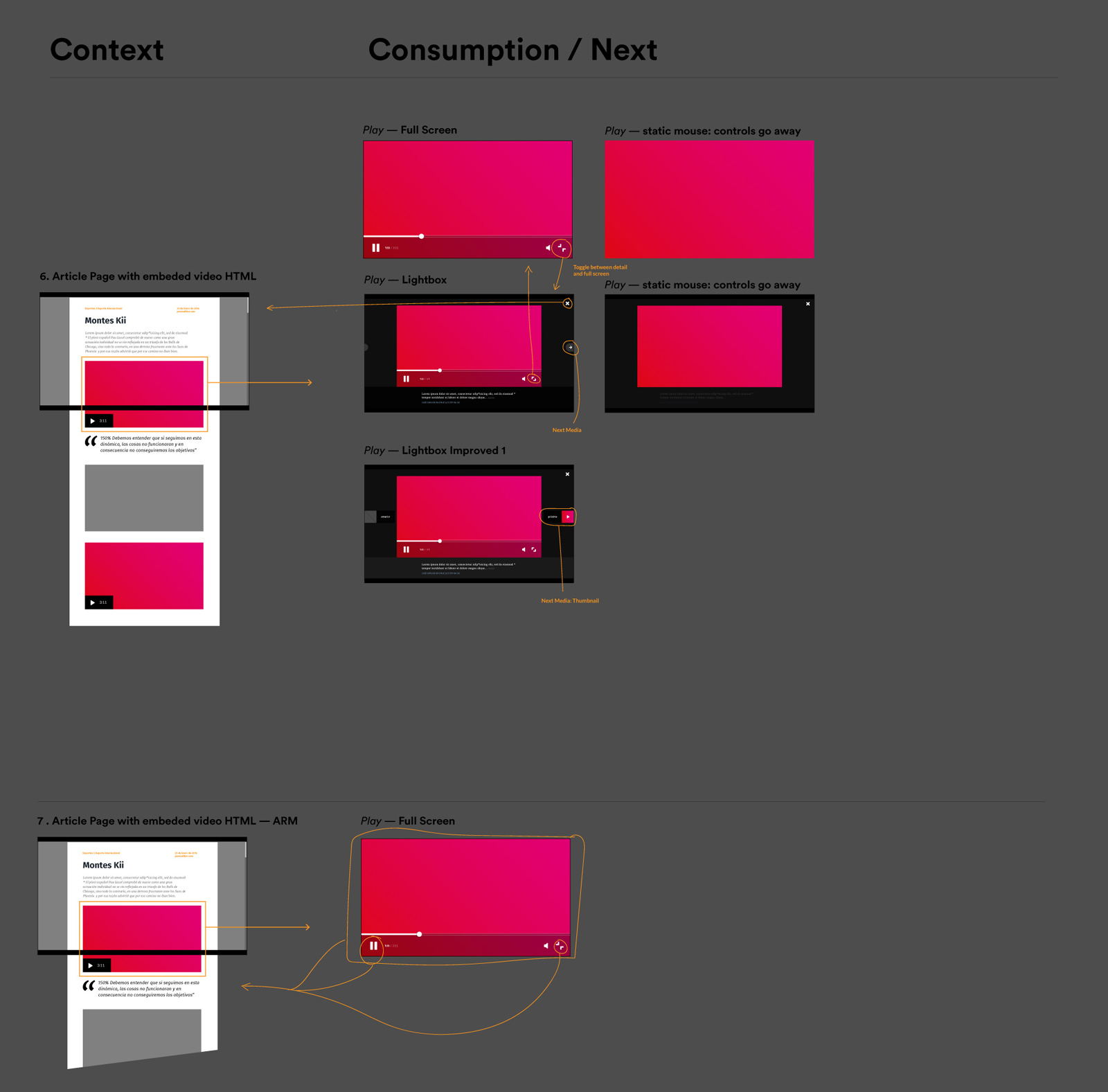
Create modularity such that elements can be repurposed to support different configurations…

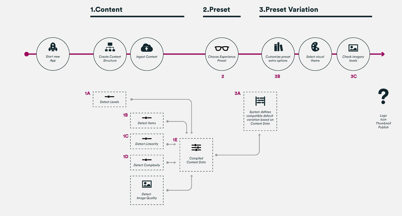
1. Content
2. Experience
3. Variation
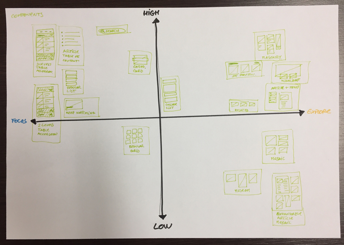
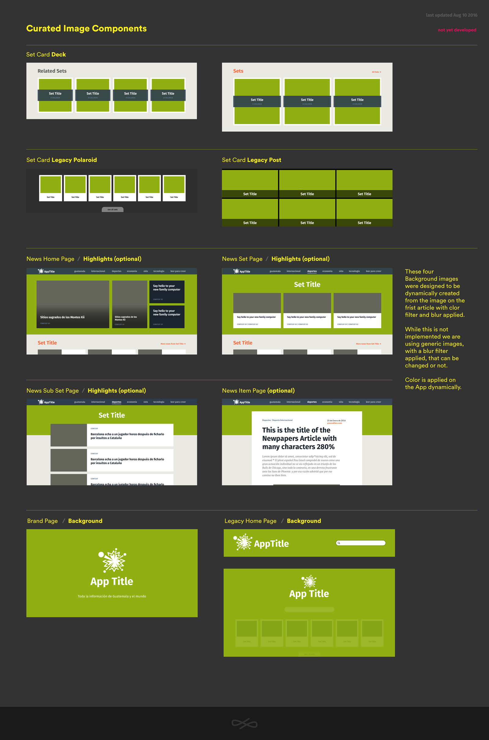
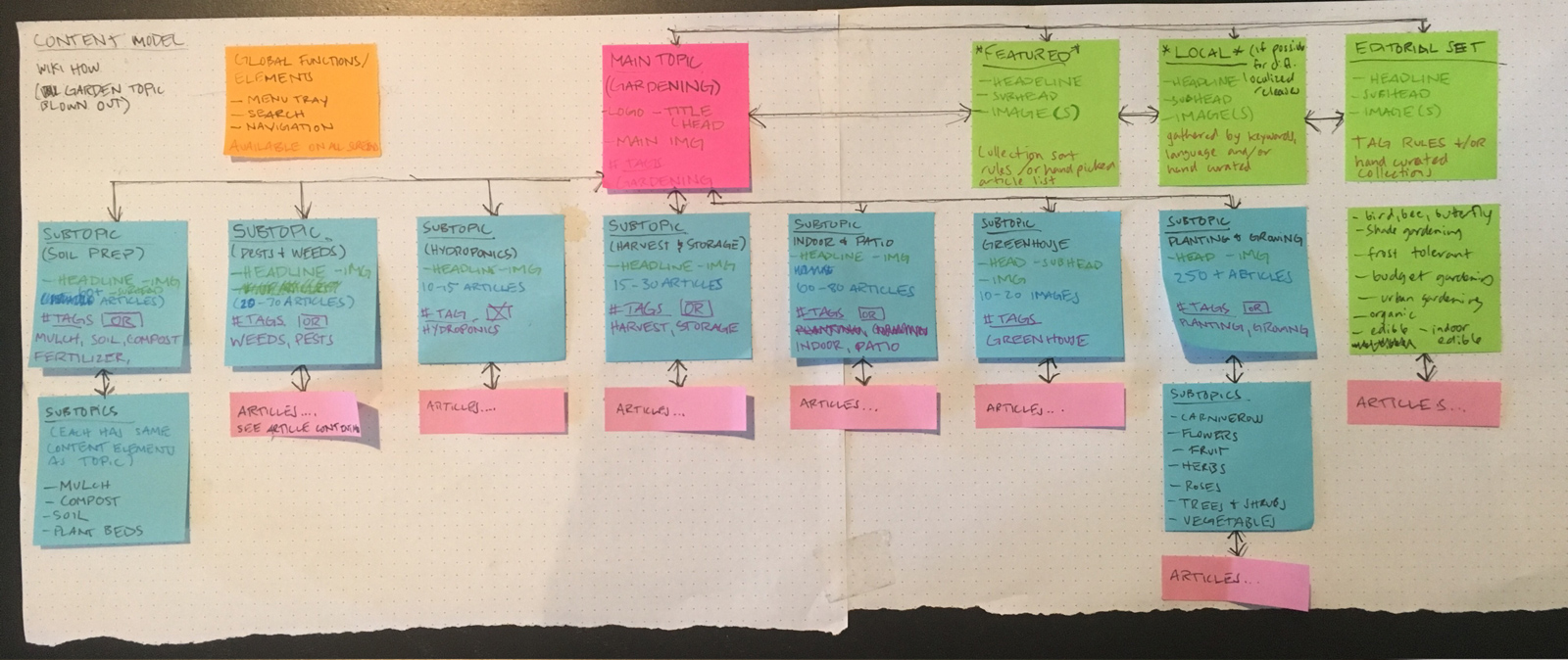
Content Patterns
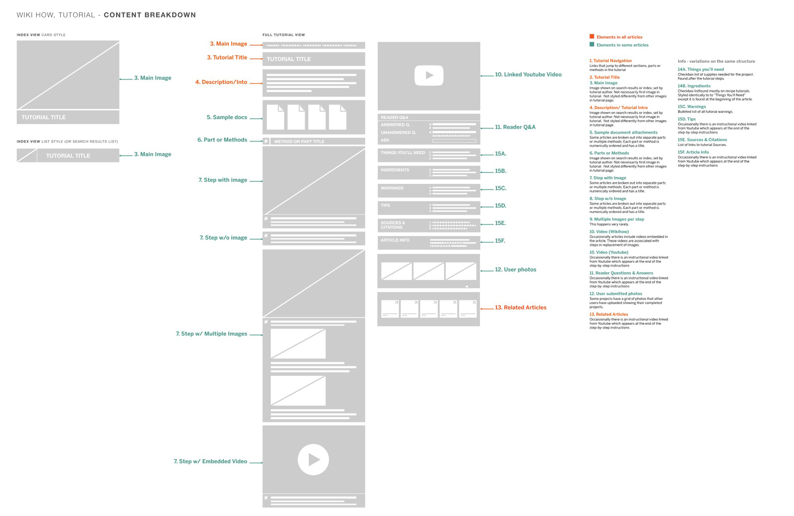
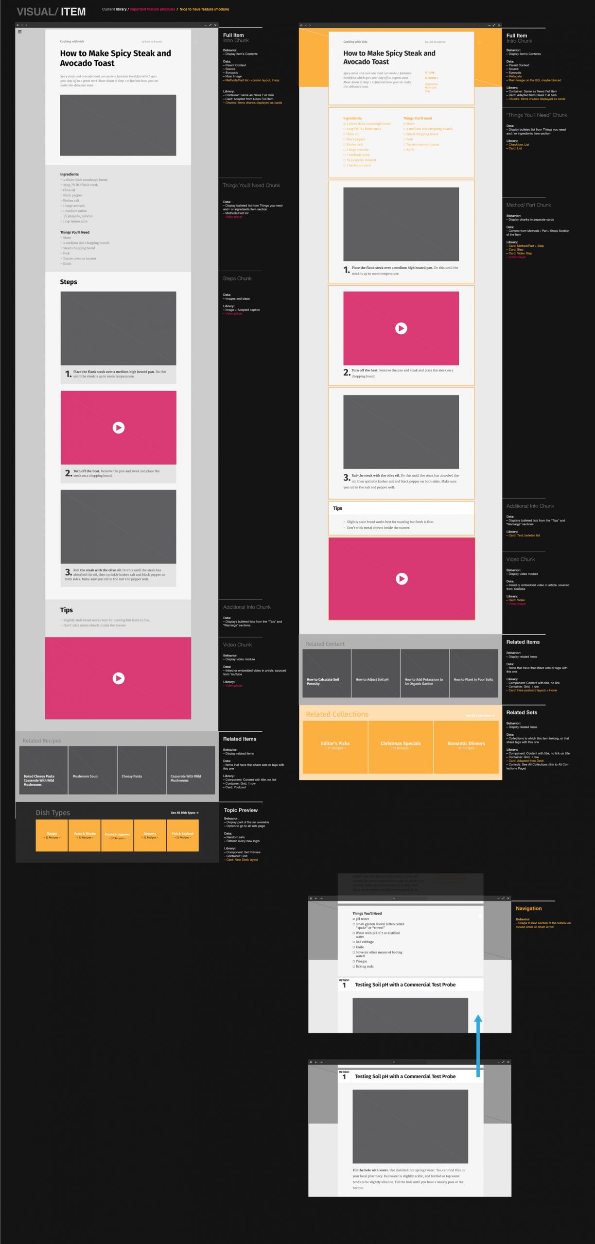
We recognized that there were different content types, for example, a chapter in a textbook, a newspaper article, and a video feed. However, they may share similar content patterns.
Identifying the content patterns separately from content types allowed us to establish a system of matching reusable display patterns.
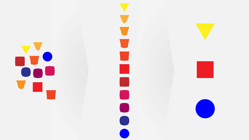
Identify
Organize
Merge
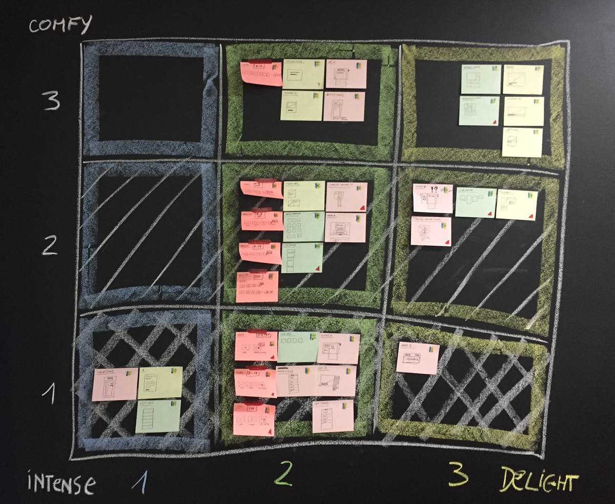
Experience
Experience refers to how a user would likely interact or engage with the content.
For a given content type, it’s important to consider the user’s mindset and behaviors when consuming the content.
What are their goals? Are they trying to get a quick answer to a question? Build upon knowledge systematically? Discover something they didn’t expect to find?
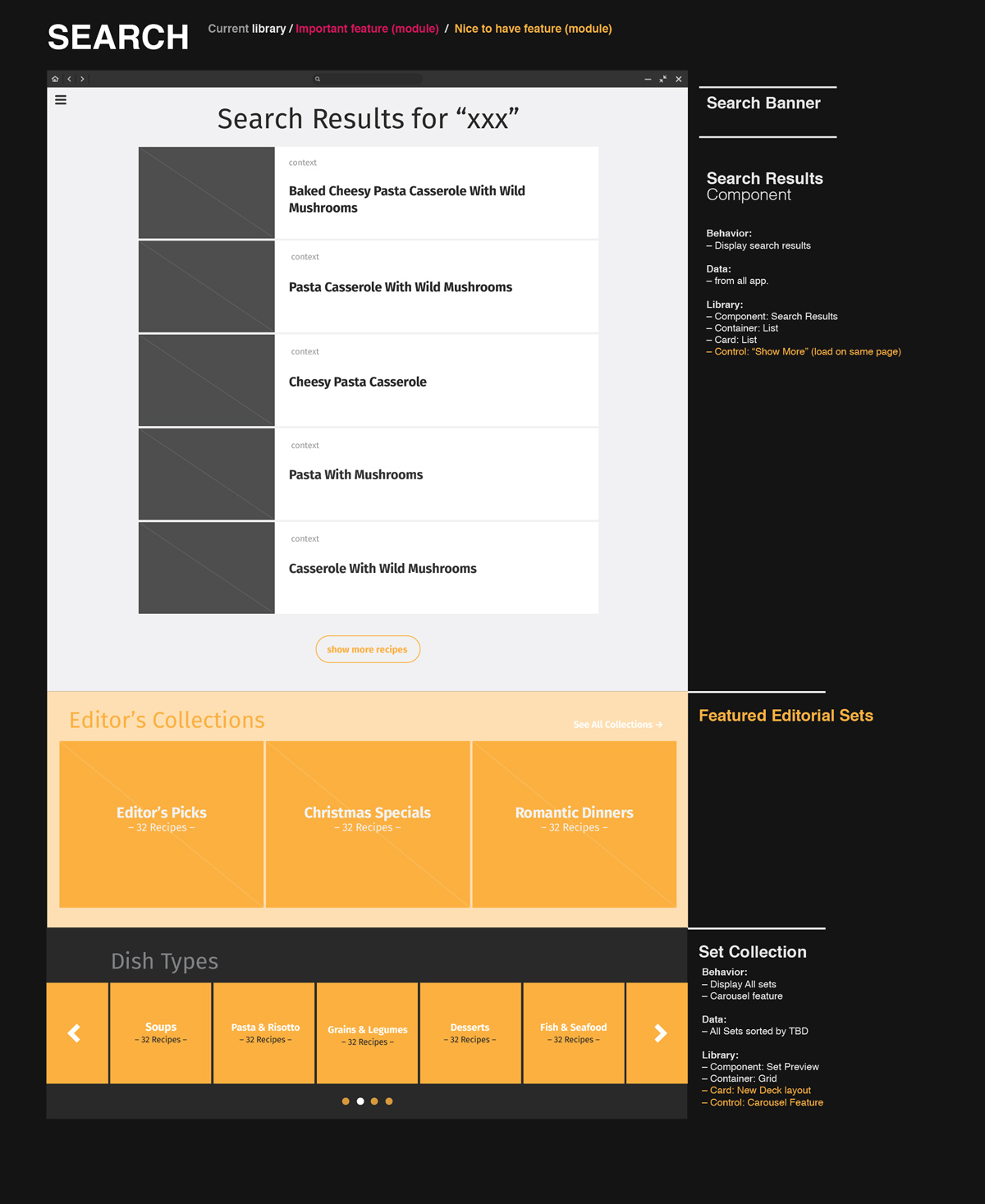
Design <>Code
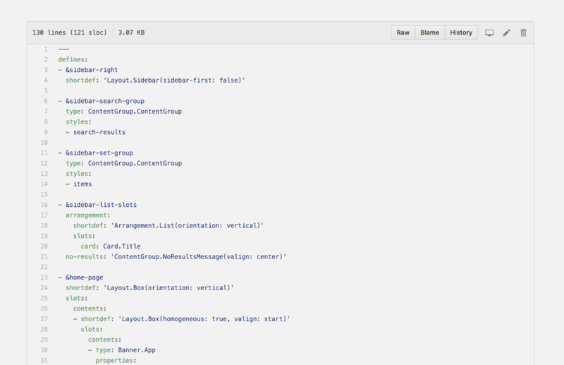
The way the code should be built should influence some design decisions and visa versa.
How is the preset skeleton code organized? (ie. the blue-print)?
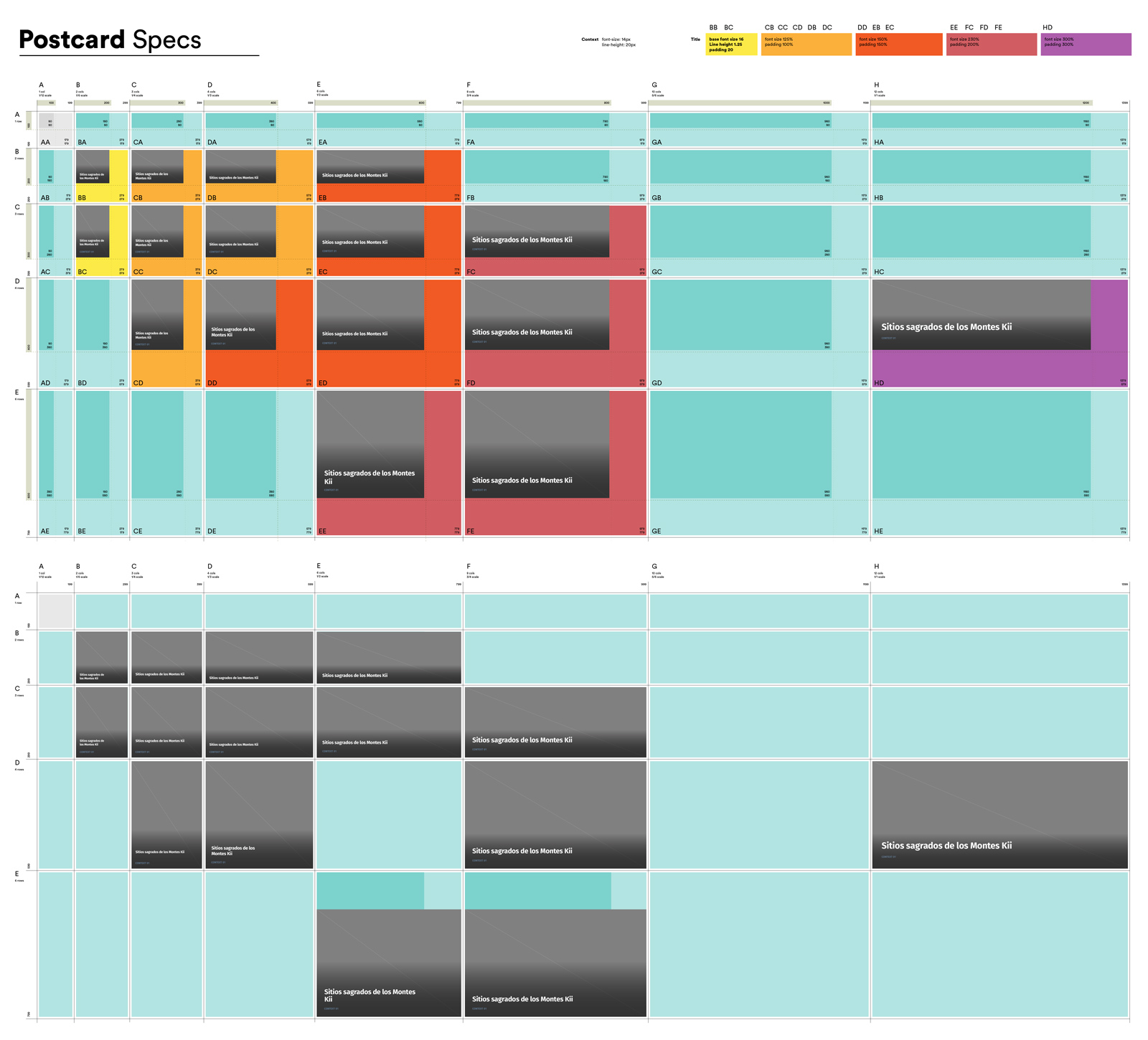
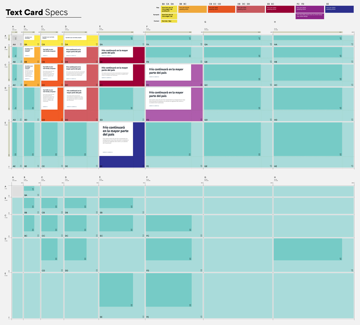
How is the final YAML file with all the display patterns applied?
How are the SCSS files for each object type> preset> app organized> And can a designer easily access and edit versions of them to meet the design needs of specific apps.
Design and Devs were careful to define the language of how we identified and discussed specific objects to communicate clearly from mock-up, spec, and implementation.
The dev team created some simple tools to allow us to run tests with various content sources and layouts, as well as do live editing of the .SCSS of built apps on the native platform (Endless OS/ Linux)

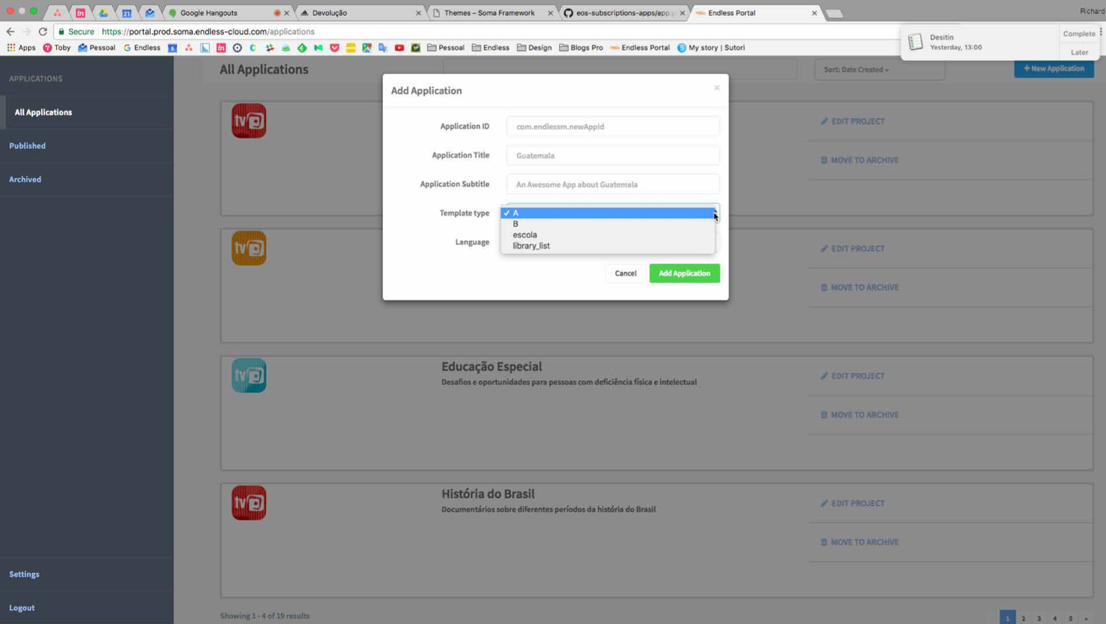
KACustomizer
Allowed designers to edit and preview the .SCSS of a built app in real-time in order to customize styles for specific content sources or test alternate designs from the defaults or basic overrides.

Libingester
Allowed designers, content partners, and other non-technical app creators to upload and prepare content from various sources/ types to be organized into apps.

Picard
Allowed designers to test/ preview various card layouts, orientations, and window sizes with different groups of content.
User Research Snapshot


UX Process Snapshots


Visual Design Snapshots


Preset Design System/ CSS


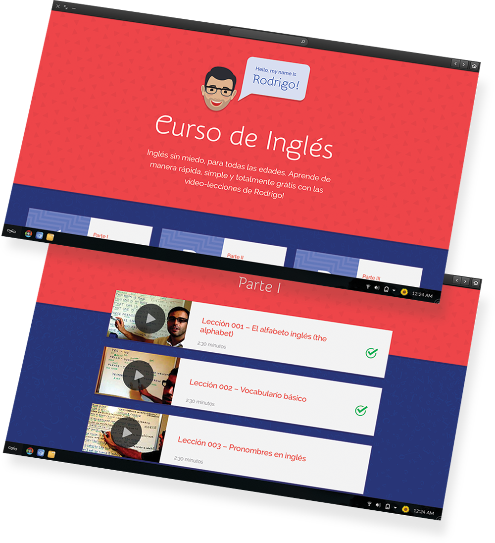
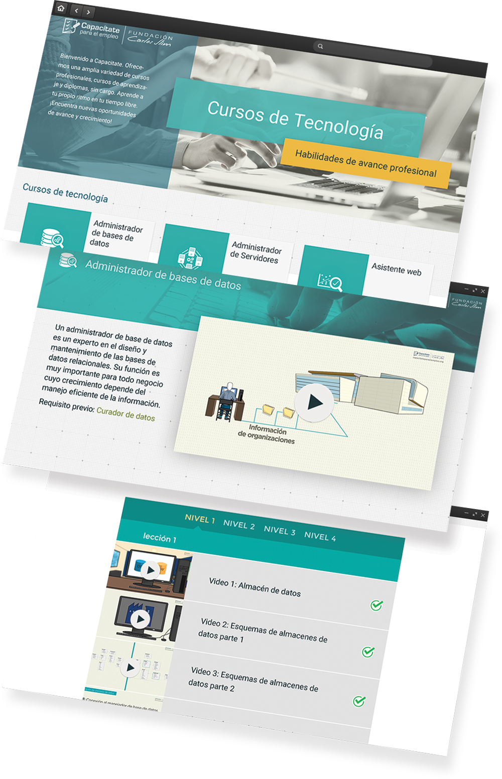
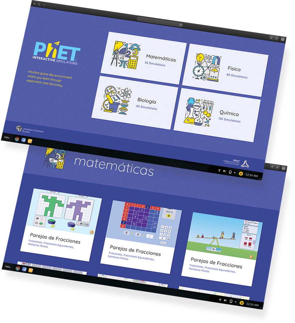
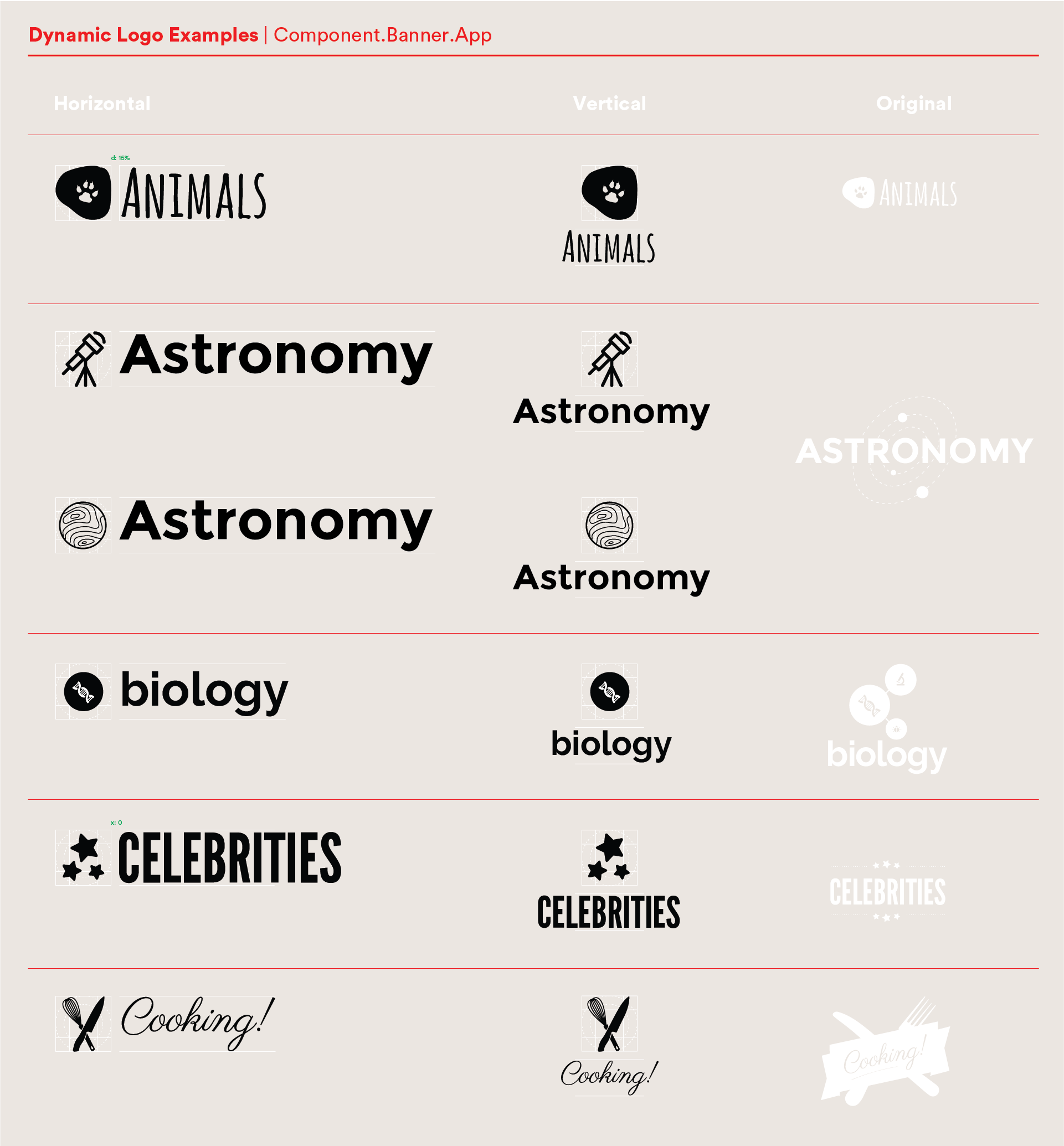
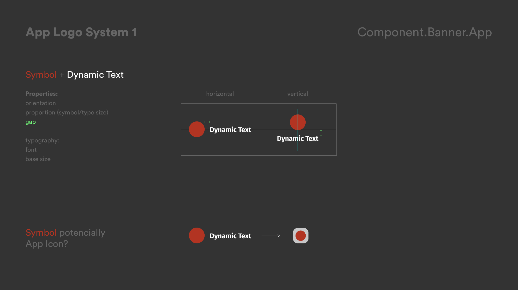
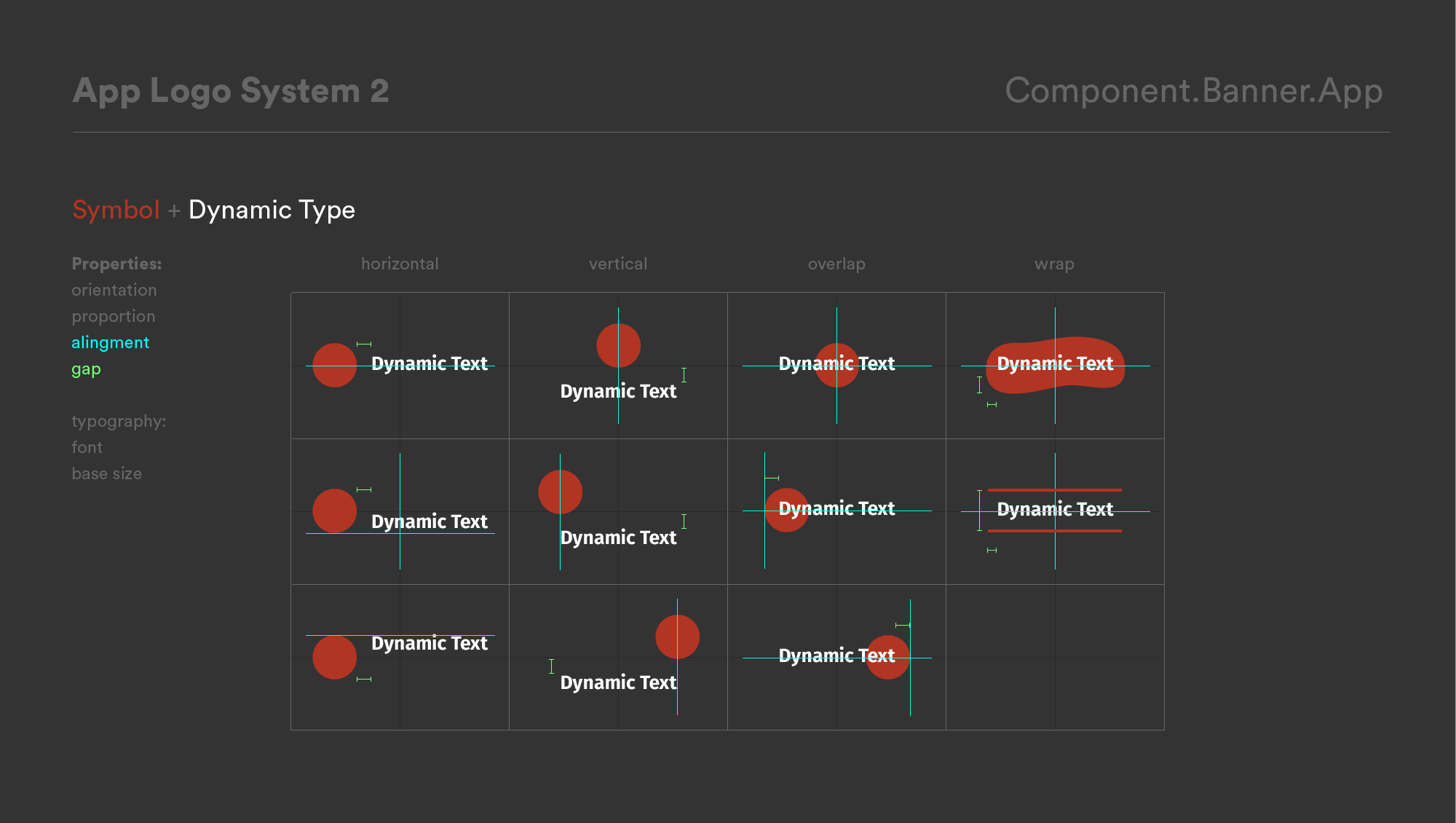
Some of the 200+ finished apps…
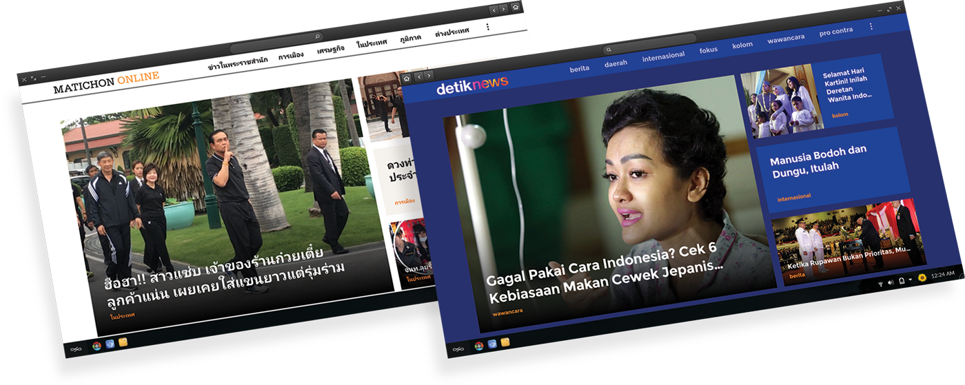
News apps
We made 40+ News apps
In 7 languages
With fresh content daily
Including Sports, World News
Entertainment, Health etc.
Blog apps
We made 30+ Blog apps
In 7 languages
With fresh content for
localized content creators
on a wide range of topics.
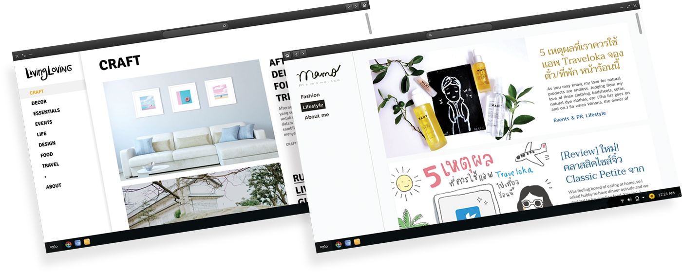
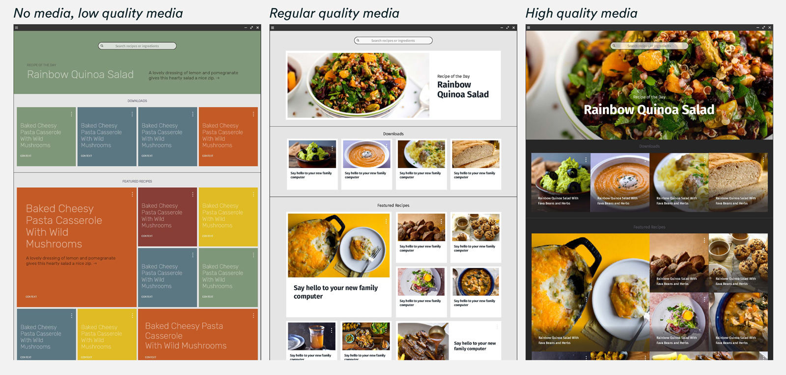
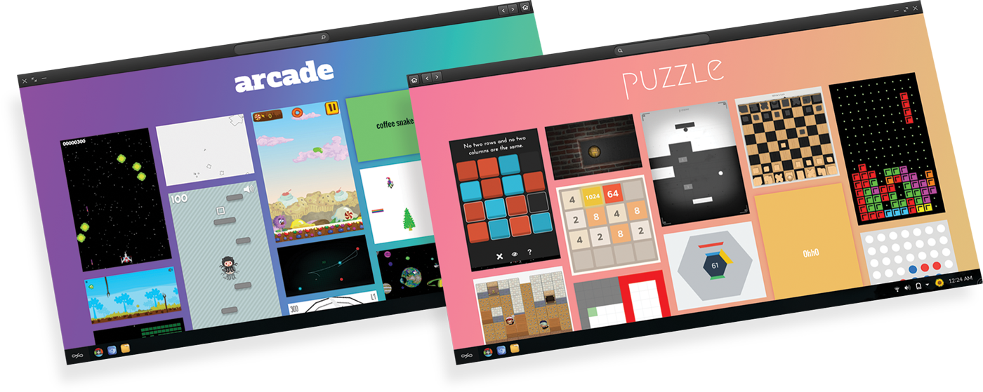
Image & Video
galleries

Game
“arcades”

Key takeaways / hard lessons
- Don’t put the cart before the horse. As in due a little more due diligence in research/ definition phases before landing on a production approach.
- Find the right technology for the job. Like above, if the design is better thought out in advance, and more “scrappy” tests are done, then we might arrive at a better way to implement the feature to achieve our goals.
- Validate early and often. Make sure that we test our assumptions for business, strategy, and productization to help gauge the level of investment that we should make
- Find lighter weight methods validation.