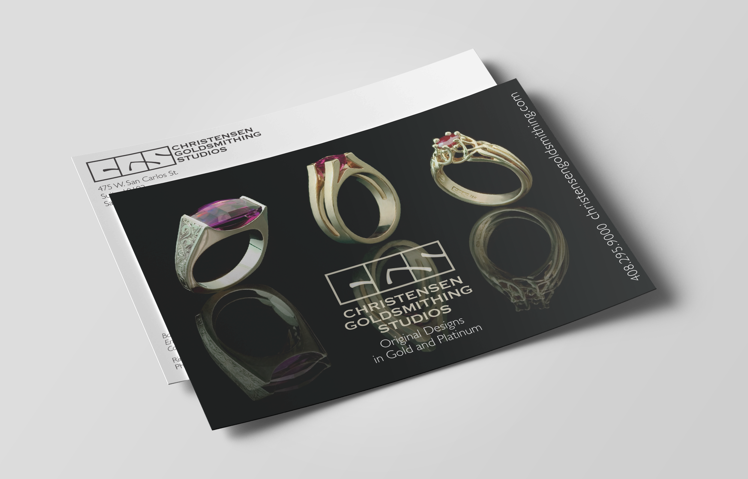
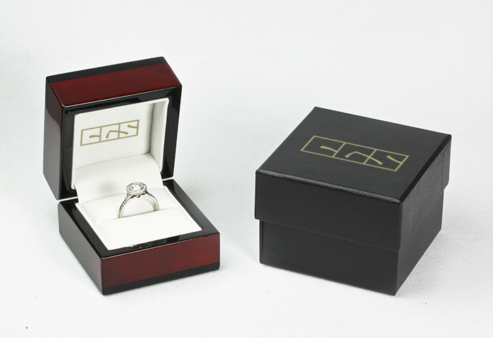
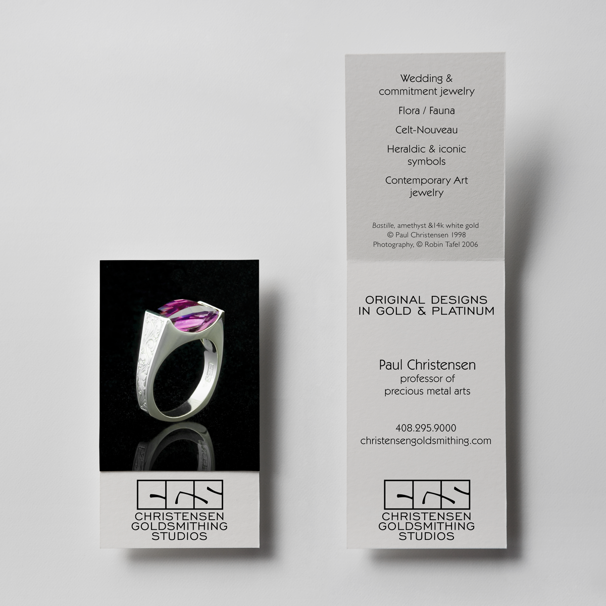
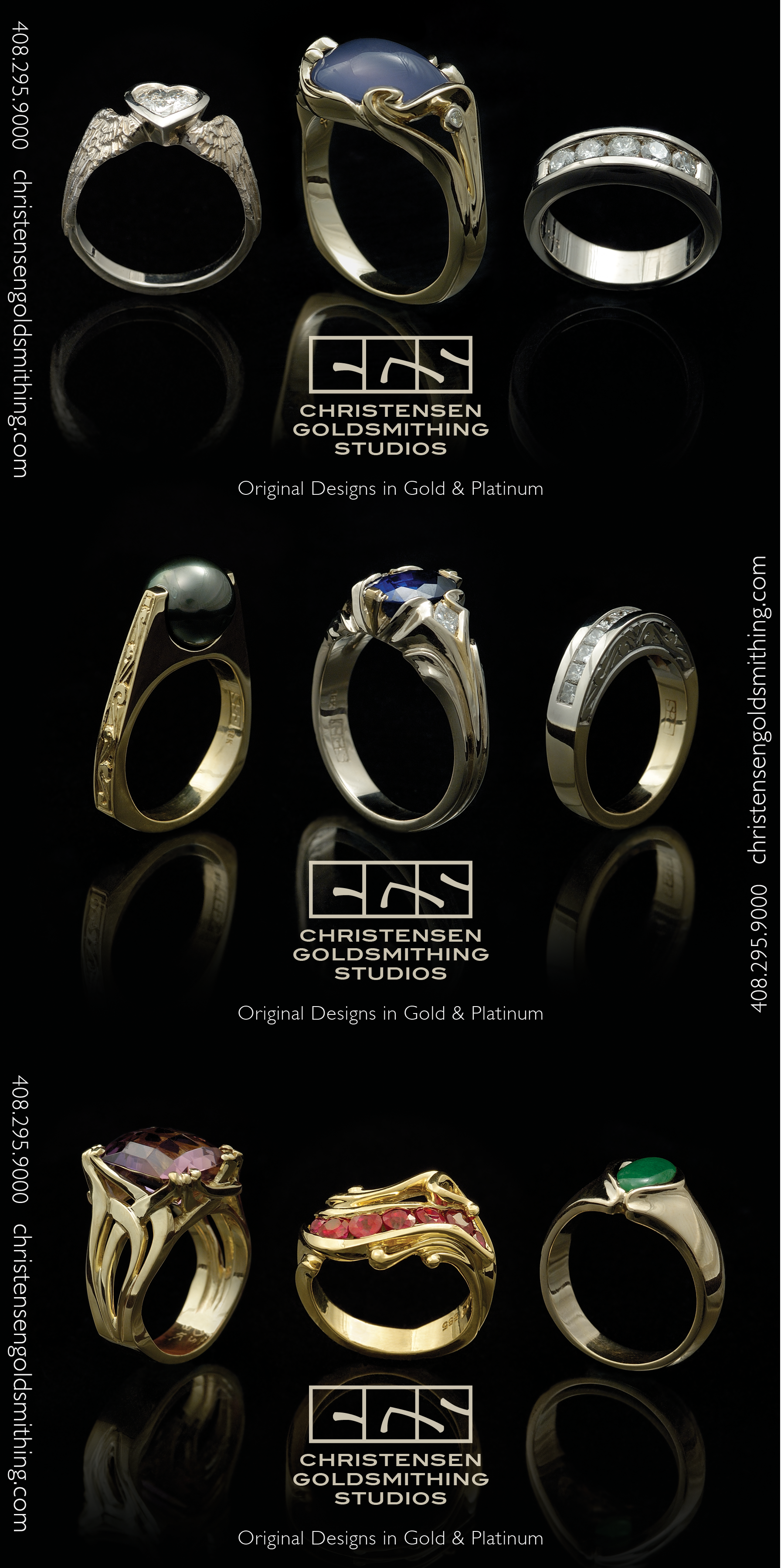
Paul Christensen had an existing goldsmith’s “chop,” which is a signature that was hand engraved onto every piece of jewelry he created. He asked me to translate his chop into a complete logo and brand identity that could be carried across all of his marketing materials.

Branding and Corporate Identity Package

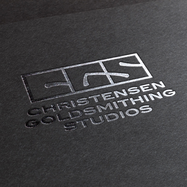
I cleaned up the lines of the chop while translating it to a digital mark. I kept notches and tapering at the edges of the stroke to hint back to the use of the goldsmith’s crafting tools.
The dominant brand colors are an off white leaning towards gold that hints at the dominant medium of a goldsmith over black, or 90% over white.
