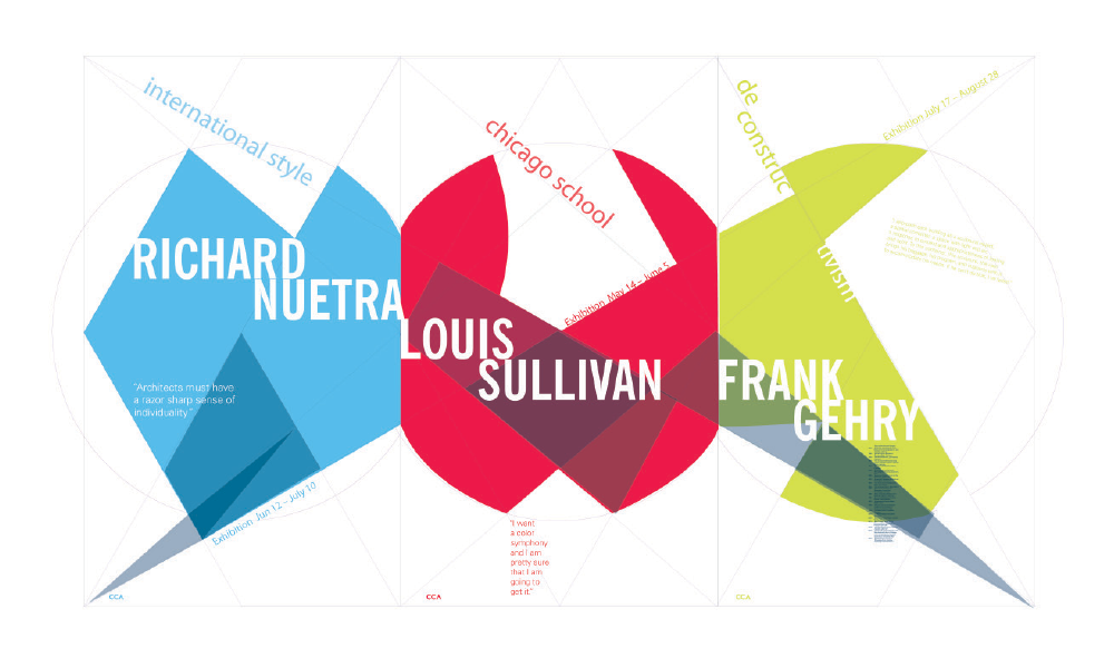
Complete Poster Triptyche
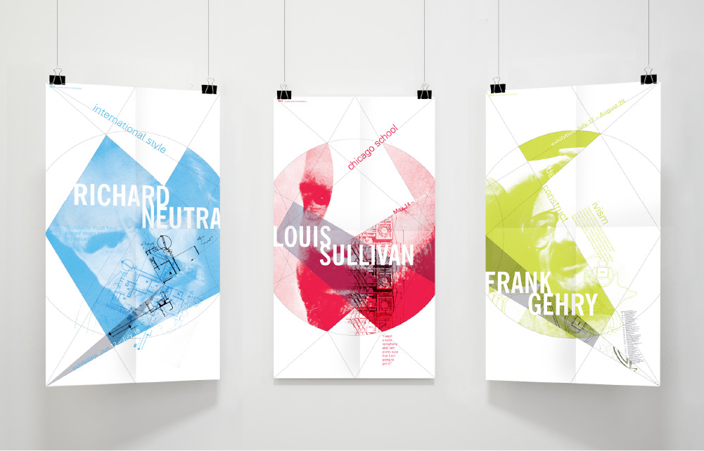
Complete Poster Triptyche
This poster triptych was designed utilizing a system and geometric based approach towards design. The format is based on a root three rectangle whose properties lend themselves well to triptychs due to the fact that they are created from hexagonal measurements and three root three rectangles next to one another create a larger rectangle of the same proportions, often called dynamic proportions. Additionally, each architect featured employed dynamic proportions, often found in nature, in there work in novel ways.
This series was a study in systems-based design in which design systems were carried out in color, typography, structure as well as image treatment to create cohesion between all three posters while differentiating them as stand-alone designs.
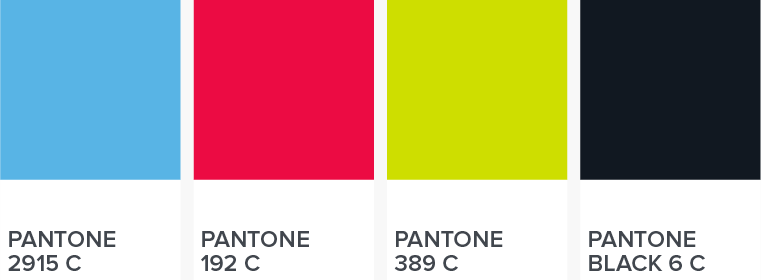
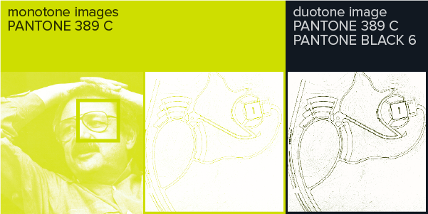
My color palette consisted of four spot colors. Each individual poster used one spot color and Pantone Black 6 C. All color variation was created by utilizing monotone or duotone images using the spot color + black or layering semi-transparent fields of pure color. The geometric grid structure across the triptych uses Pantone Black 6 creating a unifying skeleton for all three posters while the individual spot colors allows each poster to stand apart as a single unit.
An architects critical eye and visual sensibility is one of their most important design tools. In all three poster I used the eye in the architect’s portrait as that focal point for an otherwise abstracted portrait image.
I experimented with several design concepts including the use of photograms before arriving at my chosen direction.
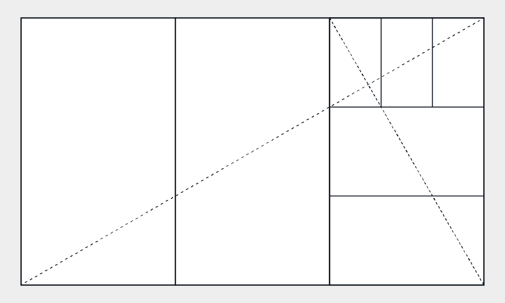
I chose a root 3 rectangle as the proportions for my triptych. I thought that would be an interesting format to explore for a triptych as a root 3 rectangle can be divided into thirds and each third would be the same proportion as the original rectangle.
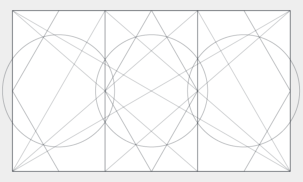
I began the design phase of the process by exploring various geometric division of my triptych’s rectangle(s).
Once I had my structure I began just laying down planes of color and the known typographic content to see what the overall composition would possible look like before experimenting with the image based content.
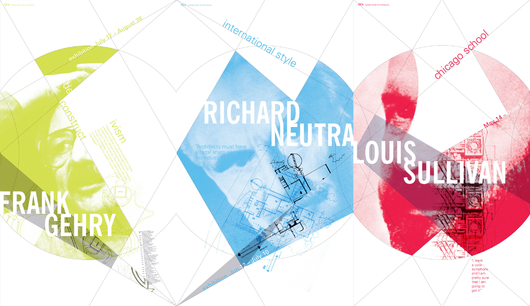
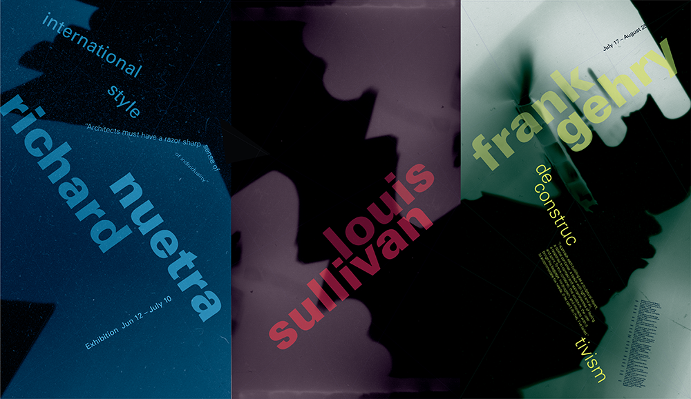
One challenge was that the poster series should also be able to work cohesively in multiple arrangements. The triptych’s skeleton of geometric lines created strong connections with one another, tying the posters cohesively in all arrangements.
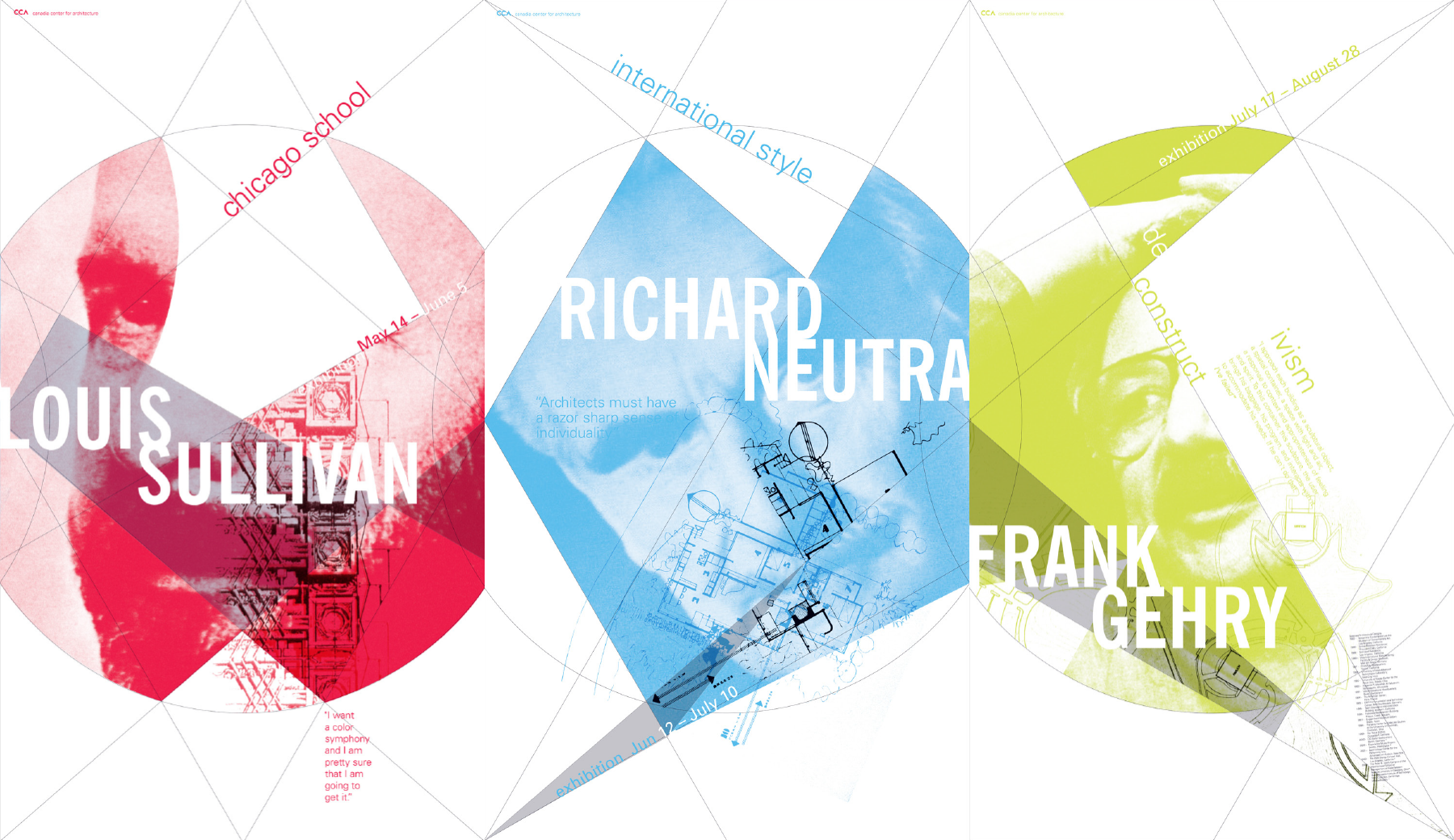
The two secondary arrangements are in some ways more interesting as symmetry of the lines is broken up making thee composition more dynamic and unexpected.
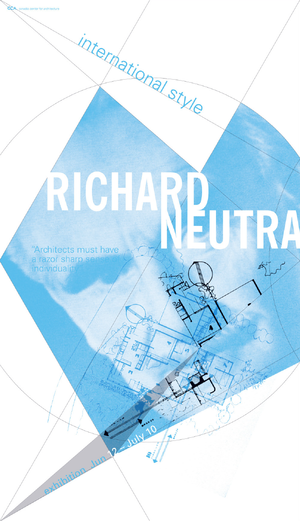
Individual Poster: Richard Neutra
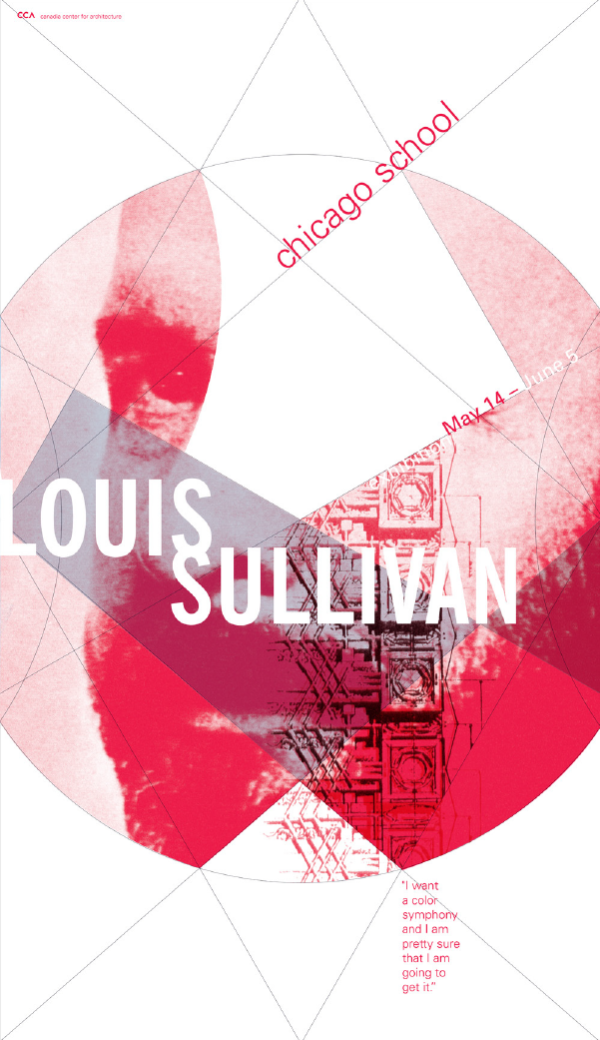
Individual Poster: Louis Sullivan
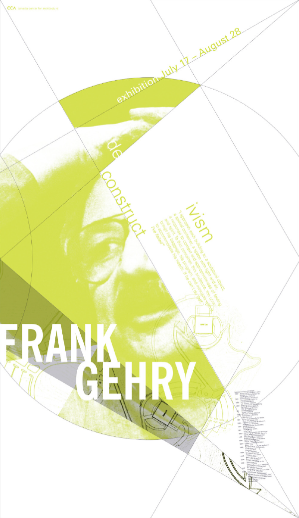
Individual Poster: Richard Gehry