Inspired by the somewhat comical “call to action,” WWII Propaganda posters of the 1950s, I decided to create a series that was both positive; empowering people to create positive change, while adding a subversive ominous tone which is also found in many of the WWII posters. I thought it would make a more compelling campaign if there were two contrasting voices interacting and adding depth and another layer of meaning. My campaign spanned across several forms of print mediums including subversive posters and informational posters, booklets and postcards.
Campaign deliverables
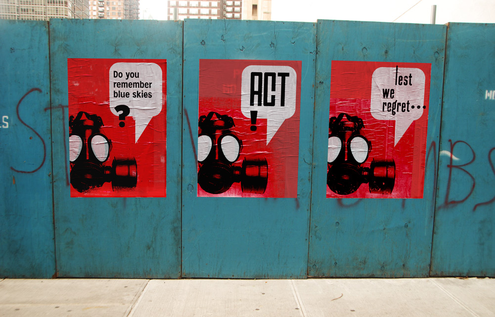
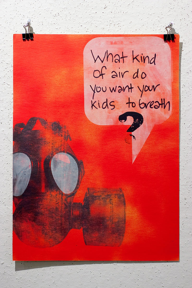
Silkscreened posters
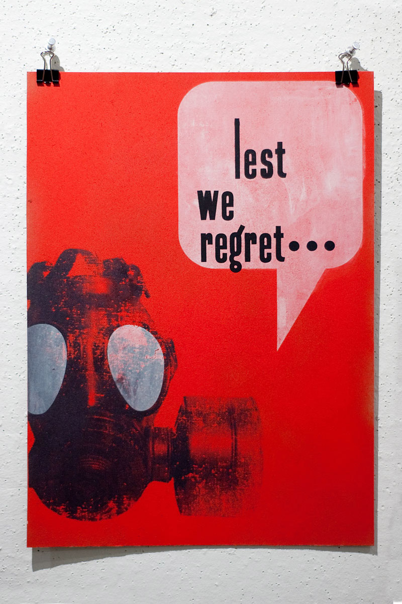
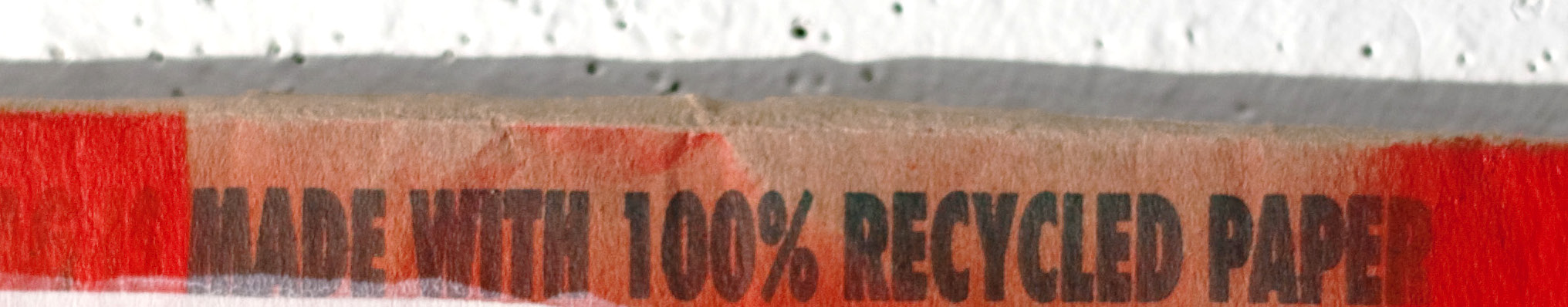
Silk screened posters on various recycled papers were posted around the school and in Downtown Providence, RI.
Global warming info zines
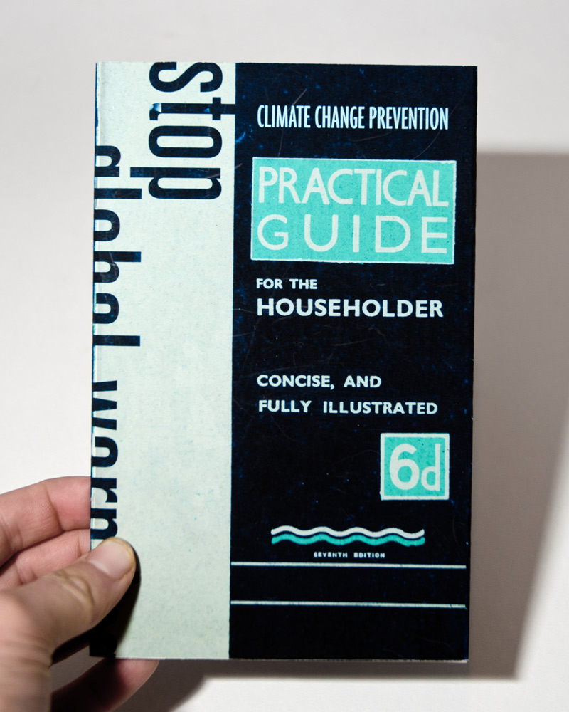
Zine with global warming information, info about what people can do, and art.
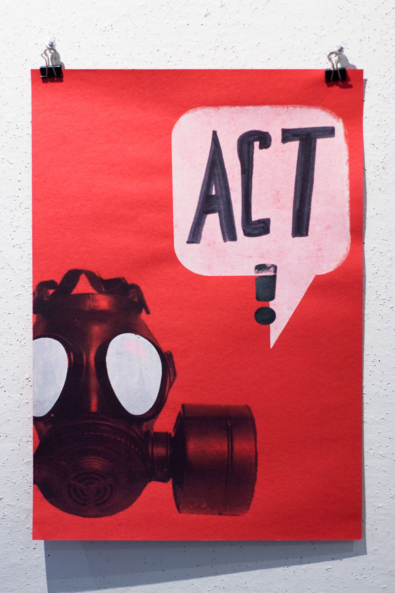
Silkscreened action posters
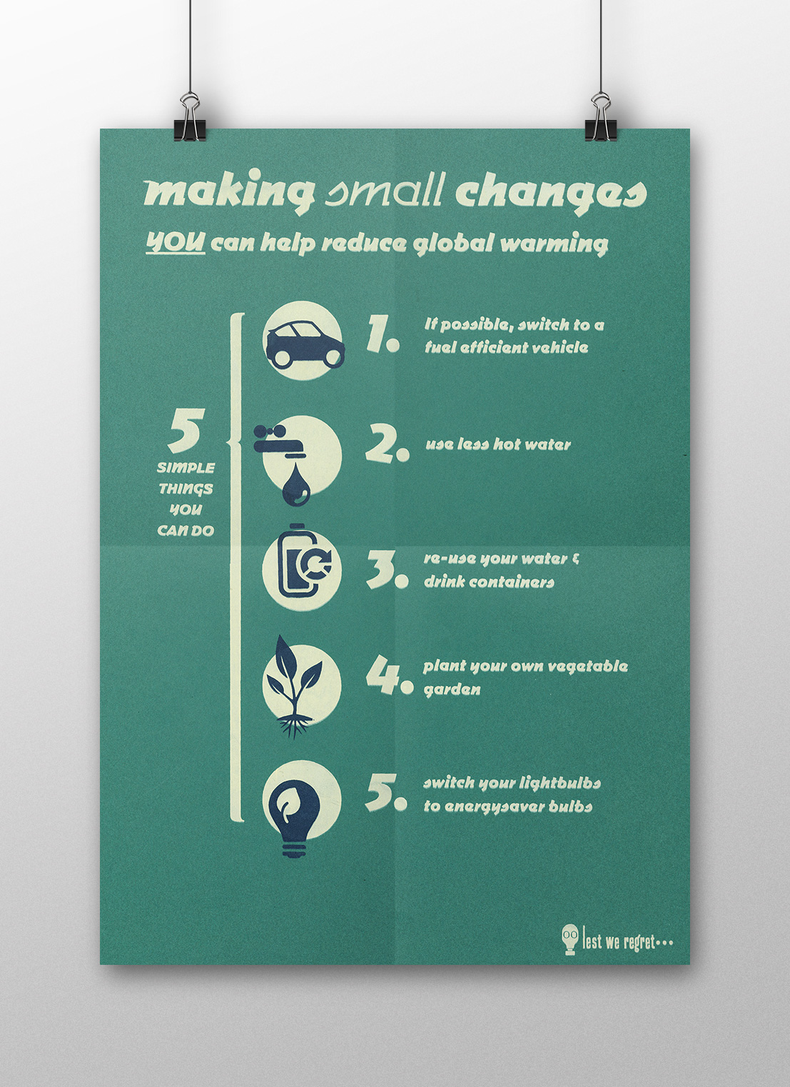
Silkscreened posters with simple, actionable changes were posted around campus and Providence.
Action items postcards
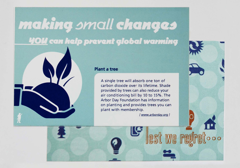
Postcards with various actionable steps people can take to reduce global warmer were left in campus cafeterias and local cafes.
Participatory design
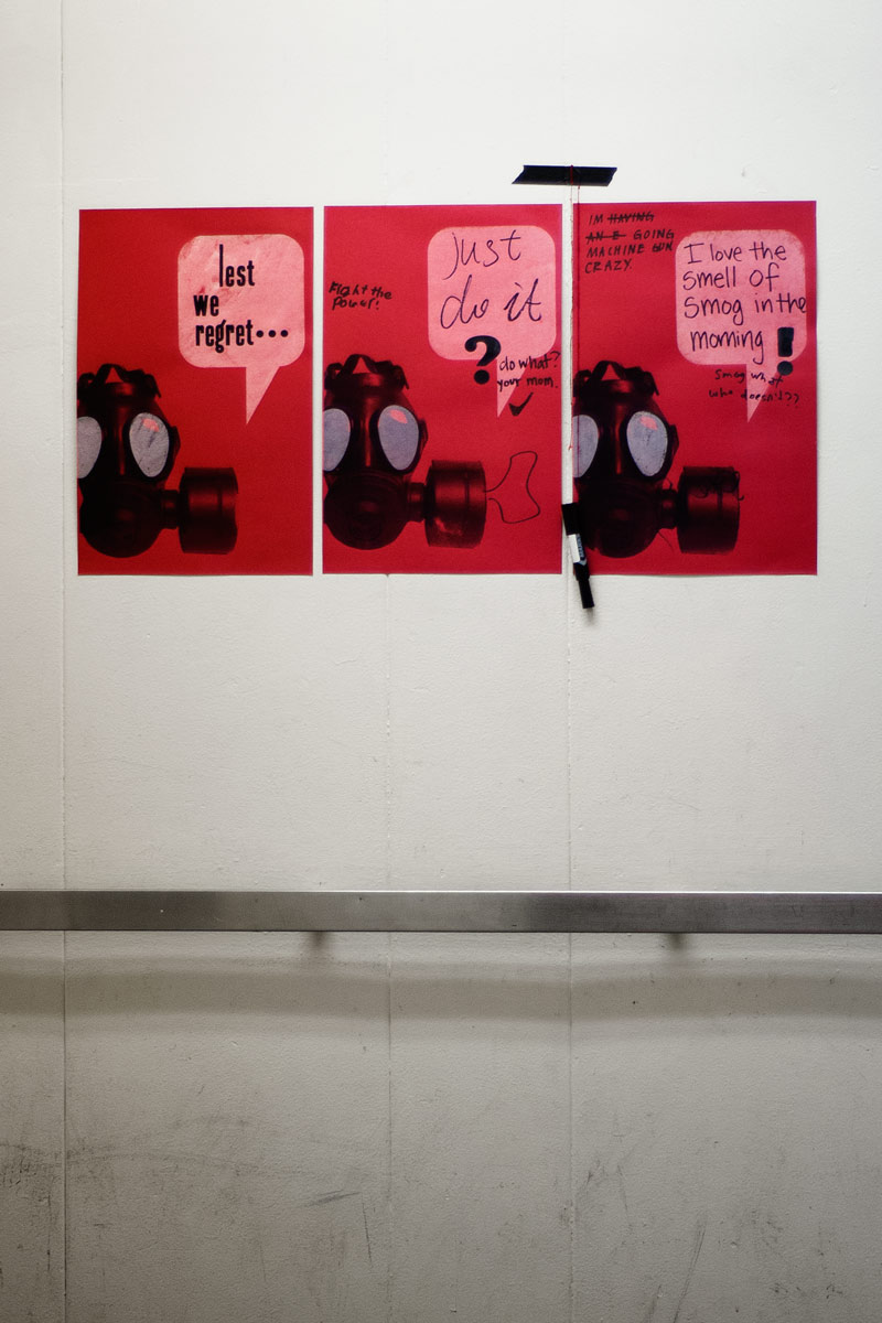
Participatory poster, hung in the elevators and elsewhere at school. They left space on the poster, along with markers, encouraging people to fill in their on ideas.
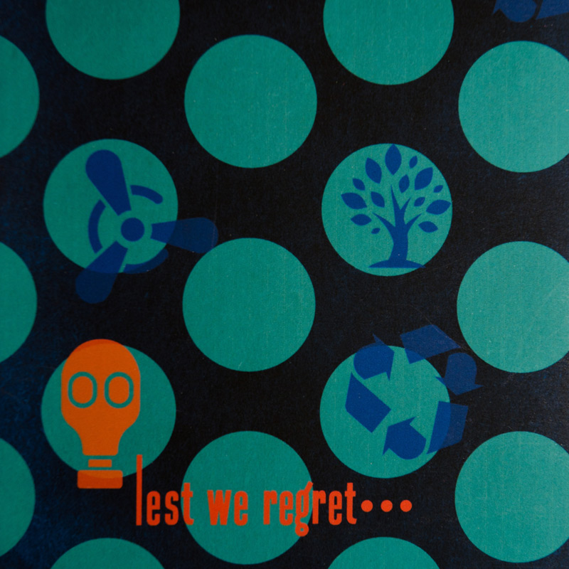
Visual language
My goal for this campaign was not to foster outright negativity which would not be productive. The aesthetic and visual imagery was partially inspired by WWII propaganda posters. I wanted to create an overall positive feeling across the material, however I felt that the gas mask theme and ominous tag line would just add a small, “what if?” thought in the minds of the viewer. “What if I don’t de my part? Will I regret it?” The aesthetic style of the logo with its playful typography also helps take the negative edge off the slogan and communicates it as subversive humor. The logo and tagline is a common thread that ties the individual pieces together into a cohesive campaign.
Process