Boards is a collaborative virtual desktop where people can talk and build together in real time. It runs in any web browser, and doesn’t require an install to use. Although the description in this document employs a PC screen, it also runs on mobile. While it will be released with a basic set of tools, it has an open architecture, so that developers can create new collaborative tools for specific tasks.
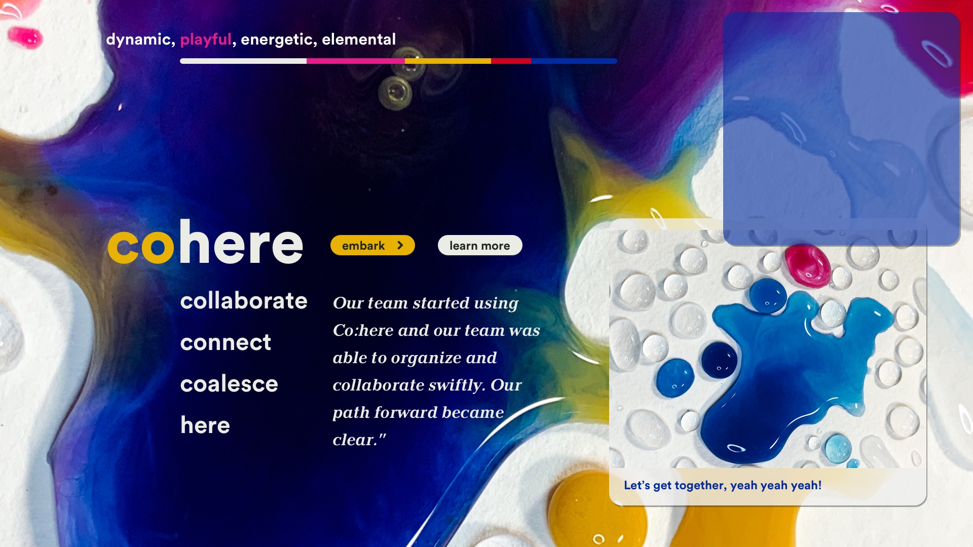
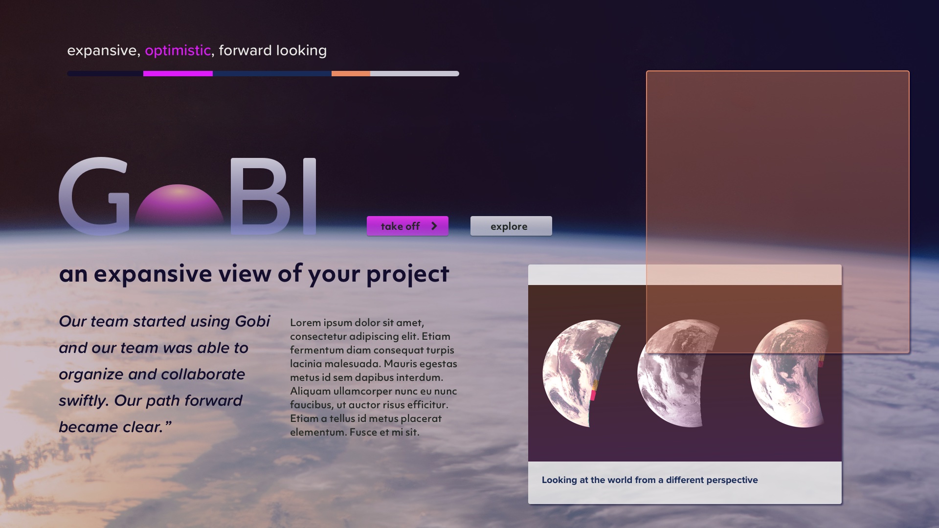
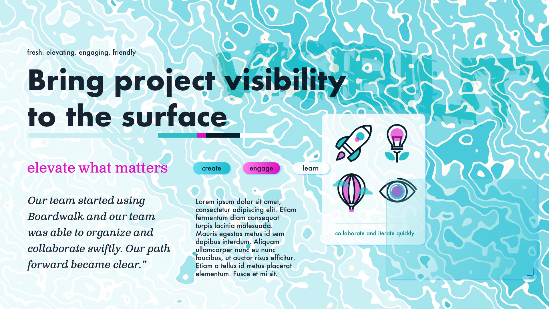
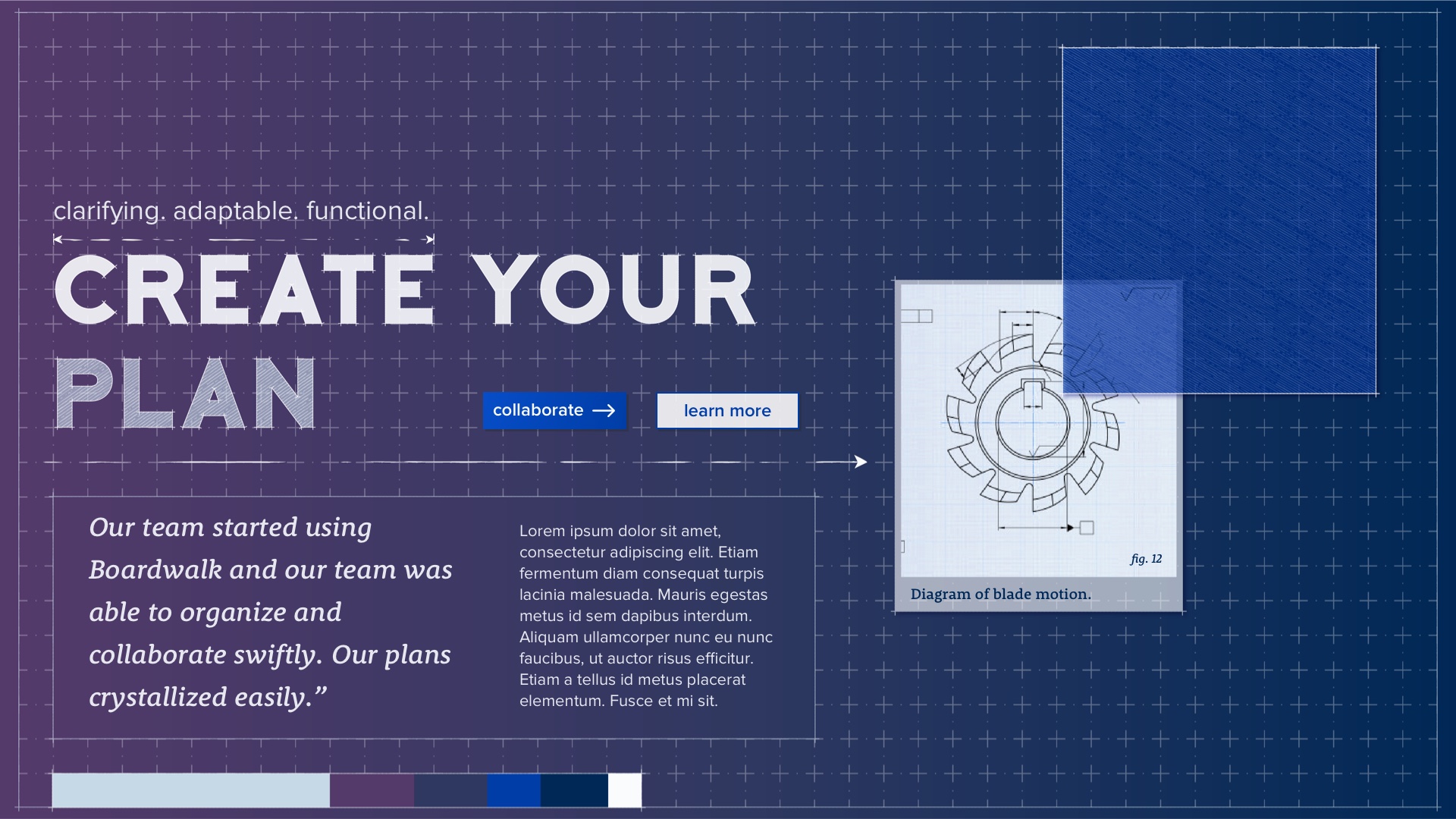
Boardwalk is a virtual space for discussing, sharing, and creating. It allows you to pull all sorts of media into a shared workspace then combine it in interesting ways.
Product Pillars
- Customizable – It’s easy to build new tools and experiences.
- Playful – Experimentation is low-risk. Engagement is seductive.
- Accessible – Amateurs can create interesting things without training.
- Collaborative – Everything happens in real-time for multiple users.
I was brought in by the team at Croquet.io during the early stages of the product definition/ development process to help them better define the core features for the MVP release of their Boards product and create a polished user experience that they could begin sharing with investors and as a Beta release with potential customers.
We had a parallel track project that began a little after when the first MVP was in development to help them define their brand visual language and the visual language and design system of their Boards product. They wanted Boards to stand out from its other competitors both visually and functionally and have a visual language that is evocative of the core product pillars that the product was based on.
Once the visual language was defined that new language and UI elements would be merged with the functional MVP ( which is the phase that the project is currently in).
Role
- Lead Product Design
- UX Research
- UX/UI Design
- Brand Positioning
- Visual Systems
Where we started
MVP Requirements/ Features
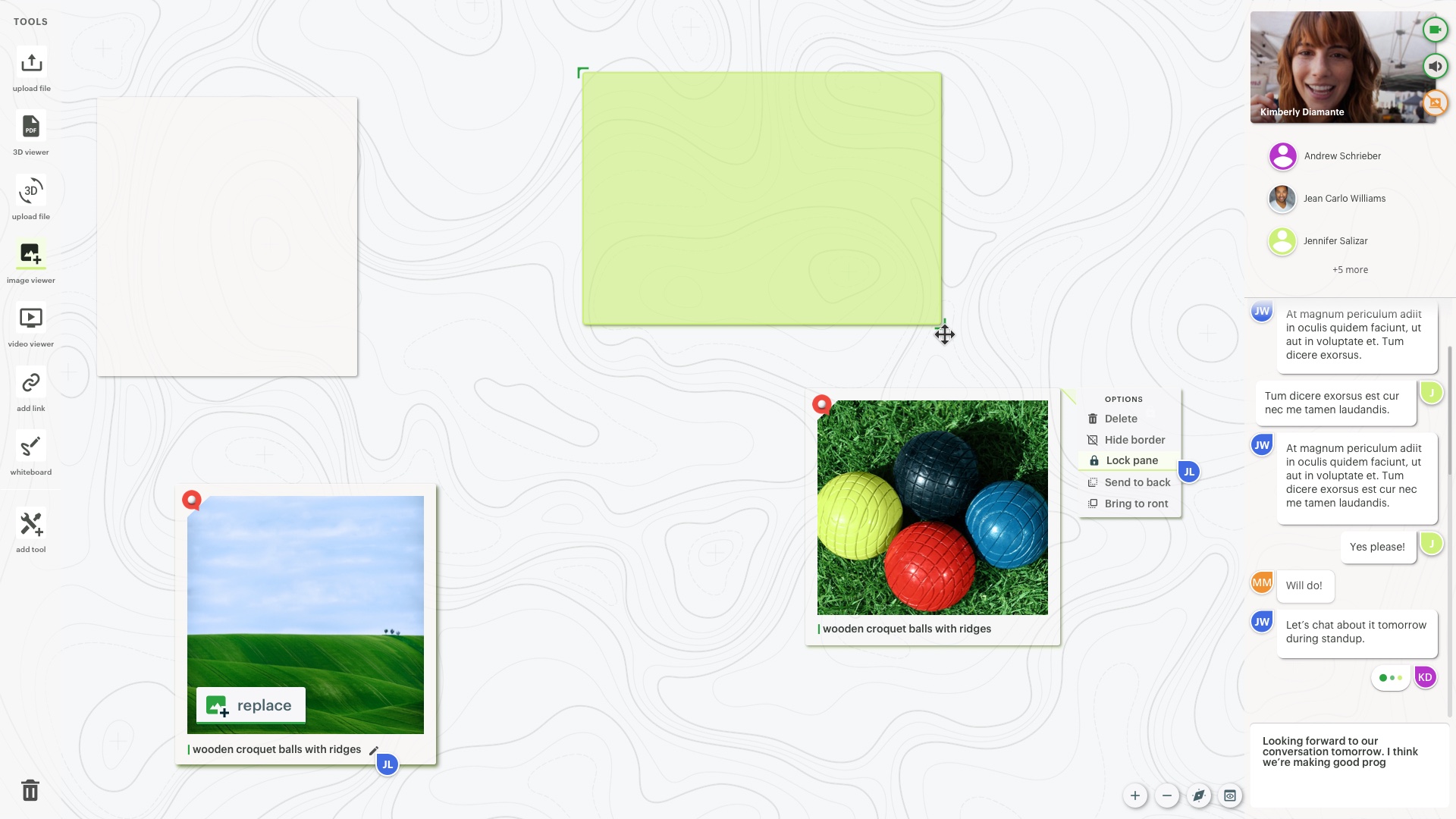
Boards consists of a central workspace surrounded by four pull-out panels:
- Tools – A palette of tools for spawning new content in the current workspace.
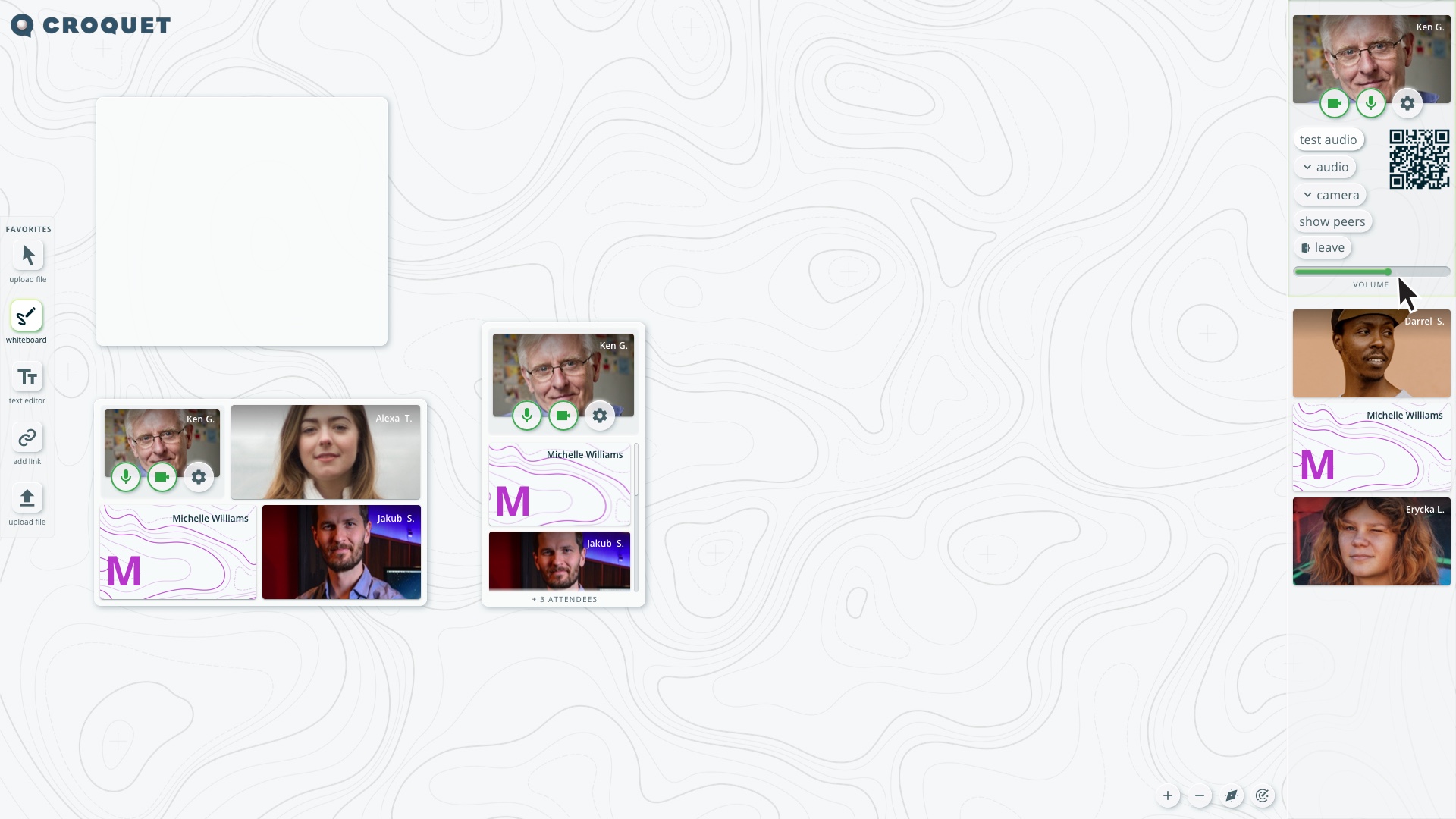
- Users – A list of all users in the current session with options to teleconference with them.
- Options – A set of controls for changing your user experience.
- Index – A collection of workspaces you can swap between.
Everything that happens in the workspace is synchronized. You can see other user’s cursors moving in real-time, and see any changes they make as they happen. (The state of the outer panels is not synchronized; it can be different for each user.

The original rough outline of features provided by the client, Croquet.
Competitive Landscape Research
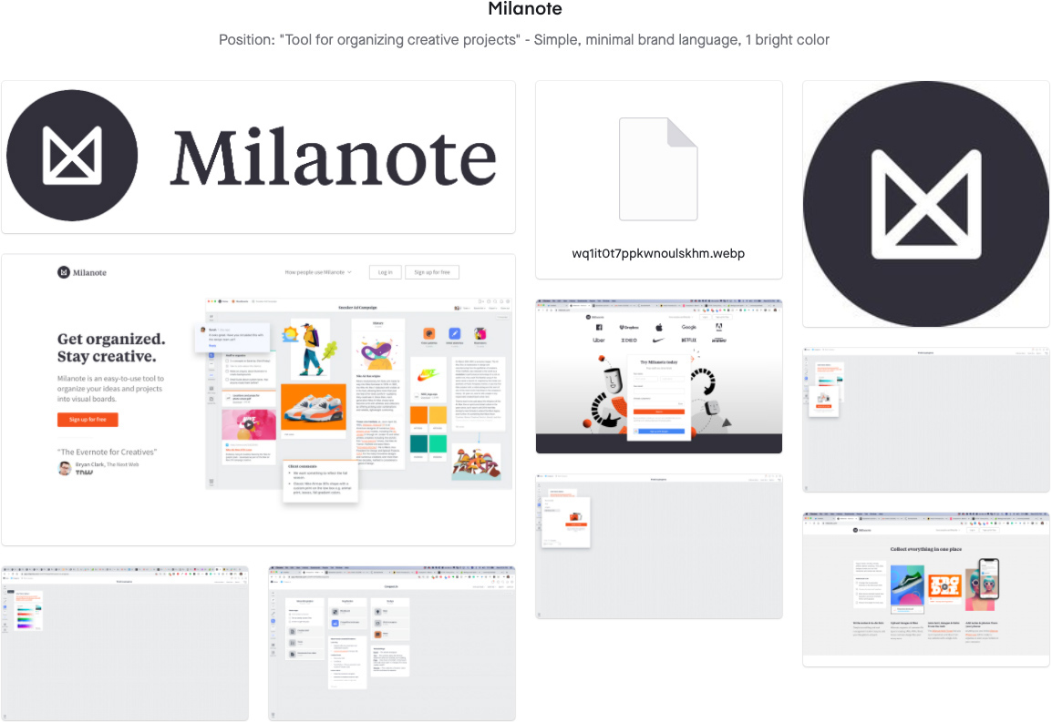
Milanote
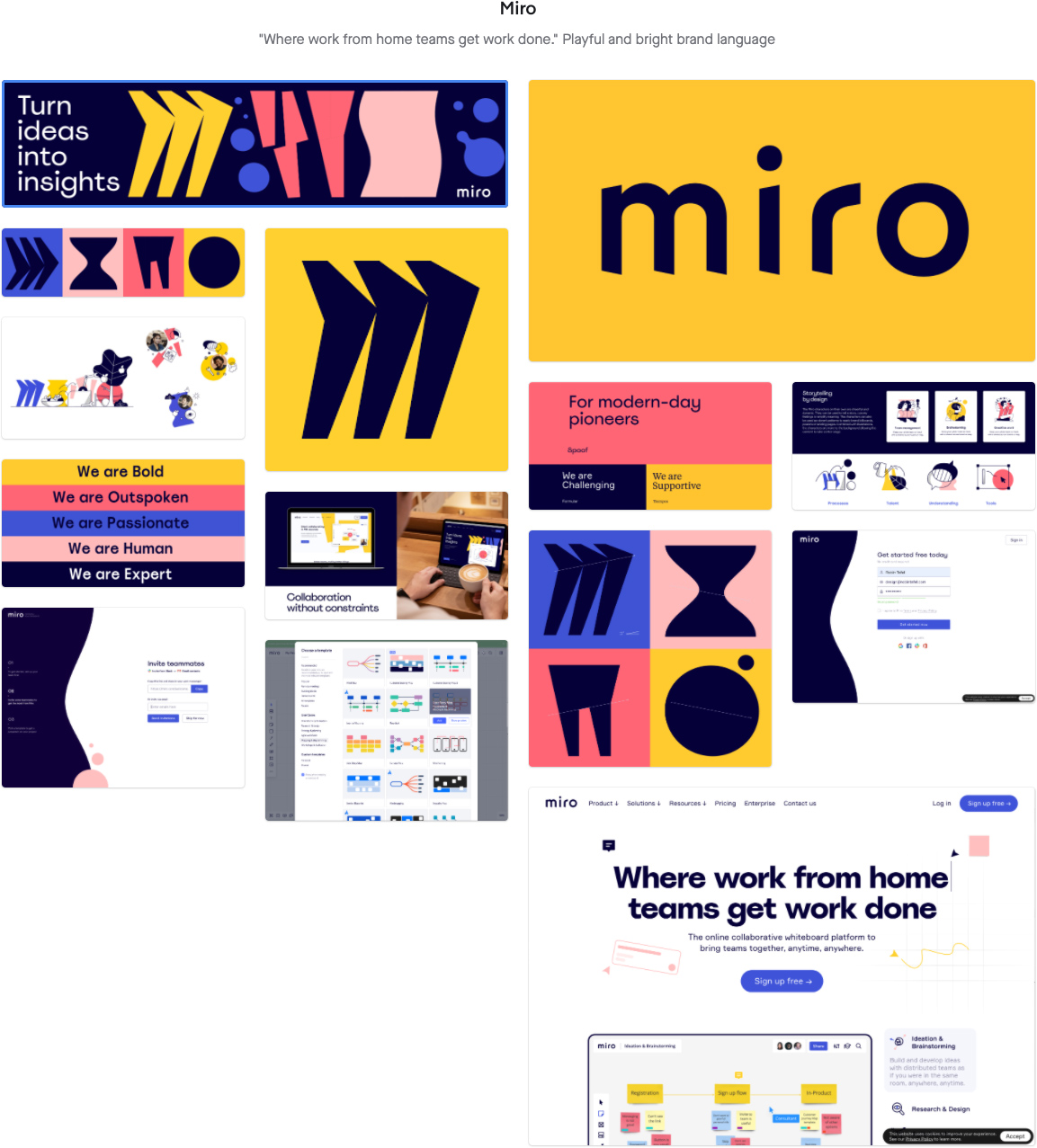
Miro
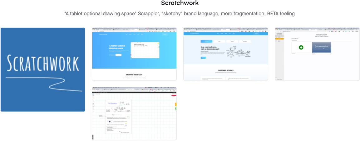
Scratchwork
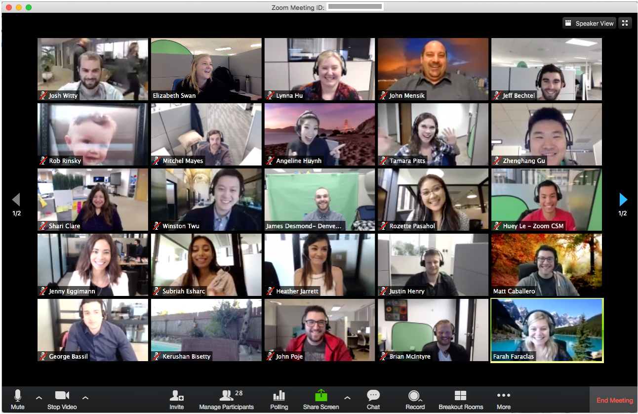
Zoom
Prototype Analysis
When I began the project there was a very rudimentary prototype. I spent time using the prototype to help jumpstart UX questions and create user stories.
User Story Creation
The team lead wants to call a quick meeting to resolve a sudden problem that’s cropped up. He needs to have a short private meeting with a few employees, review some documents to discuss a course of action, and create a plan to solve it.
A user is working on part of a group project. She’s still trying to figure out some important parts of it and wants to solve those issues privately before sharing it with the group.
The team is brainstorming ideas. They want to jot down a bunch of suggestions quickly as people throw out ideas, then go back and vote on the ones they think are important.
Three users are giving a presentation to a much larger group. They want to be able to smoothly take turns, and also open the floor up for questions when they’re done.
One user is working in a time zone that’s 12 hours out of synch with the rest of the office. He wants to be able to keep his coworkers updated about what he’s doing.
Potential investors are visiting the team’s virtual workspace. The team wants to give them of a glimpse of what they’re working on without revealing any secrets.
A social media manager is writing a history of a product’s development process for a press release. He’d like to look back through the early planning notes.
The company has decided that every meeting needs to conclude with action items to be followed up on. The teams want a way to organized their meeting notes and turn them into to-do lists.
The financial team has their own workspaces that contain information that the rest the company shouldn’t know about. In fact, the other employees shouldn’t even know that some of these workspaces exist.
Core UX Ideation
Defining and iterating core UX features using “High Fidelity Wireframe” language
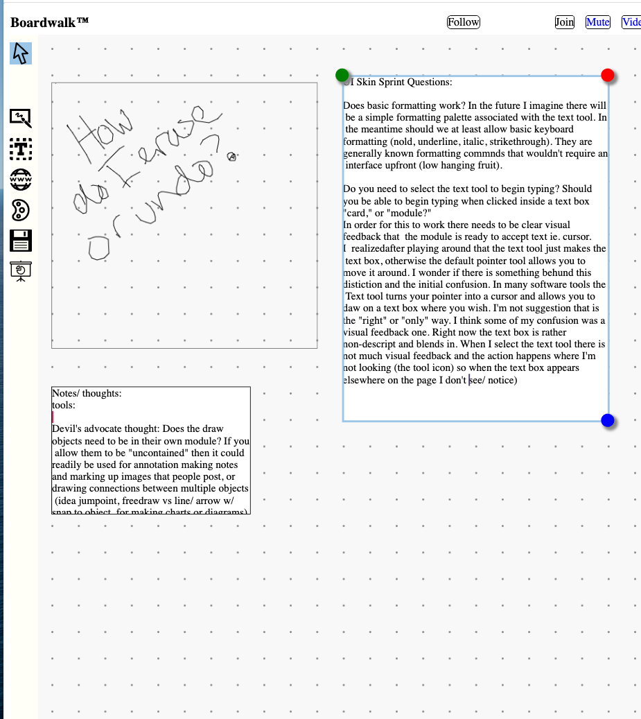
The timeline for having the first MVP iteration was fairly tight. Croquet wanted to be able to show a core set of features to investors in the demo that had a certain level of polish, even if it wasn’t the final visual language. Given these constraints, I decided to create a simple visual language that I referred to as a “polished wireframe.” With this lightweight visual framework, I was able to rapidly iterate on the UX and pass of design definitions to the developers without creating separate wireframes or wire flows. We used this method to quickly iterate on the UX and core features in parallel with the development of the MVP.
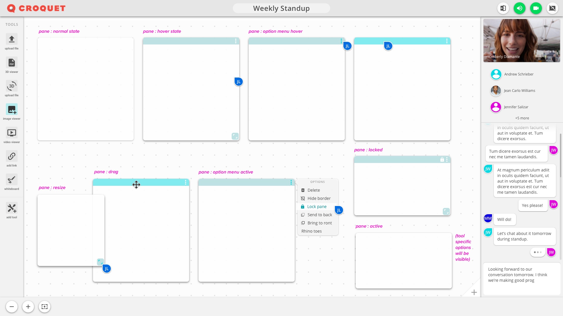
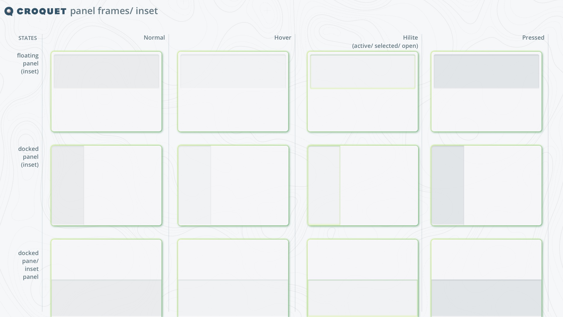
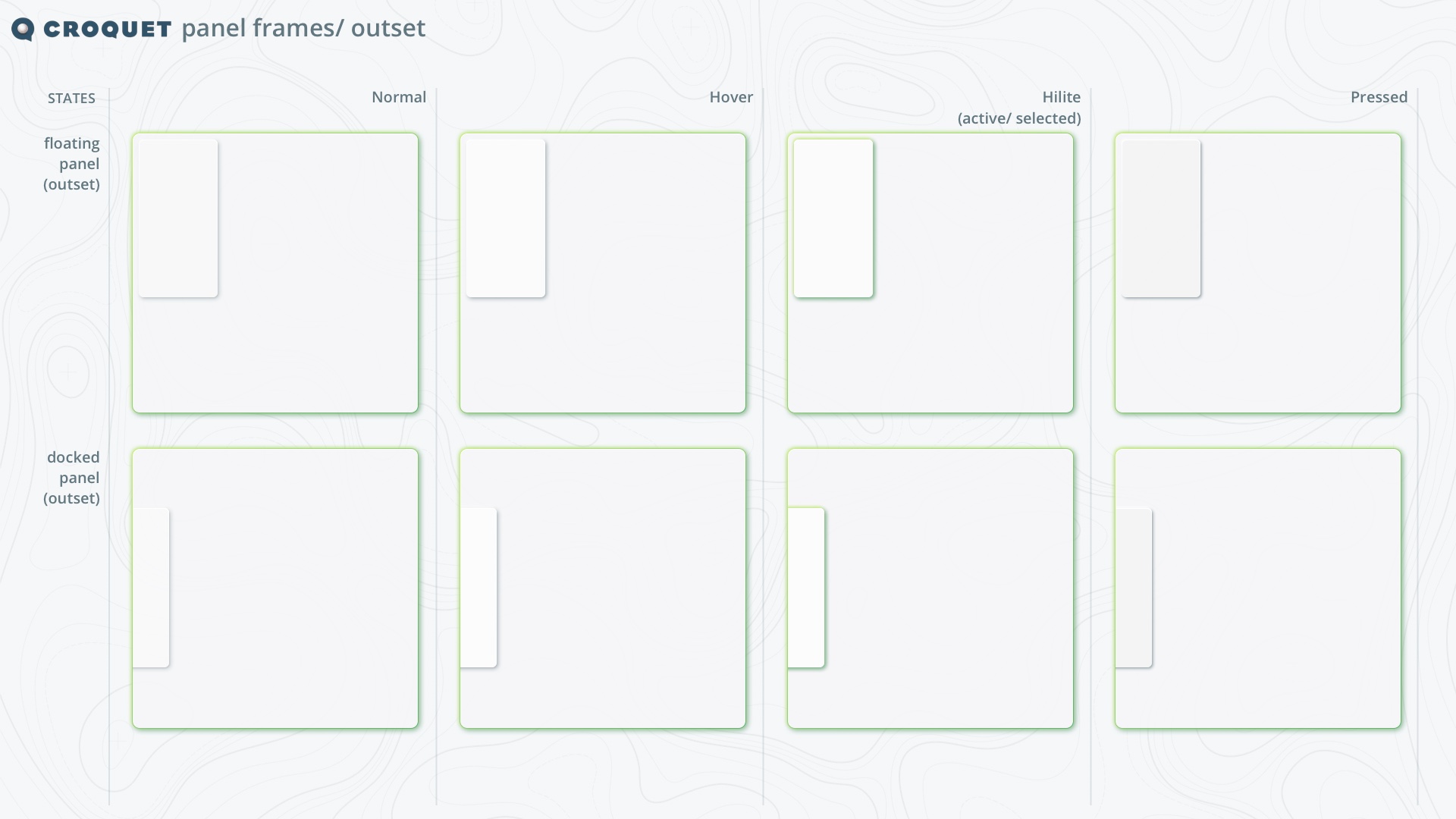
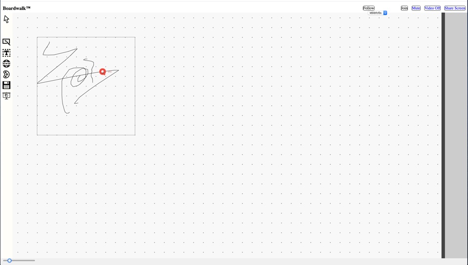
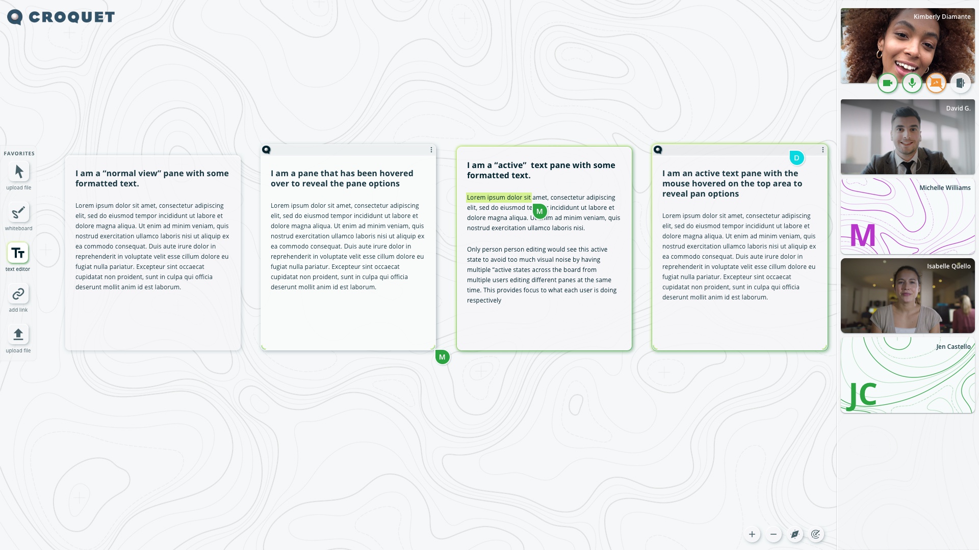
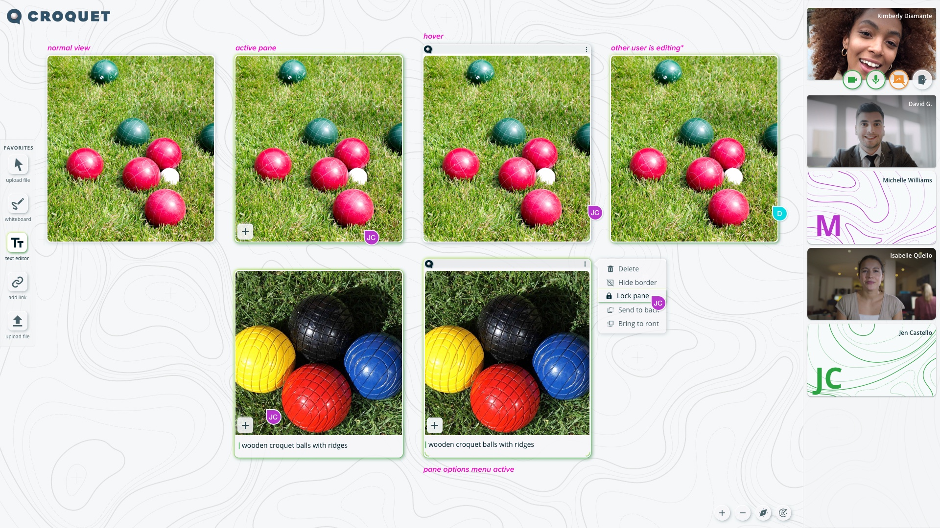
A lot of iteration went into the various states that were required for the “panes” the windows or functional cards, instantiations of the various tools that could be edited and viewed. It needed to be clear when a user was creating or interacting with a pane, as well as items that were being interacted with by other users.
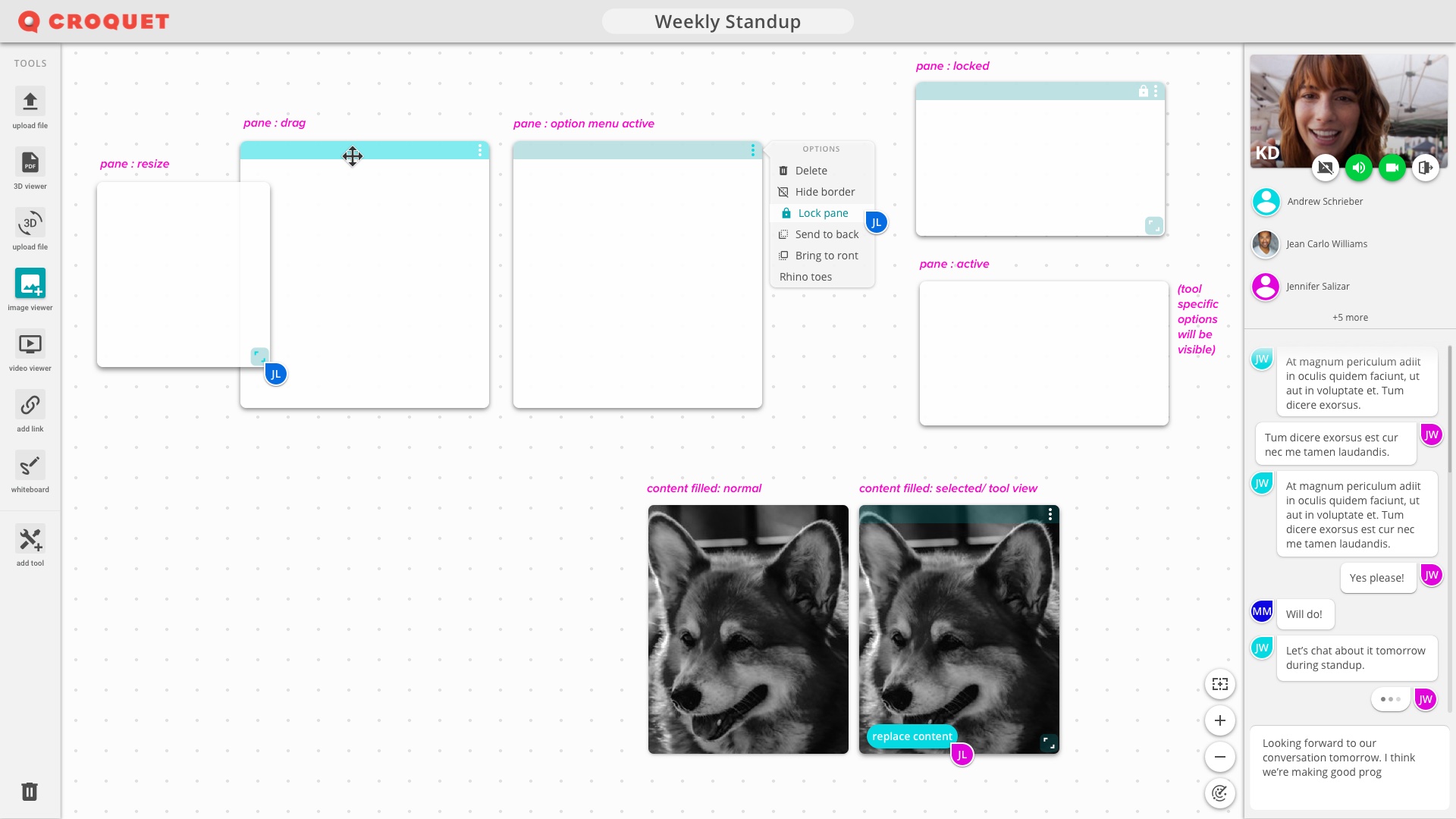
Through iteration collaboration on the project’s dev we simplified features and streamlined the main areas of the interface.
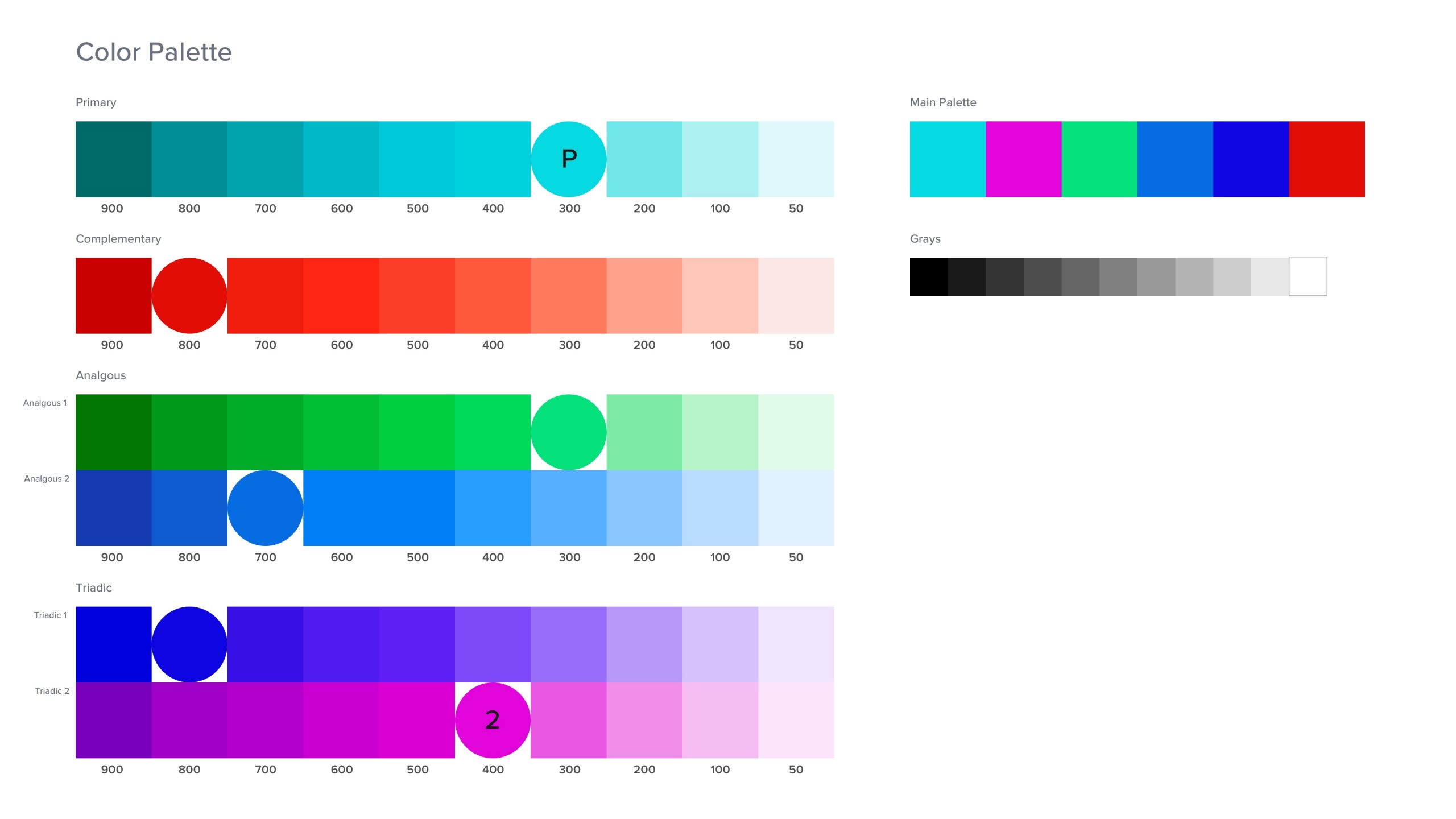
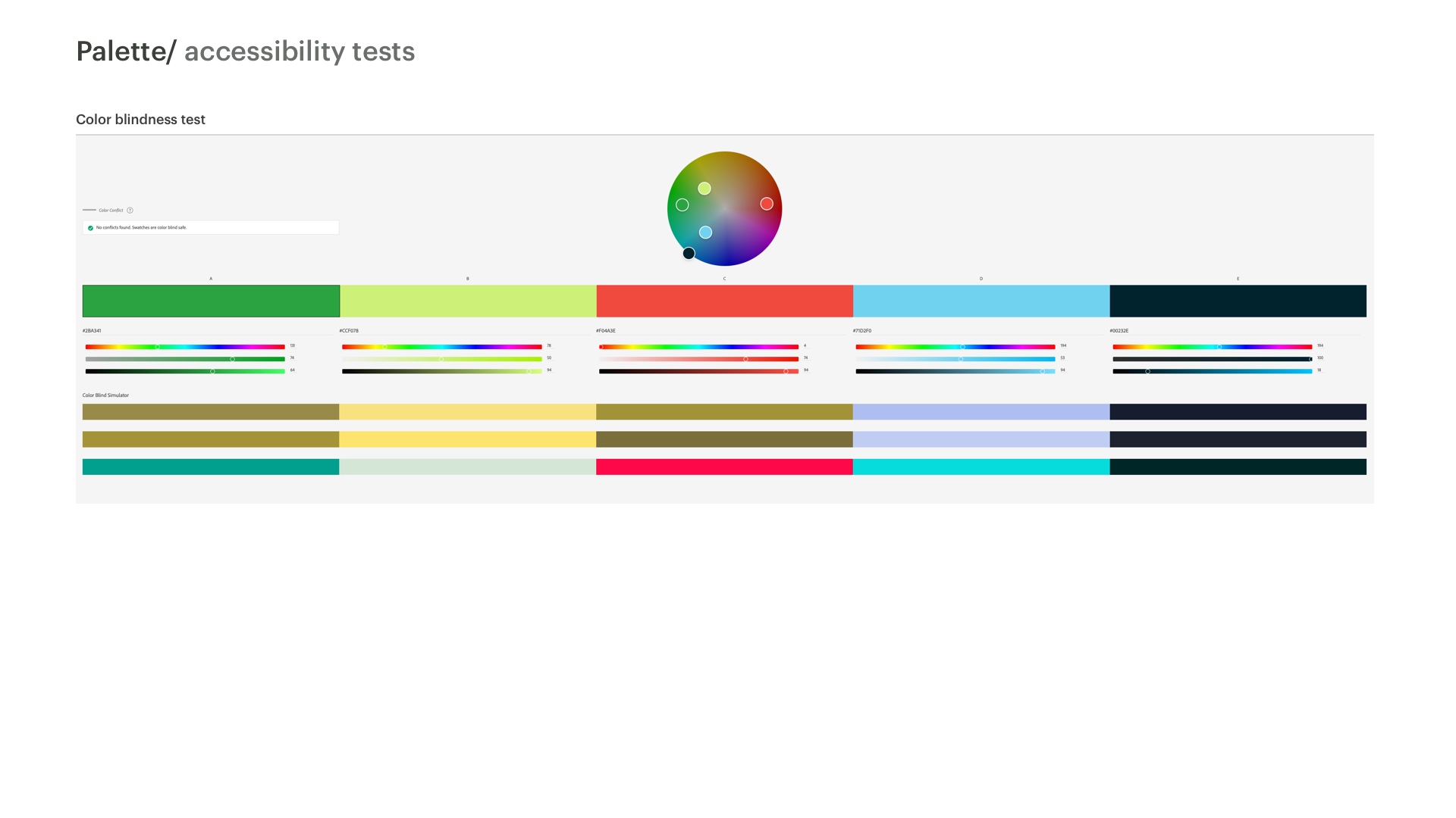
I developed a simple color palette for the “wireframe system” based on the Material Design color system. This allowed me to quickly build out a functional color palette to use while iterating that could be easily swapped in the styles as final UI colors were defined.
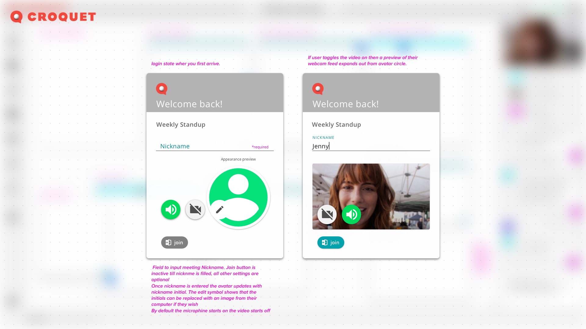
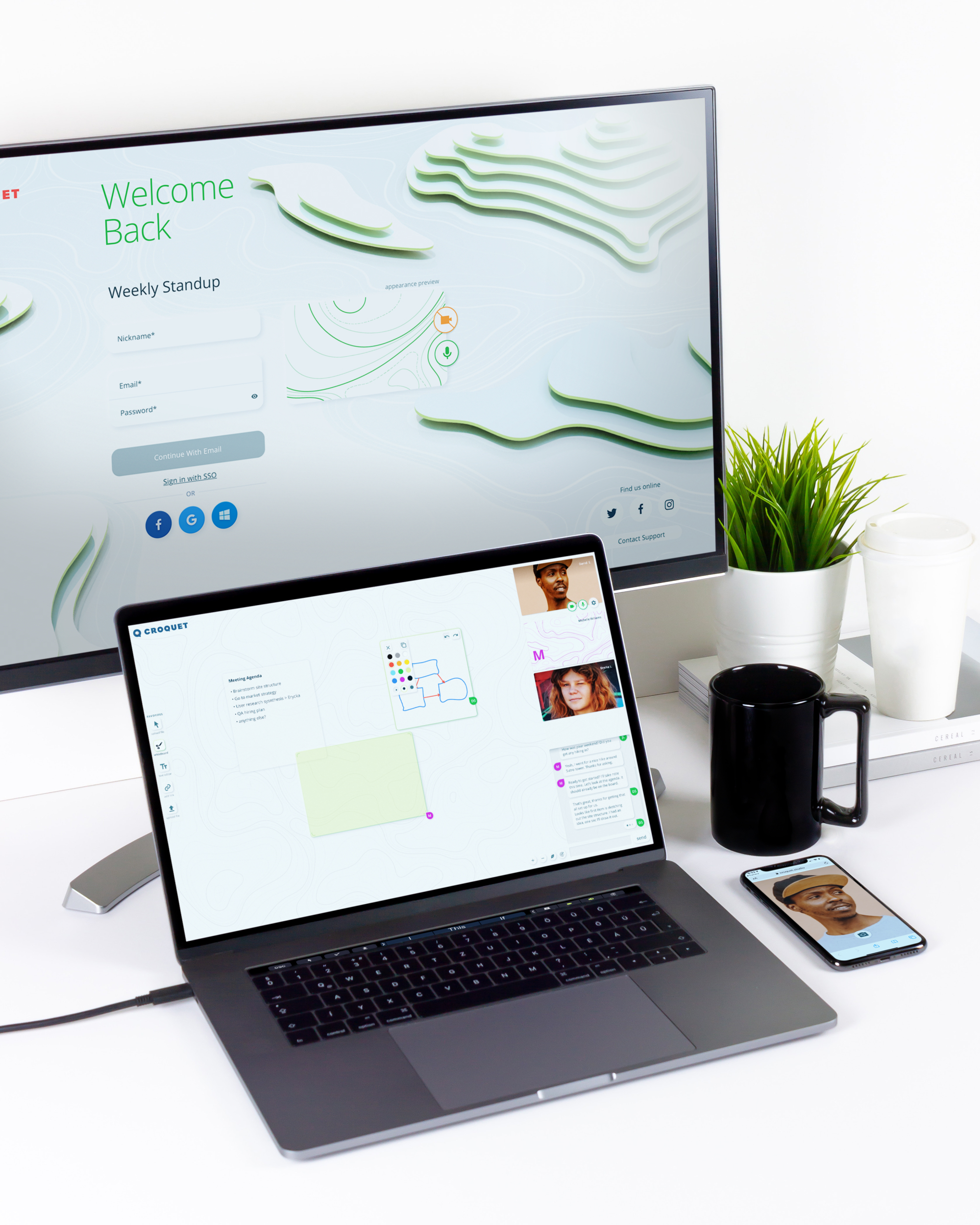
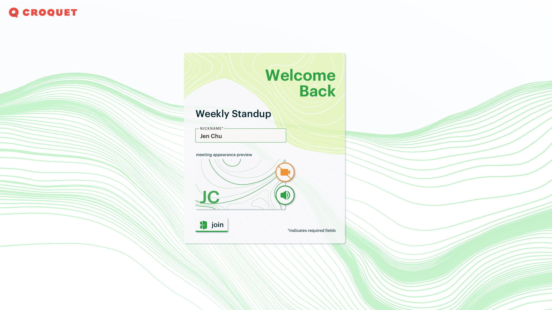
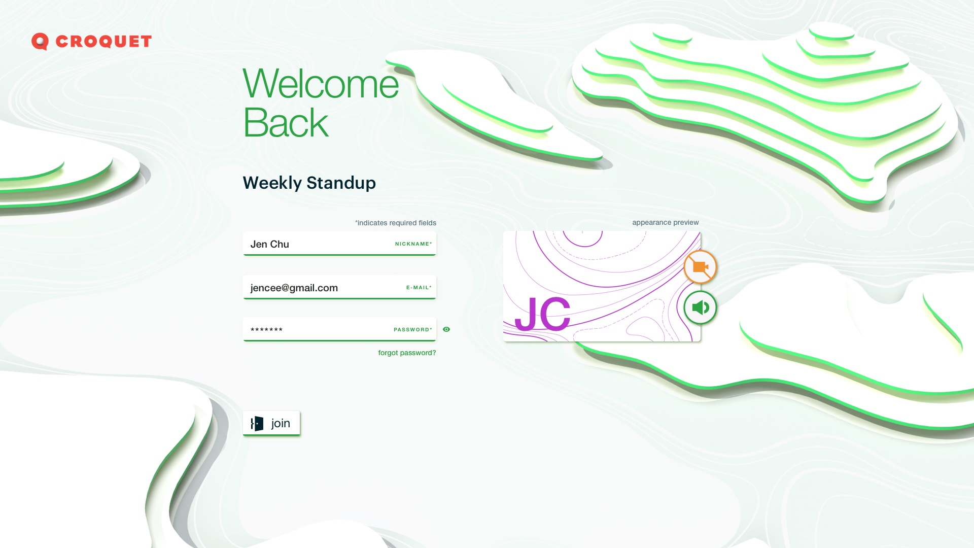
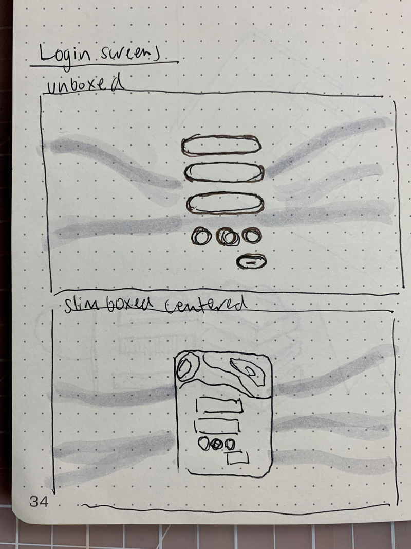
For the MVP login screen, I ideated on concepts for previewing and setting your appearance/ sharing in the session before you entered to give users control over their privacy.
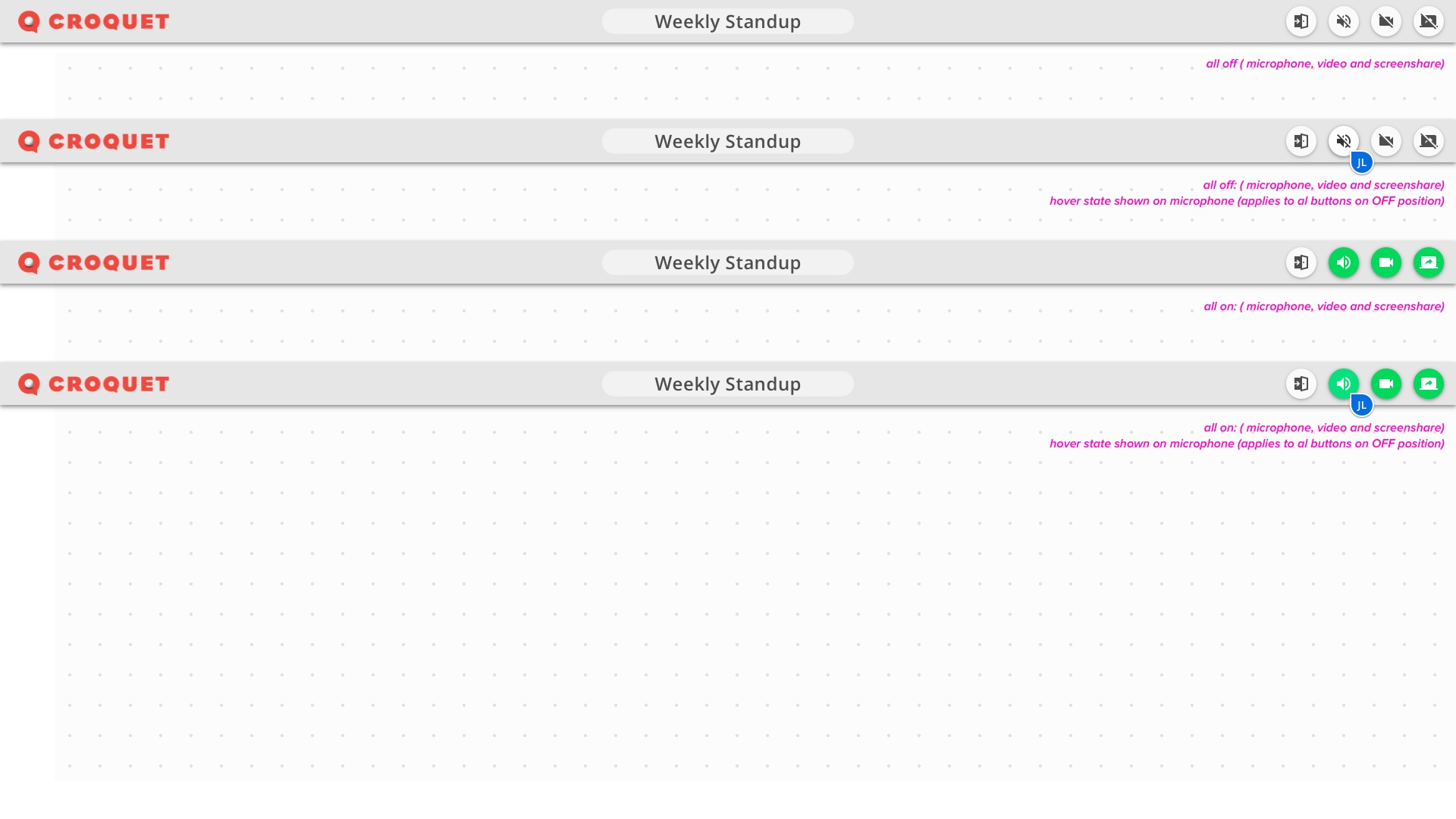
Session sharing visibility was also a major area of focus for users’ privacy and peace of mind. I wanted the sharing states to be very clear. I referenced examples in other products for references of the good, bad and ugly.
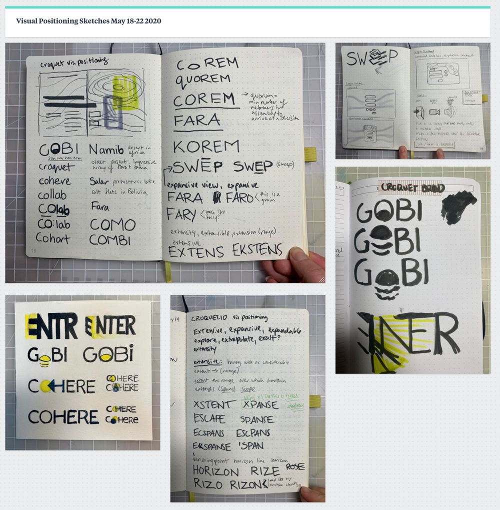
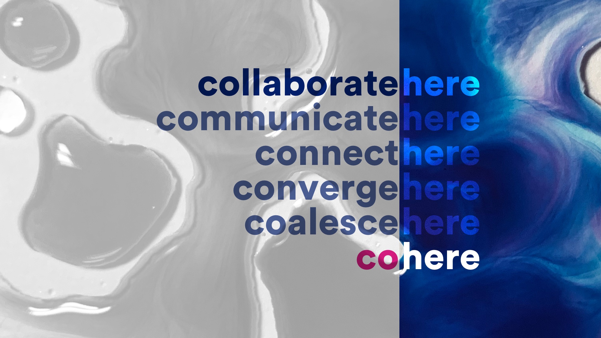
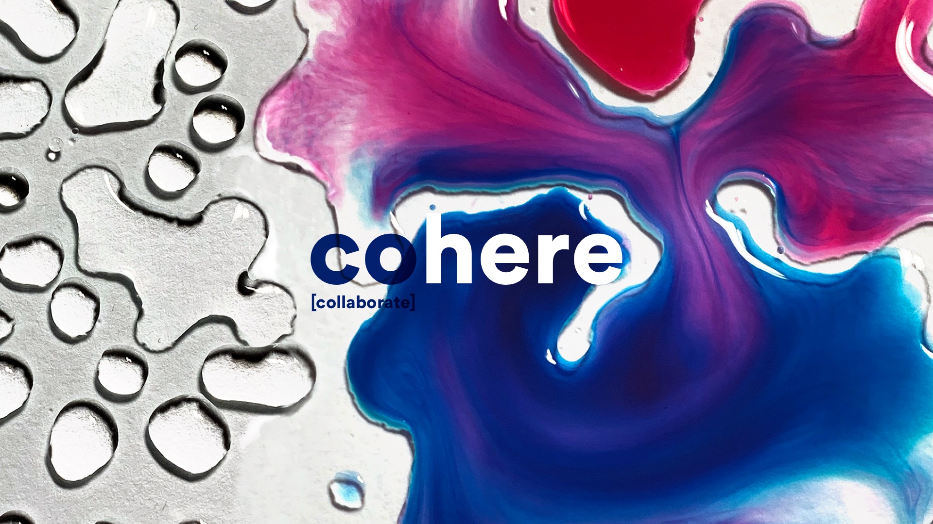
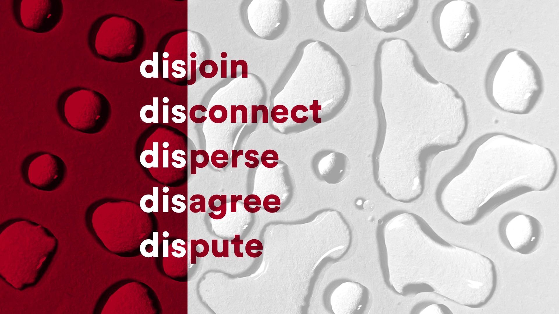
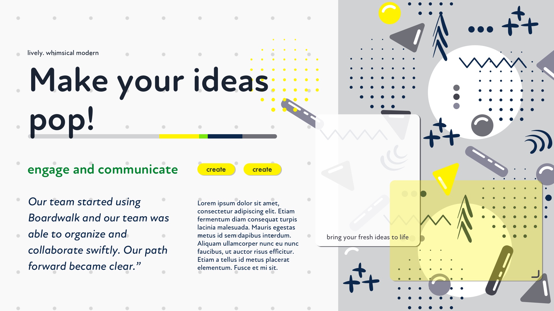
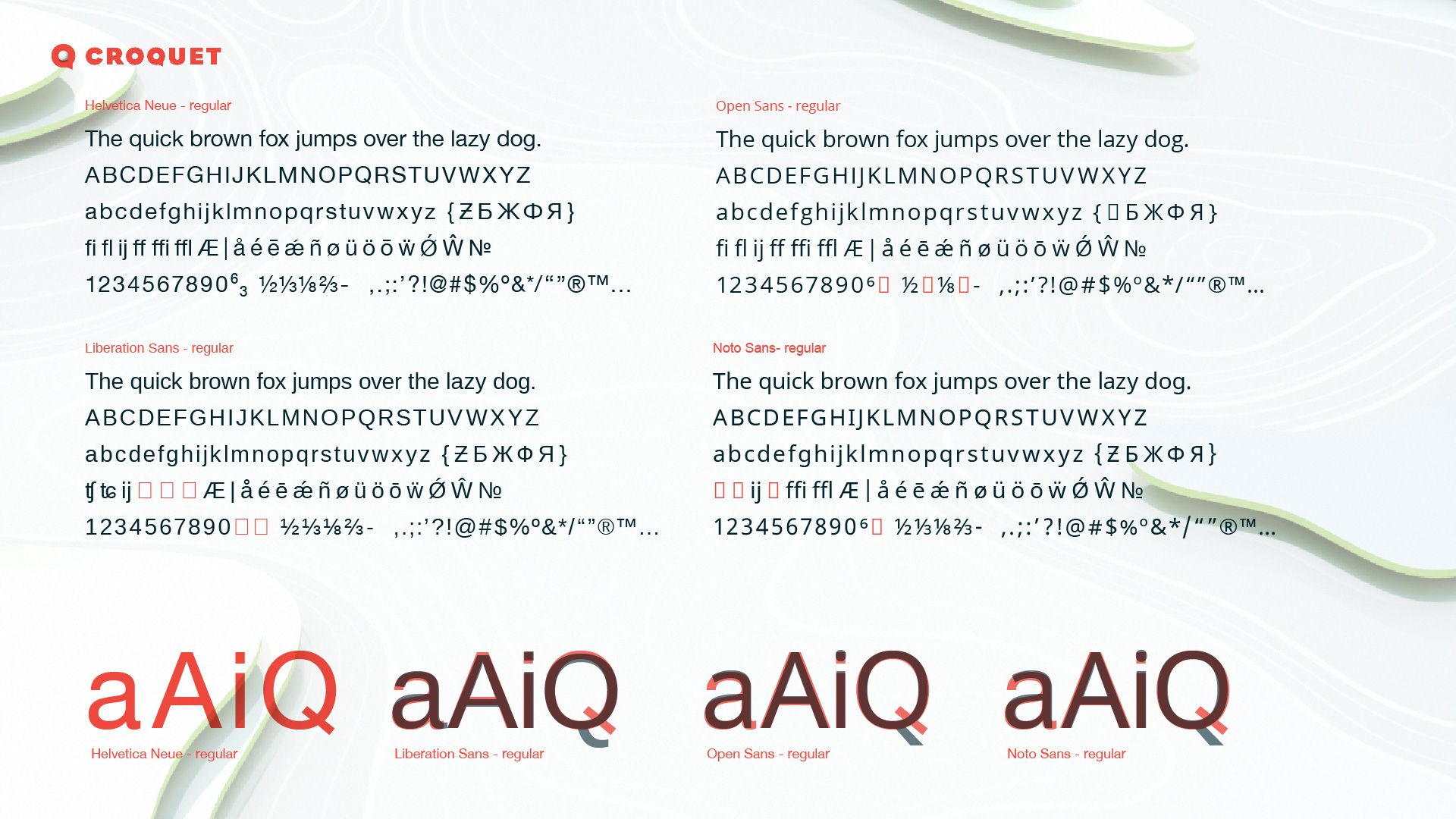
Visual Design & Brand Language Ideation
Product brand positioning
It’s “Hypercard 2020”. It’s easy to drag and drop a wide variety of different content into the shared space, and create dynamic connections tying it all together.
It’s “MacPaint 2020”. It encourages playful engagement from the moment you first encounter it.

It’s “Excel 2020”. Connections between data objects can trigger cascades of effects. You can program without being a programmer.

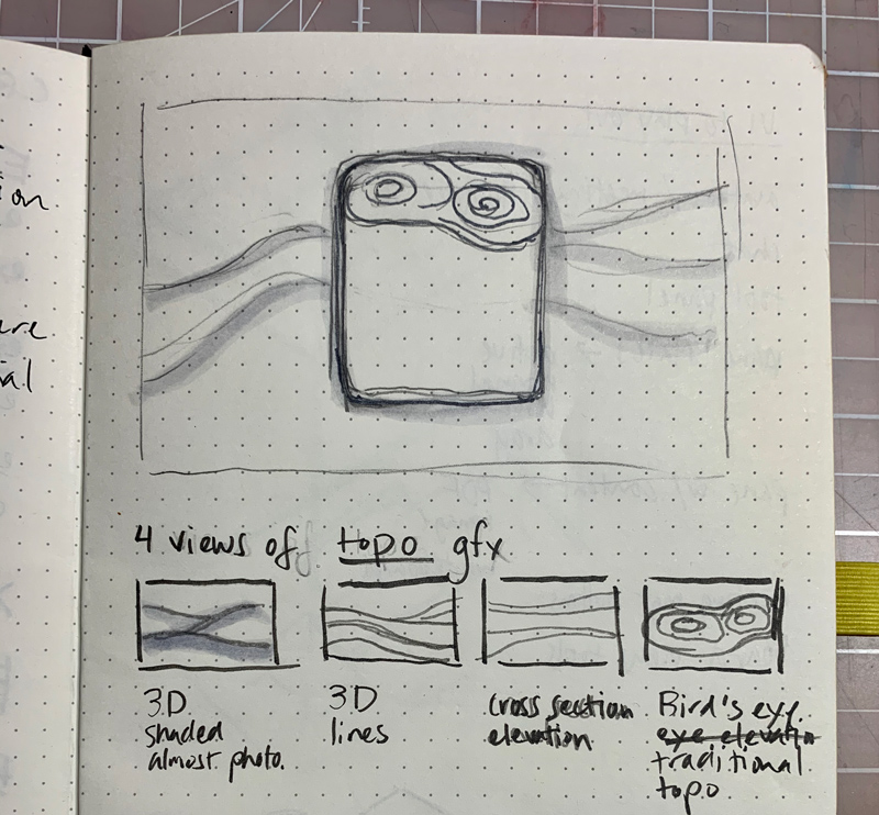
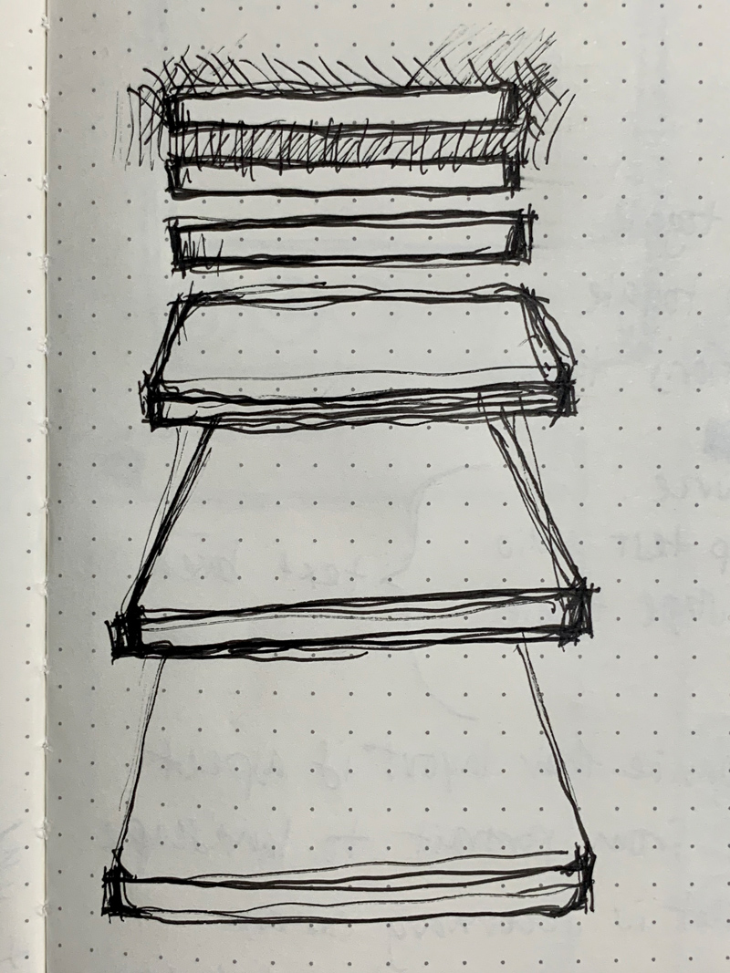
Visual design exploration with UI vignettes
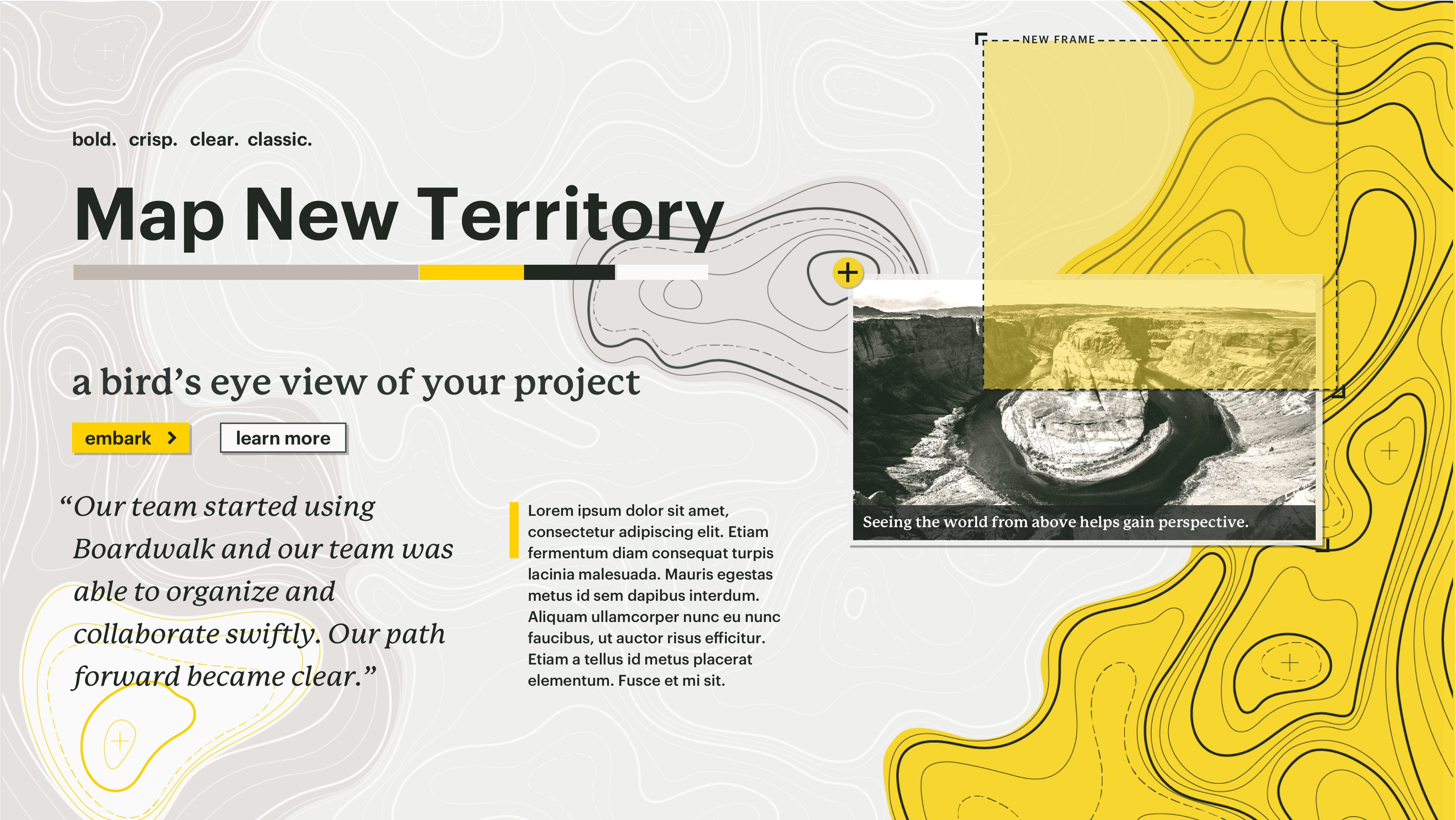
Narrowing in…

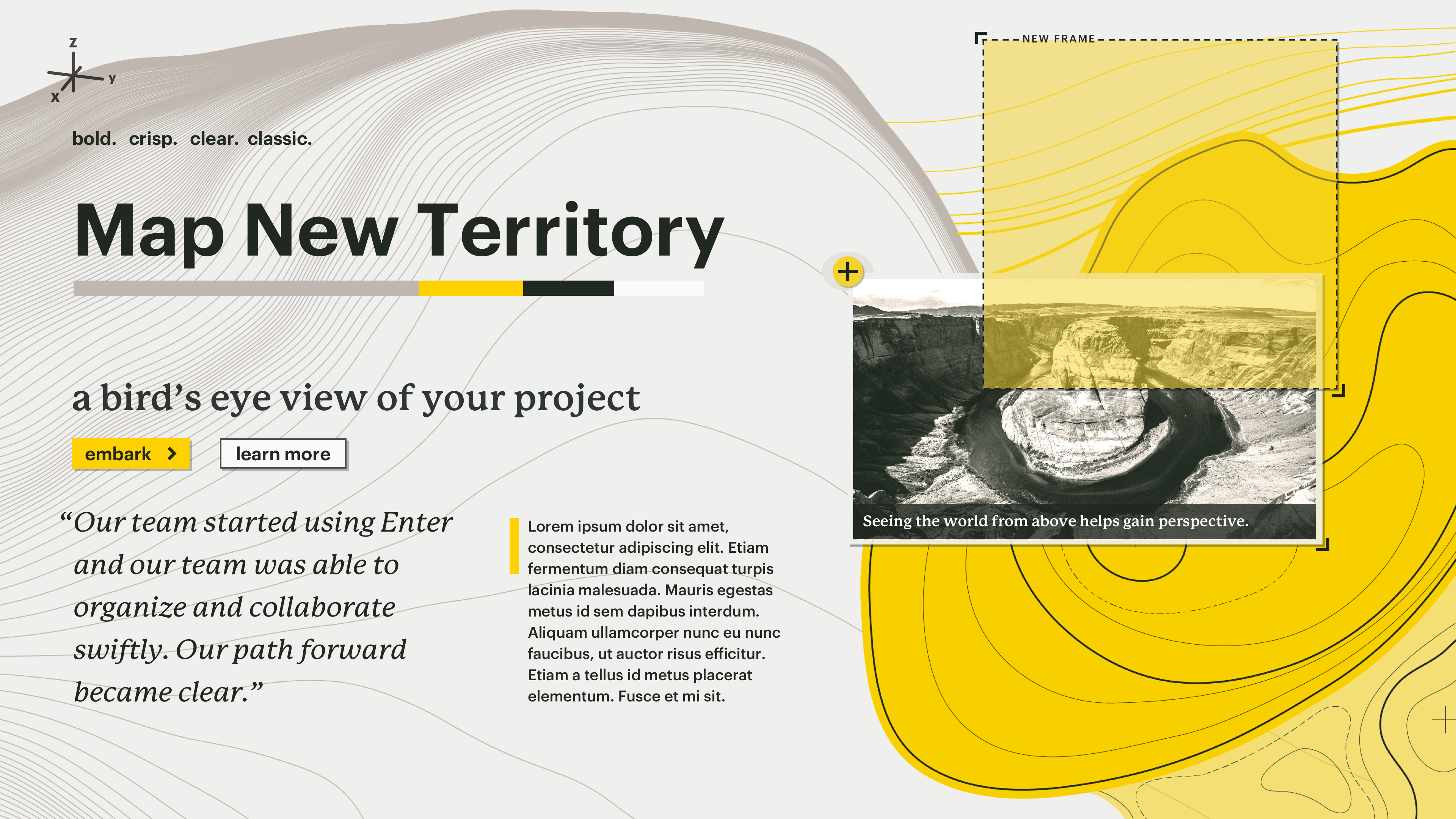
Design direction definition
![]()


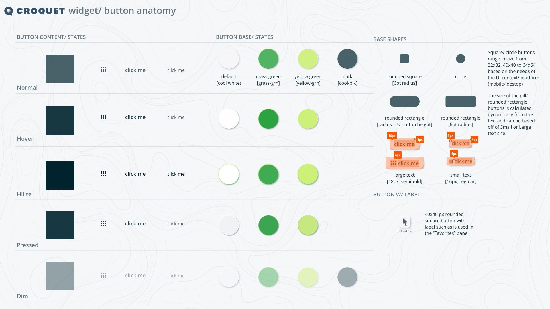
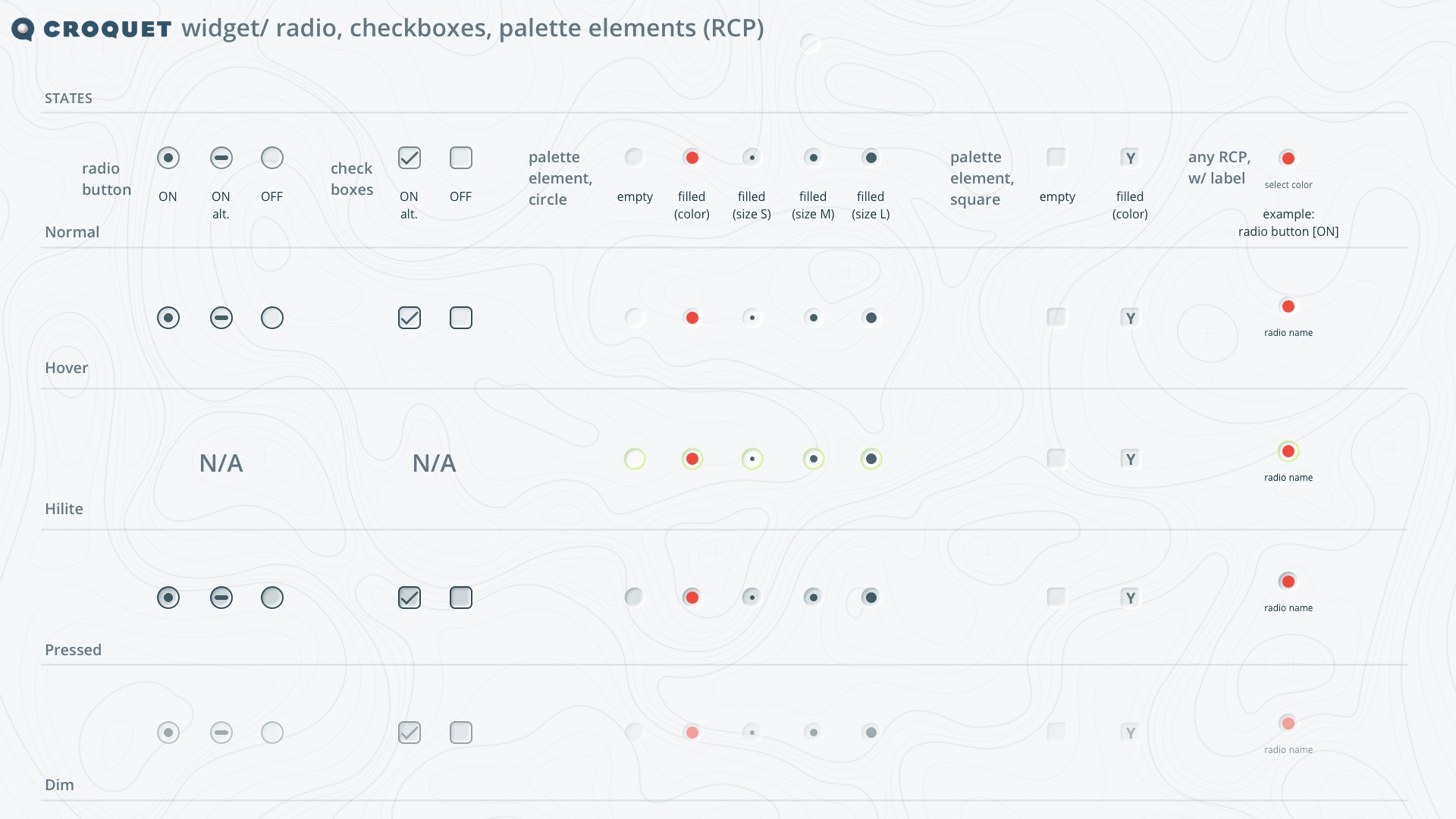
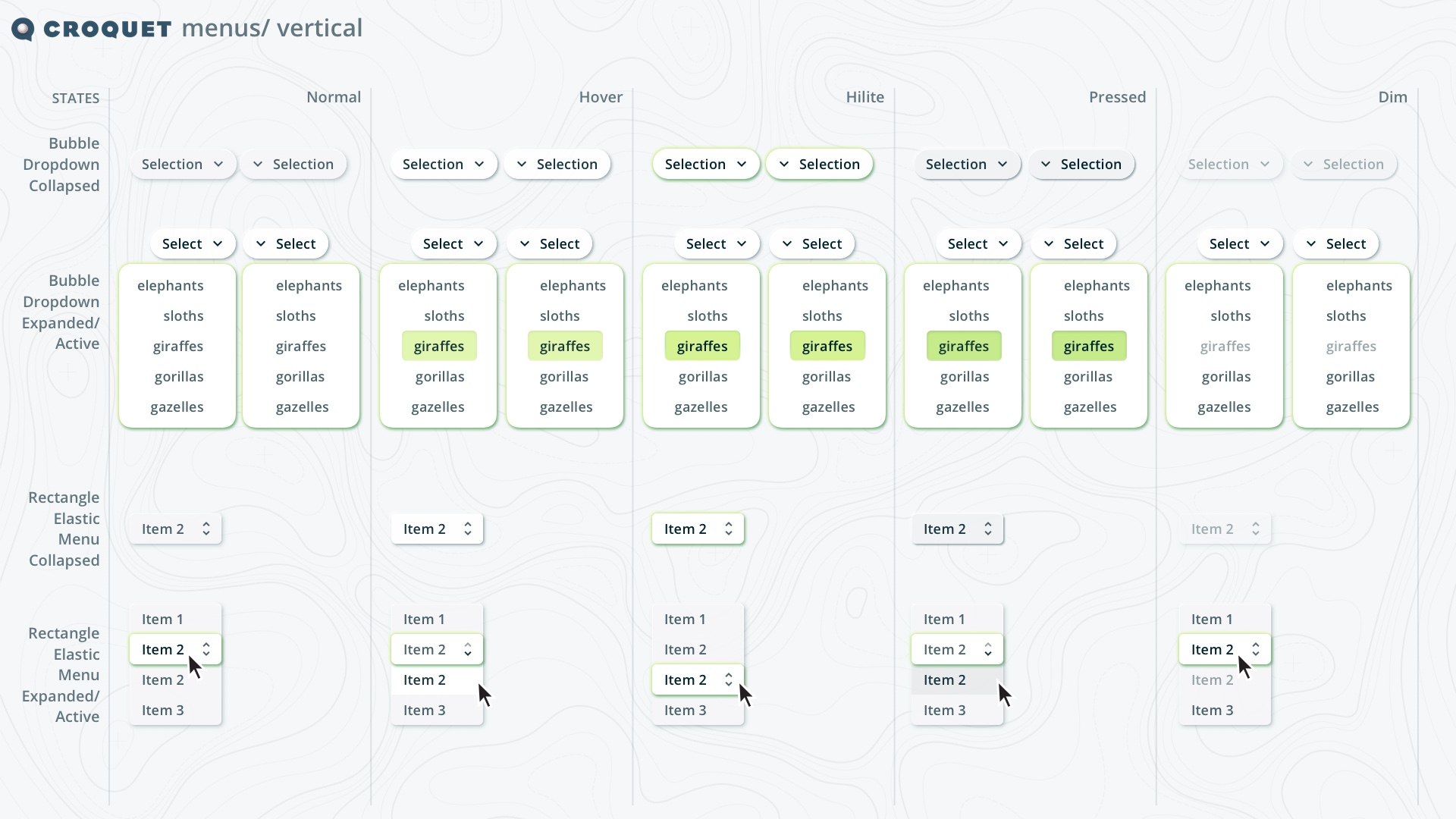
Design system creation